
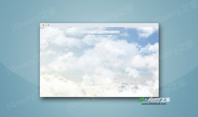

这是一款CSS3超逼真云层背景动画特效。该云层背景动画特效通过多重背景图片,以及CSS animation属性来制作逼真的云层运动动画。
使用方法
HTML结构
该云层背景动画特效的基本HTML结构如下:
<div class="satic-area">
  <div class="dynamic-area1"></div>
  <div class="dynamic-area2"></div>
</div>
CSS样式
然后分别为各个图层添加背景图片,并通过css animation属性将图层运动起来,形成云层动画特效。
html, body {
  width: 100%;
  height: 100%;
  margin: 0;
  padding: 0;
}

.satic-area {
  position: relative;
  width: 100%;
  height: 100%;
  background: url(img/poster-about.jpg) no-repeat center;
  background-size: cover;
}

.dynamic-area1   {
  position: absolute;
  width: 100%;
  height: 100%;
  top: 0;
  left: 0;
  background: url(img/poster-drop-animate2.png) repeat-x 0px 0px;
  background-size: cover;
  animation: posterDrop1 6000s linear infinite;
}

@keyframes posterDrop1 {
  from { background-position: 0 0; }
  to { background-position: 4000% 0; }
}

.dynamic-area2   {
  position: absolute;
  width: 100%;
  height: 100%;
  top: 0;
  left: 0;
  background: url(img/poster-drop-animate1.png) repeat-x 0px 0px;
  background-size: cover;
  animation: posterDrop2 8000s linear infinite;
}

@keyframes posterDrop2 {
  from { background-position: 0 0; }
  to { background-position: 30000% 0; }
}


