

这是一款炫酷的Bootstrap进度条动画样式。该进度条在原生bootstrap进度条的基础上,通过简单的CSS代码来进行美化,制作出炫酷的进度条动画样式效果。
使用方法
HTML结构
该Bootstrap进度条的HTML结构如下:
<div class="container">
<div class="row">
<div class="col-md-6">
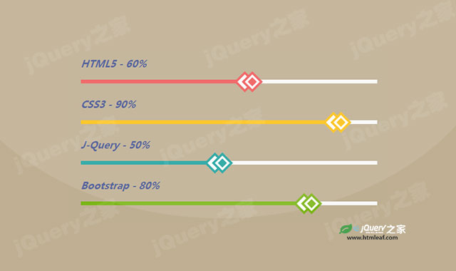
<h3 class="progress-title">HTML5 - 60%</h3>
<div class="progress red">
<div class="progress-bar" style="width:60%; background:#ef5b5b;"></div>
</div>
<h3 class="progress-title">CSS3 - 90%</h3>
<div class="progress yellow">
<div class="progress-bar" style="width:90%; background:#ffc116;"></div>
</div>
</div>
</div>
</div>
CSS样式
为该Bootstrap进度条添加如下的CSS样式来进行美化。
.progress-title{
  font-size: 18px;
  font-weight: 700;
  font-style: italic;
  color: #455493;
  margin: 0 0 20px;
}
.progress{
  height: 7px;
  background: #f8f8f8;
  border-radius: 0;
  box-shadow: none;
  margin-bottom: 30px;
  overflow: visible;
}
.progress .progress-bar{
  box-shadow: none;
  border-radius: 0;
  position: relative;
  -webkit-animation: animate-positive 2s;
  animation: animate-positive 2s;
}
.progress .progress-bar:before,
.progress .progress-bar:after{
  content: "";
  width: 20px;
  height: 20px;
  background: #fff;
  position: absolute;
  top: -6px;
  right: 16px;
  transform: rotate(45deg);
}
.progress .progress-bar:after{
  border: 4px solid #fff;
  position: absolute;
  right: 2px;
}
.progress.red .progress-bar:before,
.progress.red .progress-bar:after{
  outline: 4px solid #ef5b5b;
}
.progress.red .progress-bar:after{
  background: #ef5b5b;
}
.progress.yellow .progress-bar:before,
.progress.yellow .progress-bar:after{
  outline: 4px solid #ffc116;
}
.progress.yellow .progress-bar:after{
  background: #ffc116;
}
.progress.blue .progress-bar:before,
.progress.blue .progress-bar:after{
  outline: 4px solid #20a39e;
}
.progress.blue .progress-bar:after{
  background: #20a39e;
}
.progress.green .progress-bar:before,
.progress.green .progress-bar:after{
  outline: 4px solid #7cb518;
}
.progress.green .progress-bar:after{
  background: #7cb518;
}
@-webkit-keyframes animate-positive{
  0%{ width: 0; }
}
@keyframes animate-positive{
  0%{ width: 0; }
}


