


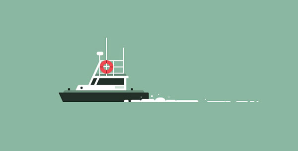
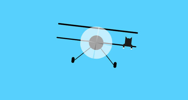
这是一款非常有意思的纯CSS3飞机和轮船动画特效。这组特效中分别使用CSS3技术来制作轮船和飞机的动画效果。特效中没有使用图片,各种元素都是通过CSS渲染出来的,效果非常的炫酷。
制作方法
HTML结构
在轮船的动画特效中,使用了嵌套<div>的HTML结构。各个<div>作为一个组件构成了整个轮船。而水浪则是使用一组<span>元素构成的。
<div class="boat">
  <!--轮船主体-->
  <div class="wrap">
    <div class="main">
      <div class="boat-top-layer">
        <div class="top">
          <div class="pole"></div>
          <div class="help"><span></span></div>
        </div>
        <div class="bottom"></div>
      </div>
      <div class="boat-mid-layer">
        <div class="top"></div>
        <div class="bottom"></div>
      </div>
      <div class="boat-bot-layer">
        <div class="top"></div>
        <div class="bottom"></div>
      </div>
    </div>
  </div>
  <!--水浪-->
  <div class="water">
    <div class="drops clearfix drops-1">
      <span class="drop drop-a"></span>
      ...
    </div>
    <div class="drops clearfix drops-2">
      <span class="drop drop-a"></span>
      ...
    </div>
  </div>
</div>
CSS样式
在轮船的CSS样式中,通过大量的:before和:after伪元素的设置来构建整个船体。例如红色的救生圈就是由div.help元素和它的子元素<span>的:before和:after伪元素来构建的。
.boat .boat-top-layer .top .help{
  z-index:1;
  width:30px;
  height:30px;
  margin-top:-2px;
  margin-left:-1px;
  position:relative;
  border-radius:50%;
  border:8px solid #f04850;
}
.boat .boat-top-layer .top .help:before,
.boat .boat-top-layer .top .help:after{
  top:50%;
  left:50%;
  position:absolute;
  background:rgba(0,0,0,.3);
}
.boat .boat-top-layer .top .help:before{
  height:2px;
  width:inherit;
  margin-top:-1px;
  margin-left:-15px;
}
.boat .boat-top-layer .top .help:after{
  width:2px;
  height:inherit;
  margin-top:-15px;
  margin-left:-1px;
}
.boat .boat-top-layer .top .help span{
  top:-2px;
  width:14px;
  height:14px;
  overflow:hidden;
  border-radius:50%;
  position:relative;
  display:inline-block;
}
.boat .boat-top-layer .top .help span:before,
.boat .boat-top-layer .top .help span:after{
  top:50%;
  left:50%;
  z-index:1;
  background:#fff;
  position:absolute;
}
.boat .boat-top-layer .top .help span:before{
  width:2px;
  height:inherit;
  margin-top:-7px;
  margin-left:-1px;
}
.boat .boat-top-layer .top .help span:after{
  height:2px;
  width:inherit;
  margin-top:-1px;
  margin-left:-7px;
}
其它部分的代码及动画效果的实现请参考下载文件。


