

这是一款使用纯CSS制作的纯CSS3超酷日常工作备忘录列表特效。该特效中没有使用js代码,通过Checkbox技巧来完成交互动作。它可以记录某项日常工作是否完成。整体界面十分时尚大方。
制作方法
HTML结构
该特效使用<input>和<label>元素来制作列表选项,并通过Checkbox技巧来实现用户的交互。
<div class="container">
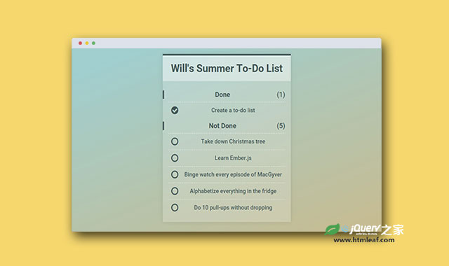
<h1>Will's Summer To-Do List</h1>
<div class="items">
<input id="item1" type="checkbox" checked>
<label for="item1">Create a to-do list</label>
<input id="item2" type="checkbox">
<label for="item2">Take down Christmas tree</label>
<input id="item3" type="checkbox">
<label for="item3">Learn Ember.js</label>
<input id="item4" type="checkbox">
<label for="item4">Binge watch every episode of MacGyver</label>
<input id="item5" type="checkbox">
<label for="item5">Alphabetize everything in the fridge</label>
<input id="item6" type="checkbox">
<label for="item6">Do 10 pull-ups without dropping</label>
<h2 class="done" aria-hidden="true">Done</h2>
<h2 class="undone" aria-hidden="true">Not Done</h2>
</div>
</div>
CSS样式
<input>元素使用一个非常大的负margin值将它隐藏。至于为何不使用display: none来隐藏,是因为考虑到屏幕阅读器和键盘Tab键的需要,display: none会使这些功能都失效。
input {
  display: block;
  height: 53px;
  margin: 0 0 -53px -9999px;
  -webkit-box-ordinal-group: 5;
  -webkit-order: 4;
      -ms-flex-order: 4;
          order: 4;
  outline: none;
  counter-increment: undone-items;
}
在checkbox元素的选取中,使用了checkbox hack技巧:通过:checked伪元素和一个相邻兄弟选择器+来实现选取功能。它的意思是:当checkbox被checked的时候,找到它后面紧邻的<label>元素,然后为它添加一些样式。在例子中是为它设置了一个帧动画效果。你也可以使用<label>元素的:before和:after伪元素来创建更多的效果。
label {
  display: block;
  position: relative;
  padding: 15px 0 15px 45px;
  border-top: 1px dashed #fff;
  -webkit-box-ordinal-group: 5;
  -webkit-order: 4;
      -ms-flex-order: 4;
          order: 4;
  cursor: pointer;
  -webkit-animation: undone .5s;
          animation: undone .5s;
}

label::before {
  content: '\f10c'; /* circle outline */
  display: block;
  position: absolute;
  top: 11px;
  left: 10px;
  font: 1.5em 'FontAwesome';
}

label:hover, input:focus + label {
  background-color: rgba(255, 255, 255, .2);
}

input:checked + label {
  -webkit-box-ordinal-group: 3;
  -webkit-order: 2;
      -ms-flex-order: 2;
          order: 2;
  -webkit-animation: done .5s;
          animation: done .5s;
}

input:checked + label::before {
  content: '\f058'; /* circle checkmark */
}


