
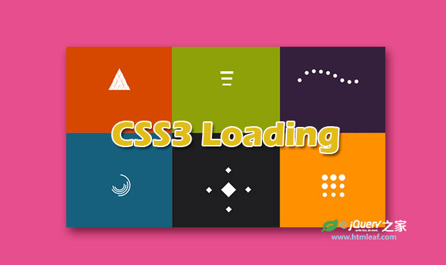

这是一组效果非常炫酷的CSS3页面预加载loading动画特效。该特效共有30种不同的loading效果。所有的加载动画都是使用CSS3来完成,jQuery代码只是用于隐藏加载动画。当你点击页面的任何一个地方时,loading动画就会被隐藏。
这30种loading动画分为3组:方形加载动画特效、圆形加载动画特效和长条形加载动画特效。每一种效果都有一个单独的页面,你可以对应查看每种效果的CSS代码。
制作方法
HTML结构
下面是第一种效果的制作方式。所有的DEMO都是使用嵌套div的HTML结构。在第一个DEMO中,嵌套了4层div元素,其中最里层的div#object是用于动画的元素。
<div id="loading">
  <div id="loading-center">
    <div id="loading-center-absolute">
      <div id="object"></div>
    </div>
  </div>
</div>
外层的div元素主要用于定位。
CSS样式
首先要设置最外层的div的定位方式为固定定位方式,这样方便它里面的元素制作各种动画效果。
#loading{
  background-color: #bd4932;
  height: 100%;
  width: 100%;
  position: fixed;
  z-index: 1;
  margin-top: 0px;
  top: 0px;
}
接着分别设置第二层和第三层div元素。第二层div元素设置为相对定位,宽度和高度均为100%。第三层div是实际动画元素的包裹元素,它设置为绝度定位,并且位置居中。
#loading-center{
  width: 100%;
  height: 100%;
  position: relative;
}
#loading-center-absolute {
  position: absolute;
  left: 50%;
  top: 50%;
  height: 200px;
  width: 200px;
  margin-top: -100px;
  margin-left: -100px;
}
最后,使用keyframes帧动画使div#object元素动起来,@-webkit-keyframes animate是为了兼容webkit内核的浏览器。@keyframes animate则是为了兼容IE浏览器。
#object{
  width: 80px;
  height: 80px;
  background-color: #FFF;
  -webkit-animation: animate 1s infinite ease-in-out;
  animation: animate 1s infinite ease-in-out;
  margin-right: auto;
  margin-left: auto;
  margin-top: 60px;
}
@-webkit-keyframes animate {
  0% { -webkit-transform: perspective(160px); }
  50% { -webkit-transform: perspective(160px) rotateY(-180deg); }
  100% { -webkit-transform: perspective(160px) rotateY(-180deg) rotateX(-180deg); }
}

@keyframes animate {
  0% {
    transform: perspective(160px) rotateX(0deg) rotateY(0deg);
    -webkit-transform: perspective(160px) rotateX(0deg) rotateY(0deg);
  } 50% {
    transform: perspective(160px) rotateX(-180deg) rotateY(0deg);
    -webkit-transform: perspective(160px) rotateX(-180deg) rotateY(0deg) ;
  } 100% {
    transform: perspective(160px) rotateX(-180deg) rotateY(-180deg);
    -webkit-transform: perspective(160px) rotateX(-180deg) rotateY(-180deg);
  }
}
JAVASCRIPT
插件中还使用了一些jQuery代码来隐藏loading效果。
$(window).load(function() {
  $("#loading-center").click(function() {
  $("#loading").fadeOut(500);
  })
});
在实际应用中,你可能需要这样使用这些Loading效果:
$(window).load(function() {
   $("#loading").fadeOut(500);
})
上面的代码表示在页面加载完成之后0.5秒的时间内将loading动画淡入淡出隐藏起来。


