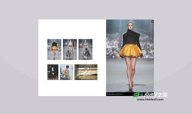
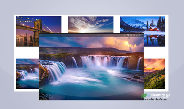
在这篇文章中我们想制作一个很有意思四格漫画风格的Lightbox特效。以前在报纸上可以看到很多的四格漫画,我们做的这个特效类似于这个风格,一个大方框中包含4格等宽等高的图片,当点击任意图片的时候,该图片放大到整个大方框的尺寸,再次点击图片时,图片缩小会原来的尺寸。
在HTML结构上,我们采用一个<div>来作为大方框,里面使用四个<figure>来作为四个格子。
<div id="quad">
  <figure>
  <img src="img/img1.jpg" alt="rose-red-wine">
  <figcaption>潘潘达漫画系列(一)</figcaption>
  </figure>
  <figure>
    <img src="img/img2.jpg" alt>
    <figcaption>潘潘达漫画系列(二)</figcaption>
  </figure>
  <figure>
    <img src="img/img3.jpg" alt>
    <figcaption>潘潘达漫画系列(三)</figcaption>
  </figure>
  <figure>
    <img src="img/img4.jpg" alt>
    <figcaption>潘潘达漫画系列(四)</figcaption>
  </figure>
</div>
我们要使这四幅图片并排排列,并且要保证它们的尺寸大小相同。
div#quad {
    background-color: #111; font-size: 0;
    width: 50%; margin: 0 auto;
}
div#quad figure {
    margin: 0; width: 50%; height: auto;
    transition: 1s; display: inline-block;
    position: relative;
}
div#quad figure img { width: 100%; height: auto; }
接下来,要确保每一个<figure>都从它的远角开始transform。注意代码中没有写厂商的前缀。
div#quad figure:nth-child(1) { transform-origin: top left; }
div#quad figure:nth-child(2) { transform-origin: top right; }
div#quad figure:nth-child(3) { transform-origin: bottom left; }
div#quad figure:nth-child(4) { transform-origin: bottom right; }
最后,为图片的标题添加一些样式:
div#quad figure figcaption {
    margin: 0; opacity: 0;
    background: rgba(0,0,0,0.3); color: #fff;
    padding: .3rem; font-size: 1.2rem;
    position: absolute; bottom: 0; width: 100%;
    transition: 1s 1s opacity;
}
.expanded { transform: scale(2); z-index: 5; }
div#quad figure.expanded figcaption { opacity: 1; }
div.full figure:not(.expanded) { pointer-events: none; }
div#quad figure:hover { cursor: pointer; z-index: 4; }
上面的CSS3代码十分好理解,就不再多说了。下面来看看js代码。代码要写在文档的最后。
<script>
    var quadimages = document.querySelectorAll("#quad figure");
        for(i=0; i<quadimages.length; i++) {
        quadimages[i].addEventListener( 'click', function(){ this.classList.toggle("expanded");
        quad.classList.toggle("full") }
        );
    }
</script>
当我们点击或触摸缩略图的时候,通过js代码为其添加相应的class来使它伸展到父容器的宽度,当图片在放大状态下,它的z-index属性是最高的,这样确保了它在其它图片的上面。为了更加稳妥,CSS代码中还去除了其它图片的pointer-events事件。
制作这个四个漫画风格的Lightbox特效的唯一条件的所有的图片都一样尺寸。按照这个原理,我们也可以制作6格漫画风格或9格漫画风格的Lightbox特效,我们只需要修改一下transform-origin即可。