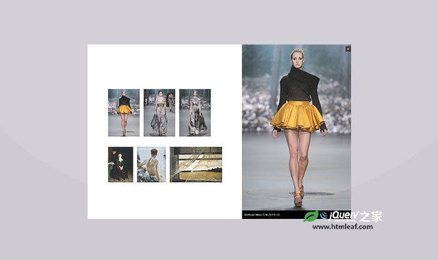
这个插件能将缩略图自动分组并堆叠到一起。缩略图根据自己的data-pile属性来分组,当点击这一组堆叠的缩略图时,所有的图片将分散开来,出现在指定的位置上。
存放图片的网格是自适应的,也就是说,当水平方向的空间不够时,缩略图会自动往下一行排列。
注意:不是每一个浏览器都支持CSS transforms和transitions ,最好是使用Chrome或Firefox浏览器观看。
HTML结构:
创建一个无序列表,并给它一个class tp-grid。
<ul id="tp-grid" class="tp-grid">
    <li data-pile="Group 1">
        <a href="#">
            <span class="tp-info">
                <span>Some title</span>
            </span>
            <img src="images/1.jpg" />
        </a>
    </li>
    <li data-pile="Group 2">
        <!-- ... -->
    </li>
    <li data-pile="Group 1,Group 2">
        <!-- ... -->
    </li>
    <!-- ... -->
</ul>
data-pile属性存放的是相同组的缩略图。注意,一张图片可以分别在不同的组中。
调用插件
$( '#tp-grid' ).stapel();
可选参数
下面是一些可选的参数:
$.Stapel.defaults = {

    // space between the items
    gutter : 40,

    // the rotations degree for the 2nd and 3rd item
    // (to give a more realistic pile effect)
    pileAngles : 2,

    // animation settings for the items of the clicked pile
    pileAnimation : {
        openSpeed : 400,
        openEasing : 'ease-in-out',
        closeSpeed : 400,
        closeEasing : 'ease-in-out'
    },

    // animation settings for the other piles
    otherPileAnimation : {
        openSpeed : 400,
        openEasing : 'ease-in-out',
        closeSpeed : 350,
        closeEasing : 'ease-in-out'
    },

    // delay for each item of the pile
    delay : 0,

    // random rotation for single items
    randomAngle : false,

    // callback functions
    onLoad : function() { return false; },
    onBeforeOpen : function( pileName ) { return false; },
    onAfterOpen : function( pileName, totalItems ) { return false; },
    onBeforeClose : function( pileName ) { return false; },
    onAfterClose : function( pileName, totalItems ) { return false; }

};
基本的样式都定义在stapel.css文件中。
本教程就到这里,希望对你有所帮助。