当我们在使用css3的3d变换效果(3d transform)的时候,我们会发现它们没有任何阴影效果。在现实生活中,物体有反光面和阴影,平面能够吸收光线和反射光线。所以,我们的作品也应该要做的更接近现实才行。
如果你需要在一个复杂的模型上计算反射光线,使用Photon语言也许可以实现,但是相当复杂。在这个教程中,我们将教大家一些简单的解决方案。在这个例子中,我们将制作一个3d电影海报画廊,当鼠标经过海报时,海报将旋转,包含电影信息的面将出现在正面。
HTML结构:
来看看整个html结构要怎么写。首先,需要一个wrapper将页面上的所有元素居中。接下来我们创建一个无需列表来放在海报,我们将为ul添加class .stage,为li添加class .scene。在我们的CSS中,stage元素将作为一个容器包含scene元素,让每个li元素都能应用perspective属性,已达到3d旋转的效果。
在每一个li元素中,我们需要添加一些html代码,用于描述每一部电影的信息。如果想做得更好一些,这里可以使用一些回调方法来获取电影信息。这里我们只是简单的演示。
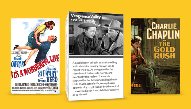
It's a Wonderful Life
1946 130 minutesIn Bedford Falls, New York on Christmas Eve, George Bailey is deeply troubled. Prayers for his well-being from friends and family reach Heaven. Clarence Odbody, Angel Second Class, is assigned to visit Earth to save George, thereby earning his wings. Franklin and Joseph, the head angels, review George's life with Clarence.
在完整的例子中,包含了另外两张海报,电影的描述信息也更多,而且还带有图片说明,你可以下载整个完整的例子来研究。
CSS样式:
首先,我们需要将wrapper居中,并且把stage的list-style去掉。
.wrapper {
    margin: 0 auto 100px auto;
    max-width: 960px;
}

.stage {
    list-style: none;
    padding: 0;
}
接下来,要为scene添加一些样式,指定它的高度和宽度。两个scene之间要指定足够大的margin,以防止两个海报重叠。然后使他们浮动起来,排成一列。
最好,我们要添加一些透视效果perspective,这将使我们能够在需要的元素上创建3d效果。在这个例子中给定1000px效果最好。在其他应用中,这个数值的大小将由你来决定。
.scene {
    width: 260px;
    height: 400px;
    margin: 30px;
    float: left;
    perspective: 1000px;
}
除了.scene,我们还需要给.movie的元素指定高度和宽度。这将使每个海报在旋转时不变形。接下来,为了使海报做3d旋转,我们要设置transform-style属性为preserve-3d,最后,我们要让它绕Z轴旋转-130px,这将使海报有足够的空间来旋转。
.movie {
    width: 260px;
    height: 400px;
    transform-style: preserve-3d;
    transform: translateZ(-130px);
    transition: transform 350ms;
}
注意上面的transition属性,正是它使海报旋转起来了。我们设置它的数值为350ms,如果你喜欢更动态的效果,你可以减小它的数值。
接下来,我们要让鼠标hover海报时,让它旋转起来。我们为每个.movie元素的:hover伪元素添加transform属性,使海报绕Y轴做3D旋转,并且沿着屏幕方向的Z轴运动。你完全可以使海报旋转90度,但这个例子中并没有这样做,而是留下一点空间。
.movie:hover {
    transform: rotateY(-78deg) translateZ(20px);
}
现在让我们来创建3d海报,每一个.poster和info都要设置为绝对定位。
.movie .poster,
.movie .info {
  position: absolute;
  width: 260px;
  height: 400px;
  background-color: #fff;
  backface-visibility: hidden;
}
设置好海报的位置后,我们就可以将它们旋转到合适的位置。.poster元素只需要沿Z轴移动130px,因为它的父元素.movie在同一时间也移动130px。background-size被设置为cover,当旋转海报时,背景将被填充。
.info需要移动和poster一样的数值,同时它还需要旋转一些角度。
.movie .poster  {
  transform: translateZ(130px);
  background-size: cover;
  background-repeat: no-repeat;
}

.movie .info {
  transform: rotateY(90deg) translateZ(130px);
  border: 1px solid #B8B5B5;
  font-size: 0.75em;
}
我们使用::after伪元素来制作海报的外阴影。
.movie::after {
  content: '';
  width: 260px;
  height: 260px;
  position: absolute;
  bottom: 0;
  box-shadow: 0 30px 50px rgba(0,0,0,0.3);
  transform-origin: 100% 100%;
  transform: rotateX(90deg) translateY(130px);
  transition: box-shadow 350ms;
}

.movie:hover::after {
  box-shadow: 20px -5px 50px rgba(0,0,0,0.3);
}
我们使用box-shadow属性来制作光线的变化。对于.poster,我们设置为 inset,x、y偏移0像素,半径设置为40px,阴影设置为rgba(255,255,255,0)。记住,所有的.movie子元素都有transition属性,所以当我们为阴影设置了开始状态,就可以用:hover来控制它的运动状态。
如果我们:hover了.movie,它会将.poster的box-shadow重置,并通过transition使它们运动起来。在这时候,海报仍然处于inset状态,但是它沿X轴偏移了300px并且透明度为0.8。这将使海报的边缘阴影产生模糊效果。透明度降低使得海报有一些玻璃质感。
.movie .poster,
.movie .info,
.movie .info header {
  transition: box-shadow 350ms;
}

.movie .poster {
  box-shadow: inset 0px 0px 40px rgba(255,255,255,0);
}

.movie:hover .poster {
  box-shadow: inset 300px 0px 40px rgba(255,255,255,0.8);
}
为了使效果更好,我们我们为海报的信息面也添加一些边部阴影。
.movie .info,
.movie .info header {
  box-shadow: inset -300px 0px 40px rgba(0,0,0,0.5);
}

.movie:hover .info,
.movie:hover .info header {
  box-shadow: inset 0px 0px 40px rgba(0,0,0,0);
}
最后,我们为每个海报添加一张预览图片,这里使用:nth-child伪元素来制作。
.scene:nth-child(1) .movie .poster {
  background-image: url(../img/poster01.jpg);
}

.scene:nth-child(2) .poster {
  background-image: url(../img/poster02.jpg);
}

.scene:nth-child(3) .poster {
  background-image: url(../img/poster03.jpg);
}

.scene:nth-child(1) .info header {
  background-image: url(../img/still01.jpg);
}

.scene:nth-child(2) .info header {
  background-image: url(../img/still02.jpg);
}

.scene:nth-child(3) .info header {
  background-image: url(../img/still03.jpg);
}
你可能已经注意到在这个例子中我们使用了Modernizr.js,它的作用是检测浏览器是否支持3D transforms并提供一个简单的回调功能。