
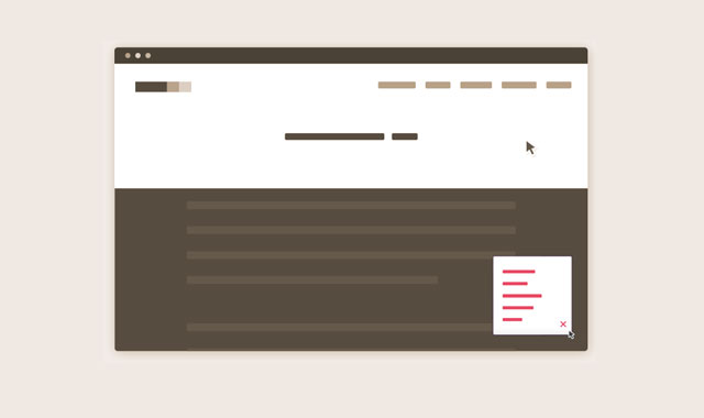

一个位置固定的导航,可以使用户在浏览你的网站时可以随时查看你的导航菜单。它比全屏宽度的固定菜单占有的地方要小,并且是替换“返回顶部”按钮的一个非常好的用户体验解决方案。
很多时候我们需要一个能够快速返回页面顶部的方法,通常是使用“返回顶部”按钮。但是,想一想用户为什么要返回页面顶部?如果我们在原来“返回顶部”按钮的地方放置一个最小化的导航菜单效果如何呢?
HTML结构
html结构非常简单:导航菜单和触发按钮都被放置到#cd-nav的div中。在.cd-nav-trigger中的<span>是用来创建触发按钮图标的。
<header><!-- ... --></header>
<div id="cd-nav">
  <a href="#0" class="cd-nav-trigger">Menu<span></span></a>

  <nav id="cd-main-nav">
    <ul>
      <li><a href="#0">Homepage</a></li>
      <li><a href="#0">Services</a></li>
      <li><a href="#0">Portfolio</a></li>
      <li><a href="#0">Pricing</a></li>
      <li><a href="#0">Contact</a></li>
    </ul>
  </nav>
</div>
<main><!-- content here --></main>
CSS样式
由于我们是从移动设备的角度去编写样式的,我们设置#cd-nav中的无序列表为position: fixed 。我们希望这个按钮位于手机的右下方,这样便于用户使用一只手来操作。当用户点解了.cd-nav-trigger,我们给无序列表添加 class .is-visible,用来改变 CSS3 Scale 的值使其从0变到1,并通过 CSS3 transition 来使动画更加平滑。
#cd-nav ul {
  /* mobile first */
  position: fixed;
  width: 90%;
  max-width: 400px;
  right: 5%;
  bottom: 20px;
  visibility: hidden;
  overflow: hidden;
  z-index: 1;
  transform: scale(0);
  transform-origin: 100% 100%;
  transition: transform 0.3s, visibility 0s 0.3s;
}
#cd-nav ul.is-visible {
  visibility: visible;
  transform: scale(1);
  transition: transform 0.3s, visibility 0s 0s;
}
.cd-nav-trigger {
  position: fixed;
  bottom: 20px;
  right: 5%;
  width: 44px;
  height: 44px;
  /* image replacement */
  overflow: hidden;
  text-indent: 100%;
  white-space: nowrap;
  z-index: 2;
}
当屏幕尺寸大于1170像素,我们将导航菜单的位置从Fixed改变为Absolute ,并将它移动到页面顶部。当用户向下滚动鼠标时,我们使用jQuery为#cd-nav添加class .is-fixed。这样可以移动整个导航菜单到屏幕的右下方-效果就像在移动设备上一样。
@media only screen and (min-width: 1170px) {
  #cd-nav ul {
    /* the navigation moves to the top */
    position: absolute;
    width: auto;
    max-width: none;
    bottom: auto;
    top: 36px;
    visibility: visible;
    transform: scale(1);
    transition: all 0s;
  }

  #cd-nav.is-fixed ul {
    position: fixed;
    width: 90%;
    max-width: 400px;
    bottom: 20px;
    top: auto;
    visibility: hidden;
    transform: scale(0);
  }
}
JAVASCRIPT
我们定义一个偏移变量用于在#cd-nav上切换.is-fixed class。
// browser window scroll (in pixels) after which the "menu" link is shown
var offset = 300;
checkMenu()方法关注于屏幕滚动时菜单的行为:
var navigationContainer = $('#cd-nav'),
  mainNavigation = navigationContainer.find('#cd-main-nav ul');

$(window).scroll(function(){
  checkMenu();
});

function checkMenu() {

  if( $(window).scrollTop() > offset && !navigationContainer.hasClass('is-fixed')) {
    //add .is-fixed class to #cd-nav
    //wait for the animation to end
    //add the .has-transitions class to main navigation (used to bring back transitions)
  } else if ($(window).scrollTop() <= offset) {

    //check if the menu is open when scrolling up - for browser that supports transition
    if( mainNavigation.hasClass('is-visible')  && !$('html').hasClass('no-csstransitions') ) {
      //close the menu
      //wait for the transition to end
      //remove the .is-fixed class from the #cd-nav and the .has-transitions class from main navigation
    }

    //check if the menu is open when scrolling up - fallback if transitions are not supported
    else if( mainNavigation.hasClass('is-visible')  && $('html').hasClass('no-csstransitions') ) {
      //no need to wait for the end of transition - close the menu and remove the .is-fixed class from the #cd-nav
    }

    //scrolling up with menu closed
    else {
      //remove the .is-fixed class from the #cd-nav and the .has-transitions class from main navigation
    }
  }
}


