

这是一款非常实用的jQuery和css3顶部固定导航菜单特效插件。我们曾经在很多网站上都看到过这种顶部固定导航菜单特效。 Disqus For Websites 的导航菜单就是一个很好的例子。
HTML结构
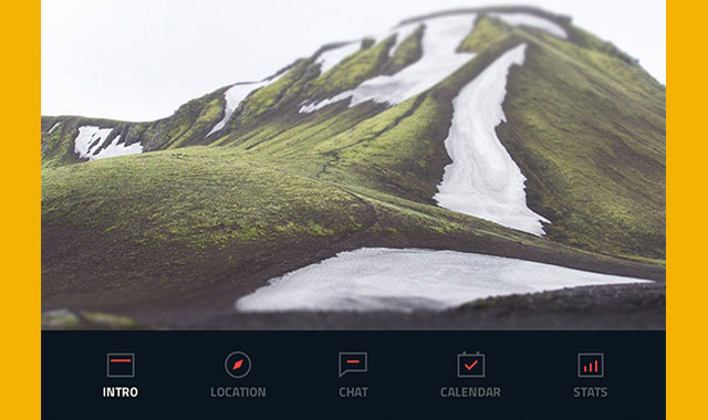
使用一个section来包含住头部的图像、标题和按钮,固定导航菜单使用一个div .cd-secondary-nav包住一个无序列表:
<section id="cd-intro">
  <div id="cd-intro-tagline">
    <h1><!-- your tagline here --></h1>
    <a href="#0" class="cd-btn"><!-- your action button text here --></a>
  </div>
</section>

<div class="cd-secondary-nav">
  <a href="#0" class="cd-secondary-nav-trigger">Menu<span></span></a> <!-- button visible on small devices -->
  <nav>
    <ul>
      <li>
        <a href="#cd-placeholder-1">
          <b>Services</b>
          <span></span><!-- icon -->
        </a>
      </li>
      <!-- other items here -->
    </ul>
  </nav>
</div> <!-- .cd-secondary-nav -->
<main class="cd-main-content">
  <section id="cd-placeholder-1" class="cd-section cd-container">
    <!-- your section content here-->
  </section> <!-- #cd-placeholder-1 -->

  <section id="cd-placeholder-2" class="cd-section cd-container">
    <!-- your section content here-->
  </section> <!-- #cd-placeholder-2 -->

  <!-- other sections here -->
</main> <!-- .cd-main-content -->
CSS样式
这款插件是移动设备优先的,我们为无序列表设置 position: fixed ,并将它放到屏幕的右下方(此时它看起来像一个图标)。当用户点击.cd-secondary-nav-trigger按钮,我们给无序列表添加上 .is-visible 类,并将CSS3 Scale的值从0变为1,使列表展开。
当屏幕大于1170像素的时候,我们将.cd-secondary-nav-trigger按钮隐藏。并将无序列表的定位设置为static。
.cd-secondary-nav ul {
  position: fixed;
  right: 5%;
  bottom: 20px;
  visibility: hidden;
  transform: scale(0);
  transform-origin: 100% 100%;
  transition: transform 0.3s, visibility 0s 0.3s;
}
.cd-secondary-nav ul.is-visible {
  visibility: visible;
  transform: scale(1);
  transition: transform 0.3s, visibility 0s 0s;
}
@media only screen and (min-width: 1170px) {
  .cd-secondary-nav ul {
    /* reset navigation values */
    position: static;
    width: auto;
    max-width: 100%;
    visibility: visible;
    transform: scale(1);
  }
}
.cd-secondary-nav-trigger {
  position: fixed;
  bottom: 20px;
  right: 5%;
  width: 44px;
  height: 44px;
}
@media only screen and (min-width: 1170px) {
  .cd-secondary-nav-trigger {
    display: none;
  }
}
当用户滚动鼠标到“intro”部分时,我们为导航菜单设置 .is-fixed 类。将它的定位从relative 改变为fixed并修改他的高度。然后为它的子节点添加.animate-children,来使它的各个子节点产生动画。这里不能使用一个class来制作动画,因为在Firefox中有一个BUG-CSS transition animation fails when parent element changes position attribute。
@media only screen and (min-width: 1170px) {
  .cd-secondary-nav.is-fixed {
    position: fixed;
    left: 0;
    top: 0;
    height: 70px;
    width: 100%;
  }
  .cd-secondary-nav li a {
    padding: 58px 40px 0 40px;
    transition: padding 0.2s;
  }
  .cd-secondary-nav li a span {
    transition: opacity 0.2s;
  }
  .cd-secondary-nav.animate-children li a {
    padding: 26px 30px 0 30px;
  }
  .cd-secondary-nav.animate-children li a span {
    opacity: 0;
  }
}
当导航菜单处于“固定”状态时,我们希望Logo和下载按钮显示出来。所以我们定义了两个class: .is-hidden 和 .slide-in 。
@media only screen and (min-width: 1170px) {
  #cd-logo.is-hidden {
    /* assign a position fixed and move outside the viewport (on the left) */
    opacity: 0;
    position: fixed;
    left: -20%;
    transition: left 0.3s, opacity 0.3s;
  }
  #cd-logo.is-hidden.slide-in {
    /* slide in when the secondary navigation gets fixed */
    left: 5%;
    opacity: 1;
  }

  .cd-btn.is-hidden {
    /* assign a position fixed and move outside the viewport (on the right) */
    opacity: 0;
    position: fixed;
    right: -20%;
    transition: right 0.3s, opacity 0.3s;
  }
  .cd-btn.is-hidden.slide-in {
    /* slide in when the secondary nav gets fixed */
    right: 5%;
    opacity: 1;
  }
}
JAVASCRIPT
当用户滚动页面超过导航条位置,我们为导航条添加.is-fixed并改变它的position的值。我们为 .animate-children添加50ms的延时来使它的子节点产生动画。因为它们的动画不是同时发生的,因此,位置值的改变不会影响过渡效果。
var secondaryNav = $('.cd-secondary-nav'),
  secondaryNavTopPosition = secondaryNav.offset().top;

$(window).on('scroll', function(){

  if($(window).scrollTop() > secondaryNavTopPosition ) {
    secondaryNav.addClass('is-fixed');
    setTimeout(function() {
            secondaryNav.addClass('animate-children');
            $('#cd-logo').addClass('slide-in');
      $('.cd-btn').addClass('slide-in');
        }, 50);
  } else {
    secondaryNav.removeClass('is-fixed');
    setTimeout(function() {
            secondaryNav.removeClass('animate-children');
            $('#cd-logo').removeClass('slide-in');
      $('.cd-btn').removeClass('slide-in');
        }, 50);
  }
});


