
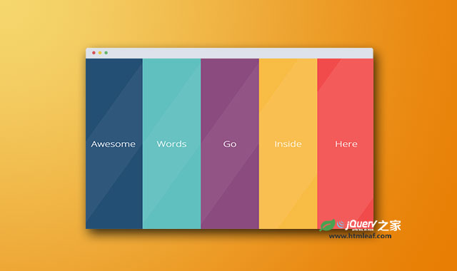

这是一款使用CSS3和一点jQuery代码制作的手风琴面板界面效果。该手风琴面板带玻璃流光质感,点击每一个面板时都会以非常炫酷的方式扩展为全屏面板。该界面设计给人的感觉非常的时尚大方。
制作方法
HTML结构
该手风琴面板采用HTML5的结构,整体使用一个<section>元素来作为包裹元素,它里面的每一个<article>元素是一个手风琴项。.strip__close是通用的面板关闭按钮。
<section class="strips">
  <article class="strips__strip">
    <div class="strip__content">
      <h1 class="strip__title" data-name="Ipsum">Words</h1>
      <div class="strip__inner-text">
        <h2>Ettrics</h2>
        <p>....</p>
        <p>
          <a href="#" target="_blank"><i class="fa fa-qq"></i></a>
        </p>
      </div>
    </div>
  </article>
  ......
  <i class="fa fa-close strip__close"></i>
</section>
CSS样式
手风琴包裹元素.strips高度设置为视口的高度,文本居中,并隐藏超出范围的内容。
.strips {
  min-height: 100vh;
  text-align: center;
  overflow: hidden;
  color: white;
}
每一个手风琴项都使用绝对定位,最小高度为视口的高度。因为这里有5个手风琴项,它们每一个的宽度都设置为20%。特效中为手风琴项设置了指定贝兹曲线的动画过渡效果,并使用will-change属性来通知浏览器对width,left,z-index和height这几个属性的动画进行优化。
.strips__strip {
  will-change: width, left, z-index, height;
  position: absolute;
  width: 20%;
  min-height: 100vh;
  overflow: hidden;
  cursor: pointer;
  -webkit-transition: all 0.6s cubic-bezier(0.23, 1, 0.32, 1);
          transition: all 0.6s cubic-bezier(0.23, 1, 0.32, 1);
}
通过nth-child选择器来指定每一个手风琴项的left属性,使它们排列成一排。每一个手风琴项中的内容都通过transform: translate3d()函数来进行转换,并执行各种的指定动画。
.strips__strip:nth-child(1) {
  left: 0;
}
.strips__strip:nth-child(2) {
  left: 20vw;
}
.strips__strip:nth-child(3) {
  left: 40vw;
}
.strips__strip:nth-child(4) {
  left: 60vw;
}
.strips__strip:nth-child(5) {
  left: 80vw;
}
.strips__strip:nth-child(1) .strip__content {
  background: #244F75;
  -webkit-transform: translate3d(-100%, 0, 0);
          transform: translate3d(-100%, 0, 0);
  -webkit-animation-name: strip1;
          animation-name: strip1;
  -webkit-animation-delay: 0.1s;
          animation-delay: 0.1s;
}
......
流光效果使用的是.strip__content元素的伪元素来制作。
.strips .strip__content:hover:before {
  -webkit-transform: skew(-30deg) scale(3) translate(0, 0);
      -ms-transform: skew(-30deg) scale(3) translate(0, 0);
          transform: skew(-30deg) scale(3) translate(0, 0);
  opacity: 0.1;
}
.strips .strip__content:before {
  content: "";
  position: absolute;
  z-index: 1;
  top: 0;
  left: 0;
  width: 100%;
  height: 100%;
  background: white;
  opacity: 0.05;
  -webkit-transform-origin: center center;
      -ms-transform-origin: center center;
          transform-origin: center center;
  -webkit-transform: skew(-30deg) scaleY(1) translate(0, 0);
      -ms-transform: skew(-30deg) scaleY(1) translate(0, 0);
          transform: skew(-30deg) scaleY(1) translate(0, 0);
  -webkit-transition: all 0.6s cubic-bezier(0.23, 1, 0.32, 1);
          transition: all 0.6s cubic-bezier(0.23, 1, 0.32, 1);
}
最后,每个面板展开时的样式是.strips__strip--expanded,这个class是在jquery代码中动态添加的。
.strips__strip--expanded {
  width: 100%;
  top: 0 !important;
  left: 0 !important;
  z-index: 3;
  cursor: default;
}
该手风琴特效中使用jQuery代码来为各种状态添加和移除相应的class,代码很简单,具体参考下载文件。


