
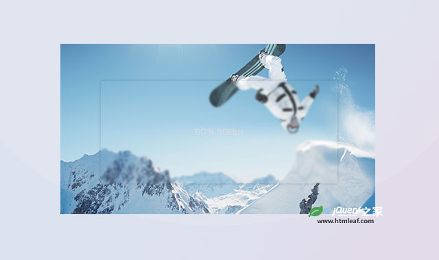

Frosted Panel 是一款使用js编写的炫酷毛玻璃特效插件。您通过简单的配置,既可以生成非常炫酷的半透明模糊的毛玻璃效果。
使用方法
在HTML文件中引入。
<script type="text/javascript" src="path/to/app.js"></script>
HTML结构
创建HTML结构并使用下面的属性来配置毛玻璃效果。
<div class="frosted-panel" panel-dimensions="80% 60%" breakpoint-type="min-width" breakpoints="600px 80% 80%, 1200px 60% 500px">
  <svg>
    <filter id="blurMe" filterRes="1200" color-interpolation-filters="sRGB">
      <feGaussianBlur in="SourceGraphic" stdDeviation="7" />
    </filter>
    <image xlink:href="bg.jpg" x="0" y="0" width="2880" height="1620" filter="url(#blurMe)" />
  </svg>
  <div class="content" content-margin="5px">
    ALL PANEL CONTENT GOES HERE
  </div>
</div>
panel-dimensions:宽度和高度。breakpoint-type:min-width 或 max-width。breakpoints:响应式断点。stdDeviation:模糊的数量。content-margin:为面板添加一个margin。
CSS
看一个小例子,下面的HTML通过初始化之后,相对于生成后面的CSS样式。
<div class="frosted-panel"
  panel-dimensions="auto auto"
  breakpoint-type="min-width"
  breakpoints="600px 70% 300px, 1200px 60% 500px">
.frosted-panel {
  width: auto;
  height: auto;
}

@media only screen and (min-width: 600px) {
  .frosted-panel {
    width: 70%;
    height: 300px;
  }
}

@media only screen and (min-width: 1200px) {
  .frosted-panel {
    width: 60%;
    height: 500px;
  }
}
/* When breakpoint-type is changed from min-width to max-width, the CSS equivalent would now be this:*/

.frosted-panel {
  width: auto;
  height: auto;
}

@media only screen and (max-width: 1200px) {
  .frosted-panel {
    width: 60%;
    height: 500px;
  }
}

@media only screen and (max-width: 600px) {
  .frosted-panel {
    width: 70%;
    height: 300px;
  }
}
该毛玻璃特效插件的github网址为:https://github.com/cryptodescriptor/frosted-panel


