
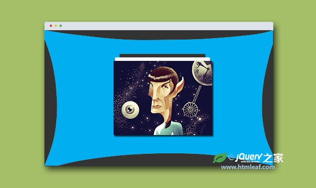

这是一款效果非常炫酷的HTML5 SVG和CSS3蹦床式图片切换特效插件。该图片切换插件在进行图片切换时,整个屏幕就像一张大蹦床一样,将图片弹射出去,切换到另一张图片,效果非常有创意。另外,所有图片都以栈的方式堆叠在一起,你也可以使用鼠标来拖拽图片,拖拽效果就和《拖拽式超弹性效果堆叠图片切换展示特效》一样。背景蹦床效果使用SVG来制作,通过Snap.svg来制作动画效果。整个动画动使用 CSS Transitions 来制作平滑的过渡效果。
HTML结构
该图片切换特效的HTML结构中,第一个元素是SVG图形,当切换图片时,它将从一个规则的矩形变为一个被压缩的矩形。
<div id="morph-shape" class="morph-shape" data-morph-next="M301,301c0,0-83.8-21-151-21C71.8,280-1,301-1,301s21-65.7,21-151C20,79.936-1-1-1-1s73,11,151,11c85 0,151-11,151-11s-21,66.43-21,151C280,229.646,301,301,301,301z">
  <svg width="100%" height="100%" viewBox="0 0 300 300" preserveAspectRatio="none">
    <path d="M301,301c0,0-83.8,0-151,0c-78.2,0-151,0-151,0s0-65.7,0-151C-1,79.936-1-1-1-1s73,0,151,0c85,0,151,0,151,0s0,66.43,0,151
C301,229.646,301,301,301,301z" />
  </svg>
</div>
规则的SVG矩形图形保存在SVG path中,被压缩的SVG矩形图形则保存在data-morph-next属性中。
图片栈的HTML结构如下:
<div class="stack">
  <ul id="elasticstack" class="stack__images">
    <li><img src="img/1.jpg" alt="01"/></li>
    <li><img src="img/2.png" alt="02"/></li>
    <li><img src="img/3.jpg" alt="03"/></li>
    <li><img src="img/4.jpg" alt="04"/></li>
    <li><img src="img/5.png" alt="05"/></li>
    <li><img src="img/6.png" alt="06"/></li>
  </ul>
  <button id="stack-next" class="stack__next"><i class="icon icon-down"></i><span>Next</span></button>
  <ul id="stack-titles" class="stack__titles">
    <li class="current">
      <blockquote>
        <p>"Once you have eliminated the impossible, whatever remains, however improbable, must be the truth."</p>
        <footer><a href="#">#RIPLeonardNimoy</a> by James Olstein</footer>
      </blockquote>
    </li>
    <li>
      <blockquote>
        <p>"The needs of the many outweigh the needs of the few, or the one."</p>
        <footer><a href="#">Mr. Spock</a> by Mustafa Kural</footer>
      </blockquote>
    </li>
    <li>
      <blockquote>
        <p>"Insufficient facts always invite danger."</p>
        <footer><a href="#">LLAP</a> by Sarah McKay</footer>
      </blockquote>
    </li>
    <li>
      <blockquote>
        <p>"Without followers, evil cannot spread."</p>
        <footer><a href="#">RIP Leonard Nimoy</a> by derric</footer>
      </blockquote>
    </li>
    <li>
      <blockquote>
        <p>"Logic is the beginning of wisdom, not the end."</p>
        <footer><a href="#">#Goodnight, Spock</a> by Helen Tseng</footer>
      </blockquote>
    </li>
    <li>
      <blockquote>
        <p>"Change is the essential process of all existence."</p>
        <footer><a href="#">RIP Spock</a> by Sahirul Iman</footer>
      </blockquote>
    </li>
  </ul>
</div><!-- /stack -->
上面的结构包括一个图片栈、一个用于导航到下一张图片的图标按钮和一组图片标题。
CSS样式
SVG“蹦床”矩形需要和屏幕一样大小:
.morph-shape {
  position: absolute;
  width: 100%;
  height: 100%;
  top: 0;
  left: 0;
}

.morph-shape svg {
  position: absolute;
  margin: 0;
  pointer-events: none;
}
为了制作一些3D效果,插件在图片栈的图片列表ul元素上使用了perspective。在下面的这段CSS代码中,最后两个class是在拖动或动画图片栈是通过js动态添加的。
.stack ul {
  position: relative;
  margin: 0 auto;
  padding: 0;
  list-style: none;
}

.stack ul li {
  position: absolute;
  width: 100%;
  opacity: 0;
}

ul.stack__images {
  width: 400px;
  height: 300px;
  z-index: 10;
  perspective: 1000px;
  perspective-origin: 50% -50%;
}

@media screen and (max-height: 530px), screen and (max-width: 400px) {
  ul.stack__images {
    width: 260px;
    height: 195px;
  }
}

.stack__images li {
  top: 0;
  z-index: 1;
  transform: translate3d(0, 0, -180px);
  transform-style: preserve-3d;
}

.stack__images li img {
  display: block;
  max-width: 100%;
  pointer-events: none;
}

.stack__images li:hover {
  cursor: url(../img/cursor_vulcan.png), auto;
}

.stack__images li:active {
  cursor: -webkit-grabbing;
  cursor: grabbing;
}

.stack__images li.animate {
  transition: all 0.3s ease-out;
}

.stack__images li.move-back {
  transition-timing-function: cubic-bezier(0.175, 0.885, 0.470, 1.515);
}
其它元素,如导航图标按钮和图片标题的样式如下:
.stack__next {
  border: none;
  background: none;
  display: block;
  padding: 0;
  overflow: hidden;
  width: 36px;
  height: 36px;
  margin: 10px auto 0;
  font-size: 30px;
  position: relative;
  cursor: pointer;
  color: #067ba7;
}

.stack__next:hover {
  color: #fff;
}

.stack__next:focus {
  outline: none;
}

.stack__next span {
  position: absolute;
  top: 200%;
}

ul.stack__titles {
  height: 18vh;
  max-width: 560px;
  width: 95%;
}

.stack__titles blockquote {
  margin: 0;
  text-align: center;
  font-size: 1.4em;
}

.stack__titles blockquote footer {
  font-size: 50%;
  padding-bottom: 1em;
  font-family: 'Montserrat', Arial, sans-serif;
}

.stack__titles li {
  pointer-events: none;
  transition: opacity 0.45s ease;
}

.stack__titles li.current {
  opacity: 1;
  pointer-events: auto;
}
图片标题绘制图片切换时淡入淡出的显示。
最后,插件中为图片维护动画效果添加了一些过渡效果,SVG图形在执行“蹦床”动画的时候将会被填充,SVG图形的父容器会使用3D transform沿Z轴推拉页面。这个效果是写在base.css样式表中。
当切换图片的时候,navigate-nextclass会被添加到<body>元素上。在第二个例子中,添加了一些旋转效果,在Z轴上旋转10deg和在X轴上旋转-5deg。
.morph-shape svg {
  fill: #01AEF0;
  transition: fill 0.1s ease-out;
}

.navigate-next .morph-shape svg {
  fill: #01a0dc;
  transition-duration: 0.45s;
}

.container {
  transition: transform 0.1s cubic-bezier(0.6, 0, 0.5, 1);
}

.demo-1.navigate-next .container {
  transition-duration: 0.45s;
  transform: translate3d(0, 0, -600px);
}

.demo-2.navigate-next .container {
  transition-duration: 0.45s;
  transform: rotate3d(-0.5, 0, 1, -6deg) translate3d(0, 0, -600px);
}

.demo-2 .morph-shape svg {
  fill: #A2CD72;
}

.demo-2.navigate-next .morph-shape svg {
  fill: #95C264;
}
JAVASCRIPT
js文件部分,需要引入snap.svg-min.js文件和Modernizr文件。还需要Draggabilly和elastiStack.js文件来制作堆叠图片栈和拖拽效果。插件中的js代码关注于SVG图形的变形和导航事件的处理,以及图片标题效果的处理。
(function() {
  var body = document.body,
    titles = [].slice.call( document.querySelectorAll( '#stack-titles > li' ) ),
    totalTitles = titles.length,
    stack = new ElastiStack( document.getElementById( 'elasticstack' ), {
      onUpdateStack : function( idx ) {
        classie.remove( titles[idx === 0 ? totalTitles - 1 : idx - 1], 'current' );
        classie.add( titles[idx], 'current' );
      }
    } ),
    shapeEl = document.getElementById( 'morph-shape' ),
    s = Snap( shapeEl.querySelector( 'svg' ) ),
    pathEl = s.select( 'path' ),
    paths = {
      reset : pathEl.attr( 'd' ),
      next  : shapeEl.getAttribute( 'data-morph-next' )
    };

  document.getElementById( 'stack-next' ).addEventListener( 'mousedown', nextItem );

  function nextItem() {
    classie.add( body, 'animating' );
    classie.add( body, 'navigate-next' );
    pathEl.stop().animate( { 'path' : paths.next }, 450, mina.easeinout, function() {
      classie.remove( body, 'navigate-next' );
      stack.nextItem( { transform : 'translate3d(0,-60px,400px)' } );
      pathEl.stop().animate( { 'path' : paths.reset }, 100, mina.easeout, function() {
        classie.remove( body, 'animating' );
      } );
    } );
  }
})();


