
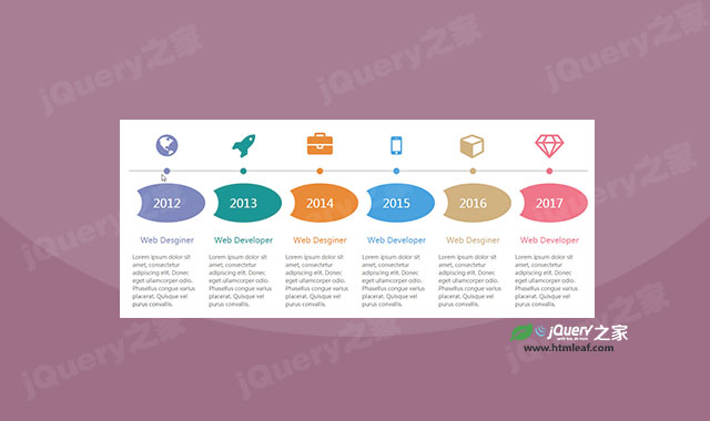

这是一款炫酷的响应式水平时间轴设计效果。该水平时间轴使用bootstrap网格进行布局,并采用了font-awesome字体图标。
使用方法
在页面中引入bootstrap和font-awesome字体图标文件。
<link href="css/bootstrap.min.css" rel="stylesheet">
<link href="css/font-awesome.min.css" rel="stylesheet">
HTML结构
该水平时间轴基本的HTML结构如下:
<div class="container">
    <div class="row">
        <div class="main-timeline">
            <div class="col-md-2 col-sm-6 timeline">
                <div class="timeline-icon"><i class="fa fa-globe"></i></div>
                <span class="year">2012</span>
                <div class="timeline-content">
                    <div class="post">Web Desginer</div>
                    <p class="description">
                        ......
                    </p>
                </div>
            </div>

            <div class="col-md-2 col-sm-6 timeline">
                <div class="timeline-icon"><i class="fa fa-rocket"></i></div>
                <span class="year">2013</span>
                <div class="timeline-content">
                    <div class="post">Web Developer</div>
                    <p class="description">
                        ......
                    </p>
                </div>
            </div>
  ......
        </div>
    </div>
</div>
CSS样式
为该水平时间轴添加下面的CSS样式。
.main-timeline{ overflow: auto; }
.main-timeline .timeline{
    padding: 0;
    text-align: center;
    overflow: hidden;
}
.main-timeline .timeline-icon{
    padding-bottom: 20px;
    margin-bottom: 30px;
    font-size: 65px;
    color: #727cb6;
    border-bottom: 3px solid #ccc;
    position: relative;
}
.main-timeline .timeline-icon:before{
    content: "";
    width: 16px;
    height: 16px;
    border-radius: 50%;
    background: #727cb6;
    margin: 0 auto;
    position: absolute;
    bottom: -9.5px;
    left: 0;
    right: 0;
}
.main-timeline .year{
    display: block;
    width: 100%;
    height: 100px;
    line-height: 100px;
    border-radius: 50%;
    background: #727cb6;
    font-size: 30px;
    color: #fff;
    margin-bottom: 30px;
    z-index: 1;
    position: relative;
}
.main-timeline .year:before{
    content: "";
    display: block;
    width: 70px;
    height: 80%;
    background: #fff;
    border-radius: 50%;
    position: absolute;
    top: 10px;
    left: -37px;
}
.main-timeline .timeline-content{ padding: 0 10px; }
.main-timeline .post{
    font-size: 20px;
    color: #727cb6;
    margin: 0 0 20px 0;
}
.main-timeline .description{
    font-size: 14px;
    color: #555;
    text-align: left;
}
.main-timeline .timeline:nth-child(2n) .timeline-icon,
.main-timeline .timeline:nth-child(2n) .post{
    color: #008b8b;
}
.main-timeline .timeline:nth-child(2n) .year,
.main-timeline .timeline:nth-child(2n) .timeline-icon:before{
    background: #008b8b;
}
.main-timeline .timeline:nth-child(3n) .timeline-icon,
.main-timeline .timeline:nth-child(3n) .post{
    color: #e77e21;
}
.main-timeline .timeline:nth-child(3n) .year,
.main-timeline .timeline:nth-child(3n) .timeline-icon:before{
    background: #e77e21;
}
.main-timeline .timeline:nth-child(4n) .timeline-icon,
.main-timeline .timeline:nth-child(4n) .post{
    color: #3498db;
}
.main-timeline .timeline:nth-child(4n) .year,
.main-timeline .timeline:nth-child(4n) .timeline-icon:before{
    background: #3498db;
}
.main-timeline .timeline:nth-child(5n) .timeline-icon,
.main-timeline .timeline:nth-child(5n) .post{
    color: #cca872;
}
.main-timeline .timeline:nth-child(5n) .year,
.main-timeline .timeline:nth-child(5n) .timeline-icon:before{
    background: #cca872;
}
.main-timeline .timeline:nth-child(6n) .timeline-icon,
.main-timeline .timeline:nth-child(6n) .post{
    color: #ed687c;
}
.main-timeline .timeline:nth-child(6n) .year,
.main-timeline .timeline:nth-child(6n) .timeline-icon:before{
    background: #ed687c;
}
本文版权属于jQuery之家,转载请注明出处:http://www.htmleaf.com/css3/ui-design/201708264706.html


