
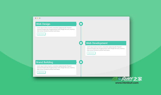

这是一款基于Bootstrap的炫酷纯CSS3响应式垂直时间轴特效。该时间轴使用CSS媒体查询来在不同的断点下,对时间点时间面板进行排列,达到响应式的效果。
使用方法
在页面中引入bootstrap相关文件和font-awesome文件。
<script src="path/to/bootstrap.min.css"></script>
<script src="path/to/font-awesome.min.css"></script>
HTML结构
该CSS3响应式垂直时间轴的HTML结构如下。
<div class="container">
    <div class="row">
        <div class="col-md-12">
            <div class="main-timeline">
                <div class="timeline">
                    <div class="timeline-icon">
                        <i class="fa fa-star"></i>
                    </div>
                    <div class="timeline-content">
                        <h2 class="title">Web Design</h2>
                        <p class="description">......</p>
                        <a href="#" class="read-more">read more</a>
                    </div>
                </div>

                <div class="timeline">
                    <div class="timeline-icon">
                        <i class="fa fa-star"></i>
                    </div>
                    <div class="timeline-content right">
                        <h2 class="title">Web Development</h2>
                        <p class="description">......</p>
                        <a href="#" class="read-more">read more</a>
                    </div>
                </div>
                ......
            </div>
        </div>
    </div>
</div>
CSS样式
为该CSS3响应式垂直时间轴添加如下的CSS样式。
.main-timeline{
    position: relative;
    -webkit-transition: all 0.4s ease 0s;
    -moz-transition: all 0.4s ease 0s;
    -ms-transition: all 0.4s ease 0s;
    transition: all 0.4s ease 0s;
}
.main-timeline:before{
    content: "";
    width: 3px;
    height: 100%;
    background: #1abc9c;
    position: absolute;
    top: 0;
    left: 50%;
}
.main-timeline .timeline{
    margin-bottom: 50px;
    position: relative;
}
.main-timeline .timeline:before,
.main-timeline .timeline:after{
    content: "";
    display: block;
    width: 100%;
    clear: both;
}
.main-timeline .timeline-icon{
    width: 50px;
    height: 50px;
    border-radius: 50%;
    background: #1abc9c;
    overflow: hidden;
    margin-left: -23px;
    position: absolute;
    top: 0;
    left: 50%;
    text-align: center;
}
.main-timeline .timeline-icon i{
    font-size: 30px;
    line-height: 50px;
    color: #fff;
}
.main-timeline .timeline-content{
    width: 45%;
    padding: 20px;
    border-radius: 5px;
    background: #fff;
    -webkit-box-shadow: 0 3px 0 rgba(0, 0, 0, 0.1);
    -moz-box-shadow: 0 3px 0 rgba(0, 0, 0, 0.1);
    -ms-box-shadow: 0 3px 0 rgba(0, 0, 0, 0.1);
    box-shadow: 0 3px 0 rgba(0, 0, 0, 0.1);
    -webkit-transition: all 0.3s ease 0s;
    -moz-transition: all 0.3s ease 0s;
    -ms-transition: all 0.3s ease 0s;
    transition: all 0.3s ease 0s;
}
.main-timeline .timeline-content:before{
    content: "";
    border-left: 7px solid #1abc9c;
    border-top: 7px solid transparent;
    border-bottom: 7px solid transparent;
    position: absolute;
    left: 45%;
    top: 20px;
}
.main-timeline .title{
    font-size: 30px;
    font-weight: 300;
    color: #fff;
    padding: 10px;
    background: #1abc9c;
    border-radius: 3px 3px 0 0;
    margin: -20px -20px 10px;
}
.main-timeline .description{
    font-size: 14px;
    color: #726f77;
}
.main-timeline .read-more{
    display: inline-block;
    font-size: 12px;
    color: #64d8c1;
    text-transform: uppercase;
    padding: 5px 15px;
    border: 2px solid #64d8c1;
    position: relative;
    border-radius: 5px;
    -webkit-box-shadow: 2px 2px 0 #64d8c1;
    -moz-box-shadow: 2px 2px 0 #64d8c1;
    -ms-box-shadow: 2px 2px 0 #64d8c1;
    box-shadow: 2px 2px 0 #64d8c1;
}
.main-timeline .read-more:hover{
    top: 2px;
    left: 2px;
    box-shadow: none;
}
.main-timeline .timeline-content.right{
    float: right;
}
.main-timeline .timeline-content.right:before{
    content: "";
    right: 45%;
    left: inherit;
    border-left: 0;
    border-right: 7px solid #1abc9c;
}
@media only screen and (max-width: 990px){
    .main-timeline .title{
        font-size: 25px;
    }
    .main-timeline .timeline-content::before{
        top: 16px;
    }
}
@media only screen and (max-width: 767px){
    .main-timeline{ margin-left: 20px; }
    .main-timeline:before{ left: 0; }
    .main-timeline .timeline-content{
        width: 90%;
        float: right;
    }
    .main-timeline .timeline-content:before,
    .main-timeline .timeline-content.right:before{
        left: 10%;
        right: inherit;
        margin-left: -6px;
        border-left: 0;
        border-right: 7px solid #1abc9c;
    }
    .main-timeline .timeline-icon{
        left: 0;
    }
}
@media only screen and (max-width: 479px){
    .main-timeline .timeline-content{
        width: 85%;
    }
    .main-timeline .timeline-content:before,
    .main-timeline .timeline-content.right:before{
        left: 15%;
    }
    .main-timeline .title{
        font-size: 20px;
    }
    .main-timeline .timeline-content:before{
        top: 13px;
    }
}


