
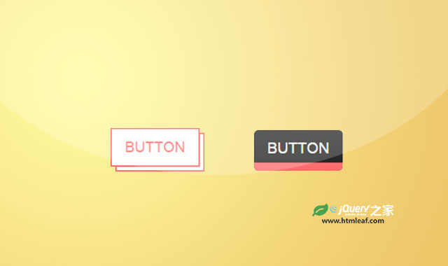

这是两款使用CSS3制作的炫酷按钮效果。这两款按钮的创意十分奇特,它们在鼠标滑过时均带有一定的动画效果。
使用方法
HTML结构
这两款按钮的示例代码均使用bootstrap来进行布局。按钮的HTML结构如下:
<div class="container">
    <div class="row">
        <div class="col-sm-3">
            <a href="#" class="btn btn-lg red">button</a>
        </div>

        <div class="col-sm-3">
            <a href="#" class="btn btn-sm red">button</a>
        </div>

        <div class="col-sm-3">
            <a href="#" class="btn btn-xs red">button</a>
        </div>
    </div>
</div>
CSS样式
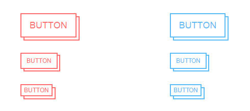
第一种按钮的CSS样式如下:
.btn{
    border: 2px solid transparent;
    border-radius: 0;
    text-transform: uppercase;
    position: relative;
    transition: all 0.3s ease 0s;
}
.btn:before{
    content: "";
    height: 6px;
    border-bottom: 2px solid transparent;
    border-left: 2px solid transparent;
    position: absolute;
    bottom: -8px;
    left: 4px;
    right: -8px;
    transition: all 0.3s ease 0s;
}
.btn.btn-sm:before{
    height: 5px;
    bottom: -7px;
    left: 4px;
    right: -6px;
}
.btn:hover:before{
    bottom: -2px;
    left: -2px;
    right: 2px;
    border-color: #e16b47;
}
.btn:after{
    content: "";
    width: 6px;
    border-right: 2px solid transparent;
    border-top: 2px solid transparent;
    position: absolute;
    bottom: -8px;
    right: -8px;
    top: 4px;
    transition: all 0.3s ease 0s;
}
.btn.btn-sm:after{
    width: 5px;
    bottom: -7px;
    top: 2px;
    right: -7px;
}
.btn:hover:after{
    bottom: 2px;
    right: -2px;
    top: -2px;
    border-color: #e16b47;
}
.btn.red,
.btn.red:before,
.btn.red:after{
    border-color: #ff6e6e;
    color: #ff6e6e;
}
.btn.blue,
.btn.blue:before,
.btn.blue:after{
    border-color: #5cbcf6;
    color: #5cbcf6;
}
.btn.orange,
.btn.orange:before,
.btn.orange:after{
    border-color: #ef965c;
    color: #ef965c;
}
.btn.green,
.btn.green:before,
.btn.green:after{
    border-color: #7ad79a;
    color: #7ad79a;
}
@media only screen and (max-width: 767px){
    .btn{ margin-bottom: 25px; }
}
第二种按钮的CSS样式如下:
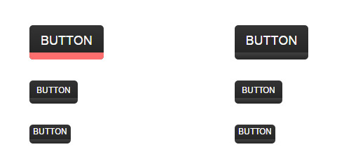
.btn{
    border: none;
    border-radius: 5px;
    color: #fff;
    text-transform: uppercase;
    padding-bottom: 15px;
    position: relative;
    background-image: linear-gradient(to top, #262626 0px, #404040 10px, #262626 10px, #333 100%);
}
.btn:hover{
    color: #fff;
}
.btn:after{
    content: "";
    width: 0;
    height: 10px;
    position: absolute;
    bottom: 0;
    left: 0;
    border-radius: 0 0 5px 5px;
    transition: all 0.35s ease 0s;
}
.btn:hover:after{
    width: 100%;
}
.btn.btn-sm{
    padding-bottom: 10px;
    background-image: linear-gradient(to top, #262626 0px, #404040 8px, #262626 8px, #333 100%);
}
.btn.btn-sm:after{
    height: 8px;
}
.btn.btn-xs{
    padding-bottom: 8px;
    background-image: linear-gradient(to top, #262626 0px, #404040 6px, #262626 6px, #333 100%);
}
.btn.btn-xs:after{
    height: 6px;
}
.btn.red:after{
    background: #ff6e6e;
}
.btn.blue:after{
    background: #5cbcf6;
}
.btn.orange:after{
    background: #ef965c;
}
.btn.green:after{
    background: #7ad79a;
}
@media only  screen and (max-width: 767px){
    .btn{ margin-bottom: 20px; }
}


