
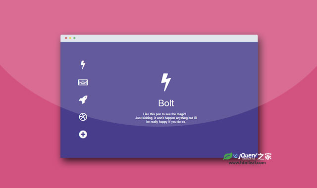

这是一款使用纯CSS3制作的单页切换导航菜单界面设计效果。该页面效果中,在页面的左侧垂直排放一组导航按钮,当点击导航按钮时,相应的页面会从屏幕右侧滑动出来,效果非常炫酷。
使用方法
HTML结构
该单页切换导航菜单界面的HTML结构如下:
<div class="ct" id="t1">
  <div class="ct" id="t2">
    <div class="ct" id="t3">
      <div class="ct" id="t4">
         <div class="ct" id="t5">
          <ul id="menu">
            <a href="#t1"><li class="icon fa fa-bolt" id="uno"></li></a>
            <a href="#t2"><li class="icon fa fa-keyboard-o" id="dos"></li></a>
            <a href="#t3"><li class="icon fa fa-rocket" id="tres"></li></a>
            <a href="#t4"><li class="icon fa fa-dribbble" id="cuatro"></li></a>
            <a href="#t5"><li class="icon fa fa-plus-circle" id="cinco"></li></a>
          </ul>
          <div class="page" id="p1">
             <section class="icon fa fa-bolt"><span class="title">Bolt</span><span class="hint">...</section>
          </div>
          <div class="page" id="p2">
            <section class="icon fa fa-keyboard-o"><span class="title">Type</span></section>
          </div>
          <div class="page" id="p3">
            <section class="icon fa fa-rocket"><span class="title">Rocket</span></section>
          </div>
          <div class="page" id="p4">
            <section class="icon fa fa-dribbble">
              <span class="title">Dribbble</span>
              <p class="hint">
                Im ready to play, <span class="hint line-trough">invite me </span> find me
              </p>
              <p class="hint">...</p>
            </section>
          </div>
          <div class="page" id="p5">
            <section class="icon fa fa-plus-circle">
              <span class="title">More</span>
              <p class="hint">
                ...
              </p>
            </section>
          </div>
        </div>
      </div>
    </div>
  </div>
</div>
CSS样式
该单页切换导航菜单界面使用transform和transition来制作页面的切换动画效果。并通过:target伪元素来完成按钮点击时的页面切换。完整的CSS代码如下,代码中没有添加浏览器厂商的前缀。
html, body, .page {
  width: 100%;
  height: 100%;
  margin: 0;
  padding: 0;
  transition: all .6s cubic-bezier(.5, .2, .2, 1.1);
  color: #fff;
  overflow: hidden;
}

* {
  font-family: 'open sans', 'lato', 'helvetica', sans-serif;
}

.page {
  position: absolute;
}

#p1 {
  left: 0;
}

#p2, #p3, #p4, #p5 {
  left: 200%;
}

#p1 { background: darkslateblue; }
#p2 { background: tomato; }
#p3 { background: gold; }
#p4 { background: deeppink; }
#p5 { background: #9b59b6; }

#t2:target #p2,
#t3:target #p3,
#t4:target #p4,
#t5:target #p5 {
  transform: translateX(-190%);
  transition-delay: .4s !important;
}

#t2:target #p1,
#t3:target #p1,
#t4:target #p1,
#t5:target #p1{
  background: black;
}

#t2:target #p1 .icon,
#t3:target #p1 .icon,
#t4:target #p1 .icon,
#t5:target #p1 .icon {
  -webkit-filter: blur(3px);
  filter: blur(3px);
}

.icon {
  color: #fff;
  font-size: 32px;
  display: block;
}

ul .icon:hover {
  opacity: 0.5;
}

.page .icon .title {
  line-height: 2;
}

#t2:target ul .icon,
#t3:target ul .icon,
#t4:target ul .icon,
#t5:target ul .icon{
  transform: scale(.6);
  transition-delay: .25s;
}

#t2:target #dos,
#t3:target #tres,
#t4:target #cuatro,
#t4:target #cinco {
  transform: scale(1.2) !important;
}

ul {
  position: fixed;
  z-index: 1;
  top: 0;
  bottom: 0;
  left: 0;
  margin: auto;
  height: 280px;
  width: 10%;
  padding: 0;
  text-align: center;
 }

#menu .icon {
  margin: 30px 0;
  transition: all .5s ease-out !important;
}

a {
  text-decoration: none;
}

.title, .hint {
  display: block;
}

.title {
  font-size: 38px;
}

.hint {
  font-size: 13px;
}

#p4 .hint {
  display: inherit !important;
}

.hint a {
  color: yellow;
  transition: all 250ms ease-out;
}

.hint a:hover {
  color: #FFF;
}

.line-trough {
  text-decoration: line-through;
}

.page .icon {
  position: absolute;
  top: 0;
  bottom: 0;
  right: 10%;
  left: 0;
  width: 270px;
  height: 170px;
  margin: auto;
  text-align: center;
  font-size: 80px;
  line-height: 1.3;
  transform: translateX(360%);
  transition: all .5s cubic-bezier(.25, 1, .5, 1.25);
}

.page#p1 .icon {
  height: 220px;
}

.page#p1 .icon {
  transform: translateX(10%) !important;
}

#t2:target .page#p2 .icon,
#t3:target .page#p3 .icon,
#t4:target .page#p4 .icon,
#t5:target .page#p5 .icon {
  transform: translateX(0) !important;
  transition-delay: 1s;
}


