
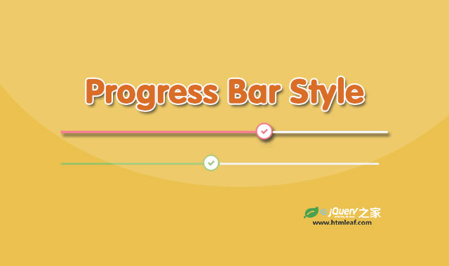

这是一款纯CSS3时尚进度条UI设计效果。该进度条使用bootstrap网格进行布局,通过简单的CSS代码和animation动画来制作带动画效果的进度条。
使用方法
在页面中引入bootstrap相关文件和font-awesome字体图标文件。
<link rel="stylesheet" href="https://maxcdn.bootstrapcdn.com/bootstrap/3.3.6/css/bootstrap.min.css">
<link rel='stylesheet' href='https://cdnjs.cloudflare.com/ajax/libs/font-awesome/4.4.0/css/font-awesome.min.css'>
HTML结构
进度条的HTML结构如下:
<div class="container">
    <div class="row">
        <div class="col-md-offset-3 col-md-6">
            <h3 class="progressbar-title">HTML</h3>
            <div class="progress">
                <div class="progress-bar" style="width: 65%; background: #ed687c;">
                    <span class="progress-icon fa fa-check" style="border-color:#ed687c; color:#ed687c;"></span>
                    <div class="progress-value">65%</div>
                </div>
            </div>

            <h3 class="progressbar-title">CSS3</h3>
            <div class="progress">
                <div class="progress-bar" style="width: 50%; background: #92c26a;">
                    <span class="progress-icon fa fa-check" style="border-color:#92c26a; color:#92c26a;"></span>
                    <div class="progress-value">50%</div>
                </div>
            </div>

            <h3 class="progressbar-title">java script</h3>
            <div class="progress">
                <div class="progress-bar" style="width: 80%; background: #f0ad4e;">
                    <span class="progress-icon fa fa-check" style="border-color:#f0ad4e; color:#f0ad4e;"></span>
                    <div class="progress-value">80%</div>
                </div>
            </div>
        </div>
    </div>
</div>
CSS样式
为进度条设置下面的CSS样式。
.progressbar-title{
    font-size: 14px;
    color: #D5D6E2;
    text-transform: capitalize;
}
.progress{
    height: 5px;
    overflow: visible;
    background: #f0f0f0;
    margin-bottom: 40px;
}
.progress .progress-bar{
    position: relative;
    animation: animate-positive 2s;
}
.progress .progress-icon{
    width: 30px;
    height: 30px;
    line-height: 25px;
    border-radius: 50%;
    font-size: 13px;
    position: absolute;
    top: -14px;
    right: 0;
    background: #fff;
    border-width: 3px;
    border-style: solid;
    text-align: center;
}
.progress-value{
    font-size: 13px;
    color: #D5D6E2;
    position: absolute;
    top: 16px;
    right: 0;
}
@-webkit-keyframes animate-positive {
    0% { width: 0%; }
}
@keyframes animate-positive {
    0% { width: 0%; }
}


