
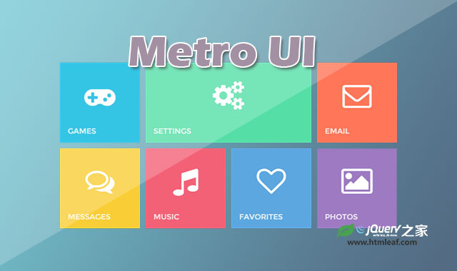

这是一款仿windows 8 Metro风格的布局和面板打开动画UI设计效果。该UI设计以扁平风格为主,将面板的缩略图以网格的方式布局。在用户点击某个缩略图后,该缩略图对应的面板会旋转放大到全屏,效果非常的炫酷。
Metro是微软在Windows Phone 7中正式引入的一种界面设计语言,也是Windows 8的主要界面显示风格。在Windows Phone之前,微软已经在Zune Player和XBox 360主机中尝试采用过类似的界面风格,并得到了用户的广泛认可。于是,微软在新发布的Windows Phone 7、已经发布的Windows 8、Windows 8.1以及Office 15中也采用了Metro设计。今后的微软产品中将更多的能看到Metro的影子,而更少的看到传统的Windows视窗界面。
使用方法
HTML结构
该windows 8 Metro风格UI设计的HTML结构使用一个无序列表来制作网格布局,里面放置的是各个面板。div.box是打开的全屏面板。
<ul class="metro">
  <li><i class="fa fa-gamepad"></i><span>Games</span></li>
  <li><i class="fa fa-cogs"></i><span>Settings</span></li>
  <li><i class="fa fa-envelope-o"></i><span>Email</span></li>
  <li><i class="fa fa-comments-o"></i><span>Messages</span></li>
  <li><i class="fa fa-music"></i><span>Music</span></li>
  <li><i class="fa fa-heart-o"></i><span>Favorites</span></li>
  <li><i class="fa fa-picture-o"></i><span>Photos</span></li>
</ul>

<div class="box">
  <span class="close"></span>
  <p></p>
</div>
CSS样式
在无序列表的网格布局中,为制作透视效果,每一个列表项都设置了perspective属性。
.metro li {
    -webkit-transform: perspective(600px);
    -webkit-transform-style: preserve-3d;
    -webkit-transform-origin-x: 50%;
    -webkit-transform-origin-y: 50%;
    -ms-transform: perspective(600px);
    -ms-transform-style: preserve-3d;
    -ms-transform-origin-x: 50%;
    -ms-transform-origin-y: 50%;
    transform: perspective(600px);
    transform-style: preserve-3d;
    transform-origin-x: 50%;
    transform-origin-y: 50%;
    cursor: default;
    position: relative;
    text-align: center;
    margin: 0 10px 10px 0;
    width: 150px;
    height: 150px;
    color: #ffffff;
    float: left;
    -webkit-transition: .2s -webkit-transform, 1s opacity;
    -ms-transition: .2s -ms-transform, 1s opacity;
    transition: .2s transform, 1s opacity;
    cursor:pointer;
}
x和y方向上的转换原点都被设置为50%,这是为了在点击小面板时制作3D效果,你会发现鼠标点击不同的小面板不松开时,会有不同的3D转换效果。这是通过nth-child选择器和不同的transform来配合完成的。
.metro li:nth-child(5):active, .metro li:first-child:active {
    -webkit-transform: scale(0.95);
    -ms-transform: scale(0.95);
    transform: scale(0.95);
}

.metro li:nth-child(7):active, .metro li:nth-child(2):active {
    -webkit-transform: perspective(600px) rotate3d(1, 0, 0, -10deg);
    -ms-transform: perspective(600px) rotate3d(1, 0, 0, -10deg);
    transform: perspective(600px) rotate3d(1, 0, 0, -10deg);
}

.metro li:nth-child(3):active {
    -webkit-transform: perspective(600px) rotate3d(0, 1, 0, 10deg);
    -ms-transform: perspective(600px) rotate3d(0, 1, 0, 10deg);
    transform: perspective(600px) rotate3d(0, 1, 0, 10deg);
}

.metro li:nth-child(4):active {
    -webkit-transform: perspective(600px) rotate3d(0, 1, 0, -10deg);
    -ms-transform: perspective(600px) rotate3d(0, 1, 0, -10deg);
    transform: perspective(600px) rotate3d(0, 1, 0, -10deg);
}

.metro li:nth-child(6):active {
    -webkit-transform: perspective(600px) rotate3d(1, 0, 0, 10deg);
    -ms-transform: perspective(600px) rotate3d(1, 0, 0, 10deg);
    transform: perspective(600px) rotate3d(1, 0, 0, 10deg);
}
在大面板.box的打开动画中,也是使用了旋转和缩放,配合适当的过渡动画来制作出3D效果。
.box {
    display: table;
    top: 0;
    visibility: hidden;
    -webkit-transform: perspective(1200px) rotateY(180deg) scale(0.1);
    -ms-transform: perspective(1200px) rotateY(180deg) scale(0.1);
    transform: perspective(1200px) rotateY(180deg) scale(0.1);
    top: 0;
    left: 0;
    z-index: -1;
    position: absolute;
    width: 100%;
    height: 100%;
    opacity: 0;
    transition: 1s all;
}
.box.open {
    left: 0;
    top: 0;
    visibility: visible;
    opacity: 1;
    z-index: 999;
    -webkit-transform: perspective(1200px) rotateY(0deg) scale(1);
    -ms-transform: perspective(1200px) rotateY(0deg) scale(1);
    transform: perspective(1200px) rotateY(0deg) scale(1);
    width: 100%;
    height: 100%;
}
JavaScript
你会发现点击不同颜色的小面板时打开的大面板和小面板的颜色是相同的,这是在jQuery代码中实现的,代码中还会为打开的面板添加.openclass和添加文本内容。
$(document).ready(function () {
    var $box = $('.box');
    $('.metro li').each(function () {
        var color = $(this).css('backgroundColor');
        var content = $(this).html();
        $(this).click(function () {
            $box.css('backgroundColor', color);
            $box.addClass('open');
            $box.find('p').html(content);
        });
        $('.close').click(function () {
            $box.removeClass('open');
            $box.css('backgroundColor', 'transparent');
        });
    });
});


