
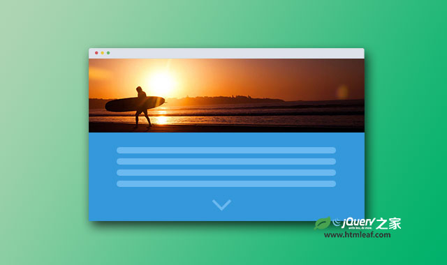

这是一款使用纯CSS/CSS3制作的响应式网页背景滚动视觉差特效。该视觉差特效在用户向下滚动页面的时候,页面的背景图像会以不同的速度进行滚动,产生炫酷的视觉差效果。
制作方法
HTML结构
该视觉差效果的HTML结构分为两个主要元素:section.parallax是用于制作视觉差效果的背景图片。section.content是用于放置文字内容。
<section class="parallax parallax-2">
  <div class="container">
    <h1>Lorem Ipsum Dollar</h1>
  </div>
</section>
<section class="content">
  <div class="container">
    <h2>Lorem Ipsum Dollar</h2>
    <p>
      ...
    </p>
    <p>
      ...
    </p>
    <p>
      ...
    </p>

  </div>
</section>
CSS样式
用于制作滚动背景视觉差效果的CSS代码非常简单,如下:
section.parallax {
  position: relative;
  height: auto;
  padding: 180px 0px;

  background-position: 50% 50%;
  background-repeat: no-repeat;
  background-attachment: fixed;
  -webkit-background-size: cover;
  -moz-background-size: cover;
  -o-background-size: cover;
  background-size: cover;
}
section.parallax:after {
    position: absolute;
    left: 0;
    right: 0;
    bottom: 0;
    top: 0;
    background-color: rgba(0, 0, 0, 0.30);
    z-index: 100;
    content: ' ';
}
section.parallax h1 {
  color: #fff;
  position: relative;
  z-index: 101;
  font-size: 48px;
  line-height: 1.5;
  font-weight: 700;
  text-align: center;
  text-transform: uppercase;
}
最后为它们添加背景图片:
section.parallax.parallax-1 {
  background-image: url("../img/image1.jpg");
  background-position: 100% 100%;
}

section.parallax.parallax-2 {
  background-image: url("../img/image2.jpg");
}

section.parallax.parallax-3 {
  background-image: url("../img/image3.jpg");
}


