
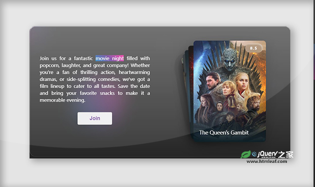

这是一款基于swiper.js的卡片拖拽特效。该特效用于展示电影海报,它先将所有电影海报图片堆叠在一起,用户可以通过拖拽图片来展示下一张海报,效果非常炫酷。
使用方法
HTML代码
<section>
    <div class="content">
        <div class="info">
            <p>Join us for a fantastic <span class="movie-night">movie night</span> filled with popcorn, laughter, and great company! Whether you're a fan of thrilling action, heartwarming dramas, or side-splitting comedies, we've got a film lineup to cater to all tastes. Save the date and bring your favorite snacks to make it a memorable evening.</p>
            <button class="btn">Join</button>
        </div>
        <div class="swiper mySwiper">
            <div class="swiper-wrapper">

                <div class="swiper-slide">
                    <span>8.5</span>
                    <div>
                        <h2>The Queen's Gambit</h2>
                    </div>
                </div>

                <div class="swiper-slide">
                    <span>9.5</span>
                    <div>
                        <h2>Breaking Bad</h2>
                    </div>
                </div>

                <div class="swiper-slide">
                    <span>8.1</span>
                    <div>
                        <h2>Wednesday</h2>
                    </div>
                </div>

                <div class="swiper-slide">
                    <span>8.7</span>
                    <div>
                        <h2>Stranger Things</h2>
                    </div>
                </div>

                <div class="swiper-slide">
                    <span>8.6</span>
                    <div>
                        <h2>Anne with an E</h2>
                    </div>
                </div>

                <div class="swiper-slide">
                    <span>8.9</span>
                    <div>
                        <h2>Friends</h2>
                    </div>
                </div>

                <div class="swiper-slide">
                    <span>8.6</span>
                    <div>
                        <h2>The Crown</h2>
                    </div>
                </div>

                <div class="swiper-slide">
                    <span>8.7</span>
                    <div>
                        <h2>House M.D.</h2>
                    </div>
                </div>

                <div class="swiper-slide">
                    <span>9.2</span>
                    <div>
                        <h2>Game of Thrones</h2>
                    </div>
                </div>
            </div>
        </div>

    </div>

    <ul class="circles">
        <li></li>
        <li></li>
        <li></li>
        <li></li>
        <li></li>
        <li></li>
        <li></li>
        <li></li>
        <li></li>
        <li></li>
    </ul>
    </section>
CSS代码
*,
*::before,
*::after {
  margin: 0;
  padding: 0;
  box-sizing: border-box;
}

section {
  position: relative;
  display: flex;
  justify-content: center;
  align-items: center;
  background: #262626;
  min-height: 100vh;
  overflow: hidden;
}

.content {
  display: flex;
  flex-direction: row;
  justify-content: center;
  align-items: center;
  gap: 30px;
  background: linear-gradient(
    180deg,
    rgba(255, 255, 255, 0.28) 0%,
    rgba(255, 255, 255, 0) 100%
  );
  backdrop-filter: blur(30px);
  border-radius: 20px;
  width: min(900px, 100%);
  box-shadow: 0 0.5px 0 1px rgba(255, 255, 255, 0.23) inset, 0 1px 0 0 rgba(255, 255, 255, 0.66) inset, 0 4px 16px rgba(0, 0, 0, 0.12);
  z-index: 10;
}

.info {
  display:flex;
  flex-direction: column;
  justify-content: center;
  align-items: center;
  max-width: 450px;
  padding: 0 35px;
  text-align: justify;
}

.info p{
  color: #fff;
  font-weight: 500;
  font-size: 1rem;
  margin-bottom: 20px;
  line-height: 1.5;
}

.movie-night {
  background: linear-gradient(225deg, #ff3cac 0%, #784ba0 50%, #2b86c5 100%);
}

.btn {
  display: block;
  padding: 10px 40px;
  margin: 10px auto;
  font-size: 1.1rem;
  font-weight: 700;
  border-radius: 4px;
  border: none;
  outline: none;
  text-decoration: none;
  color: #784ba0;
  background: rgba(255, 255, 255, 0.9);
  box-shadow: 0 6px 30px rgba(0, 0, 0, 0.1);
  border: 1px solid rgba(255, 255, 255, 0.3);
  cursor: pointer;
}

.btn:hover, .btn:focus, .btn:active, .btn:visited {
    transition-timing-function: cubic-bezier(0.6, 4, 0.3, 0.8);
    animation: gelatine 0.5s 1;
}

@keyframes gelatine {

  0%, 100% {
    transform: scale(1, 1);
  }
  25% {
    transform: scale(0.9, 1.1);
  }
  50% {
    transform: scale(1.1, 0.9);
  }
  75% {
    transform: scale(0.95, 1.05);
  }
}

/* SWIPER */

.swiper {
  width: 250px;
  height: 450px;
  padding: 50px 0;
}

.swiper-slide {
  position: relative;
  box-shadow: 0 15px 50px rgba(0, 0, 0, 0.2);
  border-radius: 10px;
}

.swiper-slide span {
  position: absolute;
  top: 0;
  right: 0;
  color: #fff;
  padding: 7px 18px;
  margin: 10px;
  border-radius: 20px;
  letter-spacing: 2px;
  font-size: 0.8rem;
  font-weight: 700;
  font-family: inherit;
  background: rgba(255, 255, 255, 0.095);
  box-shadow: inset 2.01px -2.01px 20px rgba(214, 214, 214, 0.17), inset -3.01333px 3.01333px 3.01333px rgba(255, 255, 255, 0.39);
  backdrop-filter: blur(74px);
}

.swiper-slide h2 {
  position: absolute;
  bottom: 0;
  left: 0;
  color: #fff;
  font-weight: 400;
  font-size: 1.1rem;
  line-height: 1.4;
  margin: 0 0 20px 20px;
}

.swiper-slide:nth-child(1n) {
  background: linear-gradient(to top, #0f2027, #203a4300, #2c536400), url(../images/1.jpg)
      no-repeat 50% 50% / cover;
}

.swiper-slide:nth-child(2n) {
  background: linear-gradient(to top, #0f2027, #203a4300, #2c536400), url(../images/2.jpg)
      no-repeat 50% 50% / cover;
}

.swiper-slide:nth-child(3n) {
  background: linear-gradient(to top, #0f2027, #203a4300, #2c536400), url(../images/3.jpg)
      no-repeat 50% 0% / cover;
}

.swiper-slide:nth-child(4n) {
  background: linear-gradient(to top, #0f2027, #203a4300, #2c536400), url(../images/4.jpg)
      no-repeat 50% 50% / cover;
}

.swiper-slide:nth-child(5n) {
  background: linear-gradient(to top, #0f2027, #203a4300, #2c536400), url(../images/5.jpg)
      no-repeat 50% 50% / cover;
}

.swiper-slide:nth-child(6n) {
  background: linear-gradient(to top, #0f2027, #203a4300, #2c536400), url(../images/6.jpg)
      no-repeat 50% 50% / cover;
}

.swiper-slide:nth-child(7n) {
  background: linear-gradient(to top, #0f2027, #203a4300, #2c536400), url(../images/7.jpg)
      no-repeat 50% 50% / cover;
}

.swiper-slide:nth-child(8n) {
  background: linear-gradient(to top, #0f2027, #203a4300, #2c536400), url(../images/8.jpg)
      no-repeat 50% 0% / cover;
}

.swiper-slide:nth-child(9n) {
  background: linear-gradient(to top, #0f2027, #203a4300, #2c536400), url(../images/9.jpg)
      no-repeat 50% 50% / cover;
}

/* ANIMATED BACKGROUND */

.circles{
  position: absolute;
  top: 0;
  left: 0;
  width: 100%;
  height: 100%;
  overflow: hidden;
}

.circles li{
  position: absolute;
  display: block;
  list-style: none;
  width: 20px;
  height: 20px;
  background-color: #ff3cac;
  background-image: linear-gradient(225deg, #ff3cac 0%, #784ba0 50%, #2b86c5 100%);
  animation: animate 25s linear infinite;
  bottom: -150px;
}

.circles li:nth-child(1){
  left: 25%;
  width: 80px;
  height: 80px;
  animation-delay: 0s;
}

.circles li:nth-child(2){
  left: 10%;
  width: 20px;
  height: 20px;
  animation-delay: 2s;
  animation-duration: 12s;
}

.circles li:nth-child(3){
  left: 70%;
  width: 20px;
  height: 20px;
  animation-delay: 4s;
}

.circles li:nth-child(4){
  left: 40%;
  width: 60px;
  height: 60px;
  animation-delay: 0s;
  animation-duration: 18s;
}

.circles li:nth-child(5){
  left: 65%;
  width: 20px;
  height: 20px;
  animation-delay: 0s;
}

.circles li:nth-child(6){
  left: 75%;
  width: 110px;
  height: 110px;
  animation-delay: 3s;
}

.circles li:nth-child(7){
  left: 35%;
  width: 150px;
  height: 150px;
  animation-delay: 7s;
}

.circles li:nth-child(8){
  left: 50%;
  width: 25px;
  height: 25px;
  animation-delay: 15s;
  animation-duration: 45s;
}

.circles li:nth-child(9){
  left: 20%;
  width: 15px;
  height: 15px;
  animation-delay: 2s;
  animation-duration: 35s;
}

.circles li:nth-child(10){
  left: 85%;
  width: 150px;
  height: 150px;
  animation-delay: 0s;
  animation-duration: 11s;
}

@keyframes animate {

  0%{
    transform: translateY(0) rotate(0deg);
    opacity: 1;
    border-radius: 0;
  }

  100%{
    transform: translateY(-1000px) rotate(720deg);
    opacity: 0;
    border-radius: 50%;
  }

}
JS代码
var swiper = new Swiper(".mySwiper", {
    effect: "cards",
    grabCursor: true,
    initialSlide: 2,
    loop: true,
    rotate: true,
    mousewheel: {
        invert: false
    }
});
codepen网址:https://codepen.io/ecemgo/pen/ZEVojzN


