
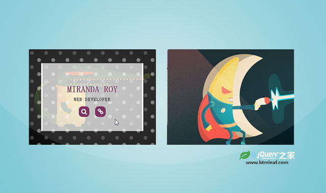

这是一款超炫酷CSS3鼠标悬停动画特效。该特效中,通过CSS圆形渐变来制作圆点背景,然后通过CSS transform来制作鼠标悬停时候的炫酷动画特效。
使用方法
在页面中引入下面的font-awesome.min.css文件。
<link rel="stylesheet" href="css/font-awesome.min.css" />
HTML
在页面中添加如下的HTML结构。
<div class="container">
    <div class="row">
        <div class="col-md-4 col-sm-6">
            <div class="box">
                <img src="images/img-1.jpg" alt="">
                <div class="box-content">
                    <h3 class="title">Williamson</h3>
                    <span class="post">Web designer</span>
                    <ul class="icon">
                        <li><a href="#"><i class="fa fa-search"></i></a></li>
                        <li><a href="#"><i class="fa fa-link"></i></a></li>
                    </ul>
                </div>
            </div>
        </div>
        <div class="col-md-4 col-sm-6">
            <div class="box">
                <img src="images/img-2.jpg" alt="">
                <div class="box-content">
                    <h3 class="title">Miranda Roy</h3>
                    <span class="post">Web developer</span>
                    <ul class="icon">
                        <li><a href="#"><i class="fa fa-search"></i></a></li>
                        <li><a href="#"><i class="fa fa-link"></i></a></li>
                    </ul>
                </div>
            </div>
        </div>
    </div>
</div>
CSS样式
然后通过下面的CSS代码来制作鼠标悬停的动画特效。
.box{
    font-family: 'Zilla Slab', serif;
    overflow: hidden;
    position: relative;
}
.box:before{
    content: '';
    height: 100%;
    width: 100%;
    background-image:
        radial-gradient(circle at 25% 25%, rgba(255,255,255,0.2) 10%, transparent 15%),
        radial-gradient(circle at 75% 75%, rgba(255,255,255,0.4) 10%, transparent 15%);
    background-size: 40px 40px;
    transform: translateX(-50%) scale(2);
    opacity: 0;
    position: absolute;
    left: 50%;
    top: 0;
    z-index: 1;
    transition: all 0.3s ease 0s;
}
.box:hover:before{
    transform: translateX(-50%) scale(1);
    opacity: 1;
}
.box:after{
    content: '';
    height: 100%;
    width: 100%;
    background: radial-gradient(transparent,rgba(0,0,0,0.7));
    transform: scale(2);
    opacity: 0;
    position: absolute;
    left: 0;
    top: 0;
    transition: all 0.3s ease 0.1s;
}
.box:hover:after{
    transform: scale(1);
    opacity: 1;
}
.box img{
    width: 100%;
    height: auto;
    transition: all 0.3s ease 0s;
}
.box .box-content{
    color: #6F1E51;
    background-color: rgba(255,255,255,0.7);
    text-align: center;
    width: 80%;
    padding: 40px 20px;
    border-left: 4px solid #fff;
    border-right: 4px solid #fff;
    transform:translateX(-50%) translateY(-50%) scale(0.2) rotate(-90deg);
    opacity: 0;
    position: absolute;
    left: 50%;
    top: 50%;
    z-index: 2;
    transition: all 0.3s ease 0s;
}
.box:hover .box-content{
    transform: translateX(-50%) translateY(-50%) scale(1) rotate(0);
    opacity: 1;
}
.box .title{
    font-size: 25px;
    font-weight: 700;
    text-transform: uppercase;
    text-shadow: 0 0 2px #fff;
    margin-bottom: 5px;
}
.box .post{
    color: #000;
    font-size:14px;
    font-weight: 500;
    letter-spacing: 1px;
    text-transform: uppercase;
    margin-bottom: 10px;
    display: block;
}
.box .icon{
    list-style: none;
    text-align: center;
    padding: 0;
    margin: 0;
}
.box .icon li{
    margin:0 4px;
    display: inline-block;
}
.box .icon li a{
    color: #fff;
    background-color: #6F1E51;
    font-size: 17px;
    text-align: center;
    line-height: 30px;
    width: 30px;
    height: 30px;
    border-radius:10px;
    display: block;
    transition:all 0.3s ease 0s;
}
.box .icon li a:hover{
    color: #6F1E51;
    background-color: #fff;
    box-shadow: 0 0 5px #6F1E51 ;
}
@media only screen and (max-width:990px){
    .box{ margin-bottom: 30px; }
}
@media only screen and (max-width:479px){
    .box .title{ font-size: 20px; }
}


