
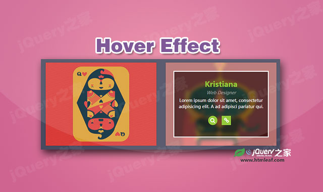

这是一款css3鼠标滑过图片遮罩层动画效果。在该特效中,当用户鼠标滑过或悬停在图片上时,遮罩层以十字架开始扩大为矩形,然后出现描述文字和链接图标,效果非常炫酷。
使用方法
在页面中引入boostrap,和fontawsome相关文件。
<link rel="stylesheet" href="/css/bootstrap.min.css">
<link rel="stylesheet" href="css/fontawsome.min.css">
HTML结构
该图片遮罩层动画效果的基本HTML结构如下:
<div class="container">
    <div class="row">
        <div class="col-md-4 col-sm-6">
            <div class="box">
                <img src="images/img-1.jpg">
                <div class="box-content">
                    <h3 class="title">Williamson</h3>
                    <span class="post">Web Developer</span>
                    <p class="description">
                        Lorem ipsum dolor sit amet....
                    </p>
                    <ul class="icon">
                        <li><a href="#" class="fa fa-search"></a></li>
                        <li><a href="#" class="fa fa-link"></a></li>
                    </ul>
                </div>
            </div>
        </div>
        <div class="col-md-4 col-sm-6">
            <div class="box">
                <img src="images/img-2.jpg">
                <div class="box-content">
                    <h3 class="title">Kristiana</h3>
                    <span class="post">Web Designer</span>
                    <p class="description">
                        Lorem ipsum dolor sit amet....
                    </p>
                    <ul class="icon">
                        <li><a href="#" class="fa fa-search"></a></li>
                        <li><a href="#" class="fa fa-link"></a></li>
                    </ul>
                </div>
            </div>
        </div>
    </div
CSS样式
然后通过下面的CSS代码来为图片添加炫酷的遮罩层动画效果。
.box{
    text-align: center;
    box-shadow: 0 0 3px rgba(0,0,0,0.3);
    overflow: hidden;
    position: relative;
}
.box:before,
.box:after{
    content: "";
    display: block;
    background: rgba(0,0,0,0.3);
    position: absolute;
    top: 10%;
    left: 7%;
    bottom: 10%;
    right: 7%;
    z-index: 1;
    transform: scale(0,1);
    transition: all 0.3s;
}
.box:after{
    top: 10.8%;
    bottom: 10.8%;
    transform: scale(1,0);
}
.box:hover:before,
.box:hover:after{
    transform: scale(1);
    animation: animate 1.5s;
}
.box:hover:before{
    border-top: 3px solid #fff;
    border-bottom: 3px solid #fff;
}
.box:hover:after{
    border-left: 3px solid #fff;
    border-right: 3px solid #fff;
}
.box img{
    width: 100%;
    height: auto;
    transition: all 0.3s;
}
.box:hover img{
    transform: scale(1.2);
    filter: blur(5px);
    -moz-filter: blur(5px);
    -webkit-filter: blur(5px);
}
.box .box-content{
    padding: 30px 10px;
    position: absolute;
    top: 10%;
    left: 7%;
    bottom: 10%;
    right: 7%;
    opacity: 0;
    z-index: 2;
    transition: all 0.3s;
}
.box:hover .box-content{
    box-shadow: 0 0 0 35px rgba(255,255,255,0.3);
    opacity: 1;
}
.box .title{
    font-size: 24px;
    font-weight: 600;
    color: #88c425;
    margin: 0 0 5px 0;
}
.box .post{
    display: block;
    margin: 0 0 5px 0;
    font-size: 14px;
    font-style: italic;
    color: rgba(255,255,255,0.5);
}
.box .description{
    font-size: 14px;
    color: #fff;
    margin: 0 0 20px 0;
}
.box .icon{
    padding: 0;
    margin: 0;
    list-style: none;
}
.box .icon li{
    display: inline-block;
    margin: 0 10px 0 0;
}
.box .icon li a{
    display: block;
    width: 30px;
    height: 30px;
    line-height: 30px;
    color: #fff;
    background: #88c425;
    transition: all 0.5s;
}
.box .icon a:hover{
    text-decoration: none;
    border-radius: 50%;
    animation: animate-hover 0.5s;
}
@keyframes animate{
    0%{opacity: 1;}
    100%{opacity: 1;}
}
@keyframes animate-hover{
    0% {box-shadow: 0 0 0 10px rgba(255,255,255,0.3);}
    50% {box-shadow: 0 0 0 5px rgba(255,255,255,0.3);}
    100% {box-shadow: 0 0 0 0 rgba(255,255,255,0.3);}
}
@media only screen and (max-width:990px){
    .box{ margin-bottom: 30px; }
    .box .box-content{ padding: 10px; }
    .box .description{ margin-bottom: 10px; }
}
@media only screen and (max-width:479px){
    .box .title{ margin: 0; }
}


