
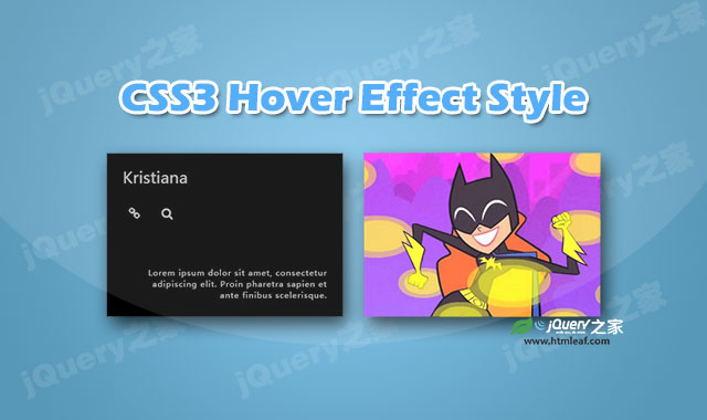

这是一款通过CSS3动画制作的炫酷鼠标hover动画特效。该CSS3鼠标hover动画特效中,当鼠标hover图片时,图片的遮罩层从图片中间向两边展开,就像是拉开窗帘的效果,非常炫酷。
使用方法
在页面中引入bootstrap.min.css和font-awesome.min.css文件。
<link href="css/bootstrap.min.css" rel="stylesheet">
<link href="css/font-awesome.min.css" rel="stylesheet">
HTML结构
使用该CSS3鼠标hover动画特效的基本HTML结构如下:
<div class="container">
    <div class="row">
        <div class="col-md-4 col-sm-6">
            <div class="box">
                <img src="images/img-1.jpg" alt="">
                <div class="box-content">
                    <h3 class="title">标题</h3>
                    <ul class="icon">
                        <li><a href="#" class="fa fa-link"></a></li>
                        <li><a href="#" class="fa fa-search"></a></li>
                    </ul>
                    <p class="description">
                        描述文本
                    </p>
                </div>
            </div>
        </div>
        <div class="col-md-4 col-sm-6">
            <div class="box">
                <img src="images/img-2.jpg" alt="">
                <div class="box-content">
                    <h3 class="title">标题</h3>
                    <ul class="icon">
                        <li><a href="#" class="fa fa-link"></a></li>
                        <li><a href="#" class="fa fa-search"></a></li>
                    </ul>
                    <p class="description">
                        描述文本
                    </p>
                </div>
            </div>
        </div>
    </div>
</div>
CSS样式
然后为该CSS3鼠标hover动画特效添加下面的CSS样式代码。
.box{
    overflow: hidden;
    box-shadow: 0 0 3px rgba(0,0,0,0.3);
    position: relative;
}
.box:before{
    content: "";
    background: #000;
    box-shadow: 0 0 20px #fff;
    position: absolute;
    top: 0;
    left: 50%;
    bottom: 0;
    right: 50%;
    z-index: 1;
    transition: all 0.3s ease-out 0.3s;
}
.box:hover:before{
    left: 0;
    right: 0;
    box-shadow: 0 0 0 #fff;
    transition-delay: 0s;
}
.box img{
    width: 100%;
    height: auto;
    transition: all 0.8s ease-out 0s;
}
.box:hover img{ opacity: 0.2; }
.box .box-content{
    width: 100%;
    height: 100%;
    position: absolute;
    top: 0;
    left: 0;
    z-index: 2;
}
.box .title{
    padding: 25px;
    margin: 0;
    font-size: 24px;
    color: #fff;
    opacity: 0;
    transition: all 0.35s ease-out 0s;
}
.box .icon{
    list-style: none;
    padding: 0 25px;
    margin: 0;
    opacity: 0;
    transition: all 0.35s ease-out 0s;
}
.box .icon li{ display: inline-block; }
.box .icon li a{
    display: block;
    width: 35px;
    height: 35px;
    line-height: 35px;
    border-radius: 50%;
    background: transparent;
    text-align: center;
    font-size: 18px;
    color: #fff;
    margin-right: 10px;
    overflow: hidden;
    position: relative;
    transition: all 0.5s ease 0s;
}
.box .icon li a:after{
    content: "";
    width: 100%;
    height: 100%;
    background: #c92853;
    border-radius: 50%;
    position: absolute;
    top: -100%;
    left: 0;
    z-index: -1;
    transition: all 0.3s ease 0s;
}
.box .icon li a:hover:after{ top: 0; }
.box .description{
    padding: 25px 25px 25px 60px;
    margin: 0;
    font-size: 12px;
    color: #fff;
    letter-spacing: 1px;
    text-align: right;
    opacity: 0;
    position: absolute;
    bottom: 0;
    transition: all 0.35s ease-out 0s;
}
.box:hover .title,
.box:hover .icon,
.box:hover .description{
    opacity: 0.7;
    transition-delay: 0.3s;
}
@media only screen and (max-width:990px){
    .box{ margin-bottom: 30px; }
}


