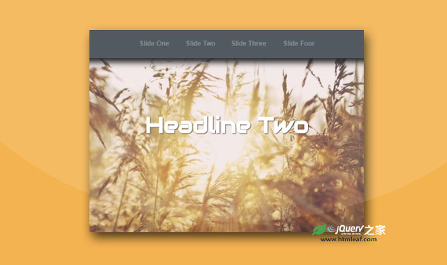
这是一款简单使用纯CSS3制作的炫酷全屏响应式幻灯片特效。该幻灯片特效使用纯CSS制作,没有任何的js代码。
使用方法
HTML结构
该纯CSS3全屏响应式幻灯片的HTML结构如下:
<div class="wrap">
  <header>
    <label for="slide-1-trigger">Slide One</label>
    <label for="slide-2-trigger">Slide Two</label>
    <label for="slide-3-trigger">Slide Three</label>
    <label for="slide-4-trigger">Slide Four</label>
  </header>

  <input id="slide-1-trigger" type="radio" name="slides" checked>
  <section class="slide slide-one">
    <h1>Headline One</h1>
  </section>

  <input id="slide-2-trigger" type="radio" name="slides">
  <section class="slide slide-two">
    <h1>Headline Two</h1>
  </section>

  <input id="slide-3-trigger" type="radio" name="slides">
  <section class="slide slide-three">
    <h1>Headline Three</h1>
  </section>

  <input id="slide-4-trigger" type="radio" name="slides">
  <section class="slide slide-four">
    <h1>Headline Four</h1>
  </section>
</div>
CSS样式
该纯CSS3全屏响应式幻灯片的主要CSS样式如下:
.wrap {
  width: 100%;
  height: 100%;
  position: relative;
  overflow: hidden;
  background: #120103;
  color: #fff;
  text-align: center;
}

header {
  background: #3E474F;
  box-shadow: 0 .5em 1em #111;
  position: absolute;
  top: 0;
  left: 0;
  z-index: 900;
  width: 100%;
}

header label {
  color: #788188;
  cursor: pointer;
  display: inline-block;
  line-height: 4.25em;
  font-size: .667em;
  font-weight: bold;
  padding: 0 1em;
}

header label:hover {
  background: #2e353b;
}

.slide {
  width: 100%;
  height: 100%;
  position:absolute;
  top: 0;
  left: 100%;
  z-index: 10;
  padding: 8em 1em 0;
  background-color: #120103;
  background-position: 50% 50%;
  background-size:cover;
  transition: left 0s .75s;
}
.slide-one {
  background-image: url('../images/starryFarm.jpg');
}
.slide-two {
  background-image: url('../images/campusDarkDays.jpg');
}
.slide-three {
  background-image: url('../images/autumn.jpg');
}
.slide-four {
  background-image: url('../images/lakehouse.jpg');
}
/* So all that is left to do is to target this text state.
We are going to use an attribute selector to select any input that has an ID that starts with slide.
Then we will further qualify the selector by adding the pseudo-class of "checked" */
/* This will target any of our radio inputs as they all begin with "slide" Then by using the adjacent sibling combinator which is the "+" sign, we can finally target our slide.*/

[id^="slide"]:checked + .slide {
  left: 0;       /* When our radio element is checked, we want to position our slide back on the left corner of our wrapper, so we will set left to zero */
  z-index: 100;   /* we wanna raise the z-index to 100, to be sure our slide is on top of the previous one. */
  transition: left .65s ease-out;
}
.slide h1 {
  opacity: 0;
  transform: translateY(100%);
  transition: transform .5s .5s, opacity .5s;    /* This transition will allow us to see the opacity go down to zero, but it will delay the transform until the next slide is already covering it.*/
}
[id^="slide"]:checked + .slide h1 {  /* Now we target our headline when our input is in its checked state */
  opacity: 1;
  transform: translateY(0);
  transition: all .5s .5s;   /* This will have our headline appearing and rising as the slide is coming onto the screen. */
}
css-fullscreen-slider全屏响应式幻灯片的github地址为:https://github.com/OlgaMendenhall/css-fullscreen-slider


