

CaptionHover.css是一组超酷CSS3鼠标滑过图片过渡动画特效。该特效中共有4种效果,分别是在鼠标滑过图片时图片产生过渡动画,展现图片标题的特效。
使用方法
在页面中引入CaptionHover.css文件。
<script type="text/javascript" src="css/CaptionHover.css"></script>
HTML结构
使用一个<div>作为容器,4种效果对应的class类分别为:ef1-ef4。里面放置图片和一个子<div>元素。子<div>元素用于制作图片标题层,需要添加contentPart class类。
<div class="box ef4">
  <img src="images/01.jpeg">
  <div class="contentPart">
    <p>This is your Content Place.</p>
    <a href="#">Click on Me</a>
  </div>
</div>
CSS样式
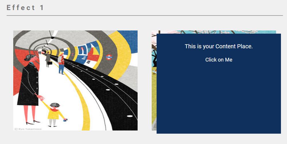
效果一的预览及CSS样式如下:
.ef1 .contentPart {
  position: absolute;
  top: 0px;left: 0px;
  width: 100%;height: 100%;
  background-color: #0f305d;
  opacity: 0;
  transition:all 0.4s;
}
.ef1 .contentPart:hover {
  opacity: 1;
  top: 3%;
  left: 4%;
}
.ef1 .contentPart p {
  color: #fff;
  letter-spacing: 0px;
  margin-top: 32px;
  font-size: 20px;
  margin-bottom: 24px;
}
.ef1 .contentPart a {
  color: #fff;
  letter-spacing: 0px;
  font-size: 18px;
}
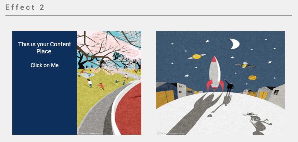
效果二的预览及CSS样式如下:
.ef2 {
  overflow: hidden;
}
.ef2 .contentPart {
  position: absolute;
  top: 0px;
  left: 0px;
  width: 50%;
  height: 100%;
  background-color: #0f305d;
  opacity: 1;
  transition: all 0.4s;
  -webkit-transition: all 0.4s;
  -moz-transition: all 0.4s;
  transform: rotateY(-90deg);
  -webkit-transform: rotateY(-90deg);
  -moz-transform: rotateY(-90deg);
  -webkit-transform-origin: 0 0;
  -moz-transform-origin: 0 0;
  transform-origin: 0 0;
}
.ef2:hover .contentPart {
  transform: rotateY(0deg);
  -webkit-transform: rotateY(0deg);
  -moz-transform: rotateY(0deg);
}
.ef2:hover img {
  transform: translateX(50%);
  -webkit-transform: translateX(50%);
  -moz-transform: translateX(50%);
}
.ef2 .contentPart p {
  color: #fff;
  letter-spacing: 0px;
  margin-top: 32px;
  font-size: 20px;
  margin-bottom: 24px;
}
.ef2 .contentPart a {
  color: #fff;
  letter-spacing: 0px;
  font-size: 18px;
}
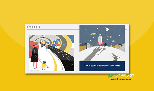
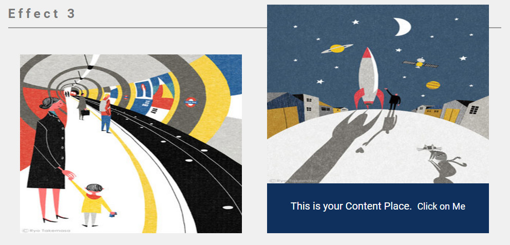
效果三的预览及CSS样式如下:
.ef3 .contentPart {
  position: absolute;
  left: 0px;
  width: 100%;
  height: 28%;
  bottom: 0px;
  background-color: #0f305d;
  opacity: 1;
  -webkit-transition: all 0.4s;
  -o-transition: all 0.4s;
  transition: all 0.4s;
}
.ef3 .contentPart p {
  display: inline-block;
}
.ef3 img {
  -webkit-transition: all 0.4s;
  -o-transition: all 0.4s;
  transition: all 0.4s;
  position: relative;
  z-index: 100;
  bottom: 0;
  left: 0;
}
.ef3:hover img {
  bottom: 28%;
}
.ef3 .contentPart p {
  color: #fff;
  letter-spacing: 0px;
  margin-top: 32px;
  font-size: 20px;
  margin-bottom: 24px;
}
.ef3 .contentPart a {
  color: #fff;
  letter-spacing: 0px;
  font-size: 18px;
}
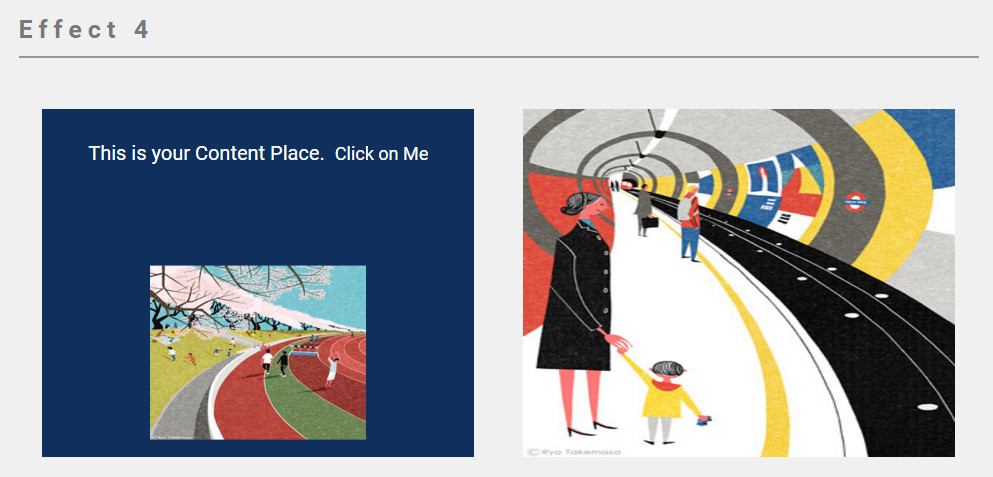
效果四的预览及CSS样式如下:
.ef4 .contentPart {
  position: absolute;
  left: 0px;
  width: 100%;
  height: 100%;
  bottom: 0px;
  background-color: #0f305d;
  opacity: 1;
  transition: all 0.4s;
  -webkit-transition: all 0.4s;
  -moz-transition: all 0.4s;
}
.ef4 .contentPart p {
  display: inline-block;
}
.ef4 img {
  position: relative;
  z-index: 100;
}
.ef4:hover img {
  -webkit-transform: scale(0.5) translateY(40%);
  -moz-transform: scale(0.5) translateY(40%);
  transform: scale(0.5) translateY(40%);
}
.ef4 .contentPart p {
  color: #fff;
  letter-spacing: 0px;
  margin-top: 32px;
  font-size: 20px;
  margin-bottom: 24px;
}
.ef4 .contentPart a {
  color: #fff;
  letter-spacing: 0px;
  font-size: 18px;
}
CaptionHover鼠标滑过图片过渡动画特效的github地址为:https://github.com/mahdixco/CaptionHover


