
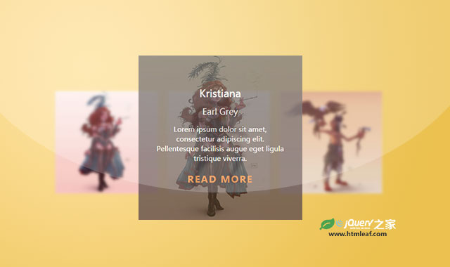

这是一款使用CSS3制作的鼠标滑过图片标题文字动画特效。该特效在鼠标滑过图片的时候,会展现遮罩层,并在遮罩层上以旋转的方式使图片描述文字逐一展现。
使用方法
HTML结构
DEMO中使用bootstrap的网格系统来进行布局。整个图片放置在一个.box容器中,它里面的.box-content是图片的描述文本层。
<div class="box">
    <img src="img/1.jpg" alt=""/>
    <div class="box-content">
        <h3 class="title">Kristiana</h3>
        <span class="post">Earl Grey</span>
        <p class="description">
            Lorem ipsum dolor sit amet......
        </p>
        <a href="#" class="read">read more</a>
    </div>
</div>
CSS样式
容器.box的定位方式为相对定位,它里面的图片宽度为父容器的100%宽度。
.box{
    border: 1px solid #333;
    position: relative;
    overflow: hidden;
}
.box img{
    width: 100%;
    height: auto;
}
.box-content用于制作遮罩层。颜色为60%的黑色,定位方式为绝对定位,并使用transform属性将它逆时针旋转了90度,旋转的中心点位于左上角位置。最后为所有的动画属性设置0.5秒ease效果的过渡动画。
.box .box-content{
    width: 100%;
    height: 100%;
    position: absolute;
    top: 0;
    left: 0;
    color: #fff;
    text-align: center;
    padding: 20% 20px;
    background: rgba(0,0,0,0.6);
    transform: rotate(-90deg);
    transform-origin: left top 0;
    transition: all 0.50s ease 0s;
}
.title是标题,初始状态它旋转了180度,旋转的中心点为右上角。并设置0.3秒的ease-in-out效果过渡动画,动画的延迟时间为0.2秒。
.box .title{
    display: inline-block;
    font-size: 22px;
    color: #fff;
    margin: 0 0 15px 0;
    position: relative;
    transform: rotate(180deg);
    transform-origin: right top 0;
    transition: all .3s ease-in-out 0.2s;
}
.post是子标题,初始状态它旋转了180度,旋转的中心点为右上角。并设置0.3秒的ease-in-out效果过渡动画,动画的延迟时间为0.4秒。
.box .post{
    display: block;
    font-size: 18px;
    margin-bottom: 15px;
    transform: rotate(180deg);
    transform-origin: right top 0;
    transition: all .3s ease-in-out 0.4s;
}
.description是描述文本,初始状态它旋转了180度,旋转的中心点为右上角。并设置0.3秒的ease-in-out效果过渡动画,动画的延迟时间为0.6秒。
.box .description{
    font-size: 15px;
    margin-bottom: 20px;
    padding: 0 20px;
    transform: rotate(180deg);
    transform-origin: right top 0;
    transition: all .3s ease-in-out 0.6s;
}
.read是Read More文字,初始状态它旋转了180度,旋转的中心点为右上角。并设置0.3秒的ease-in-out效果过渡动画,动画的延迟时间为0.8秒。
.box .read{
    font-size: 20px;
    font-weight: bold;
    color: #fff;
    display: block;
    letter-spacing:2px;
    text-transform: uppercase;
    transform: rotate(180deg);
    transform-origin: right top 0;
    transition: all 0.3s ease-in-out 0.8s;
}
在鼠标滑过图片时,将上面所有元素的旋转角度变为0度,由于各个元素上都设置了多会过渡延迟时间,所以各个元素会逐一的旋转会0度位置。
.box .read:hover{
    color: #e8802e;
    text-decoration: none;
}
.box:hover .box-content,
.box:hover .title,
.box:hover .post,
.box:hover .description,
.box:hover .read {
    transform:rotate(0deg);
}


