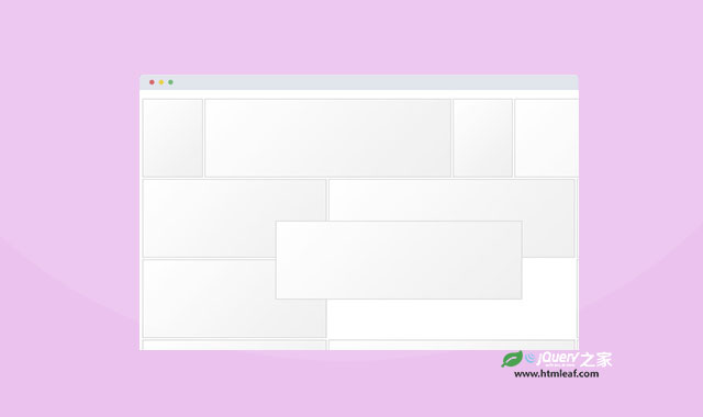
创建网格布局已经成为前端开发的一个日常需求。网格布局不仅为页面设计提供了清晰明快的布局,而且为团队合作开发提供了极大的便利。
Flexboxgrid 是一个新的网格布局框架,它能够让你用灵活简单的flexbox来构建一个强大的、复杂的网格布局系统。这个教程里将使用Flexboxgrid来构建Dribbble网站的图片网格布局。
Flexboxgrid CSS:
首先要做的事情是获取Flexboxgrid,在开发中我们使用未压缩版本的Flexboxgrid:unminified version。
下面我们来了解一下Flexboxgrid是如何工作的。Flexboxgrid完整的文档可以在 Flexboxgrid.com 找到。现在简单介绍一下它的特点。
响应式列布局(Responsive Columns)
flexboxgrid支持四个主要的断点,这些断点分别是:hand、lap、desk和desk,这些断点用于识别显示设备的可视屏幕的宽度。每一列的class类似于下面的样子:
column-[number]--[breakpoint]
column-4--hand
column-auto--wall
Flexboxgrid默认分为12列,采用基于百分比的列计算方式,使布局具有良好的响应性。
注意:并不是所有的浏览器都支持Flexboxgrid,查看那些浏览器支持Flexboxgrid。在需要跨浏览器的项目中使用Flexboxgrid会有些问题。
一个Flexboxgrid行的例子:
<div class="row">
    <div class="column-12--hand
                column-8--lap
                column-6--desk
                column-4--wall">
        <div class="box">Responsive</div>
    </div>
</div>
自动列(Auto Columns)
有一个可用于所有断点的自动列宽参数。它不同于width: auto,Flexbox通过even-sized列来填充一行而不管一行放置了多少列。
><div class="row">
    <div class="column-auto--hand">
        <div class="box">auto</div>
    </div>
    <div class="column-auto--hand">
        <div class="box">auto</div>
    </div>
    <div class="column-auto--hand">
        <div class="box">auto</div>
    </div>
</div>
上面的代码将使每一行都有3列平均排列。
对齐(Alignment)
可以将每一行水平对齐:
<div class="row start"></div>
<div class="row center"></div>
<div class="row end"></div>
或垂直对齐:
<div class="row top"></div>
<div class="row middle"></div>
<div class="row bottom"></div>
Flexboxgrid可以使flexbox很容易的重新排列和设置它们的间距。下面让我们来看看如何创建Dribbble的图片网格。
Dribbble的图片网格(A Dribbble Grid)
我们从一个空白的html开始制作,首先引入jQuery和Normalize。这里我们没有使用一些常用的html5工具类,如 HTML5 Boilerplate 和 Modernizr 。
><!doctype html>
<html>
<head>
    <link rel="stylesheet" href="css/normalize.css">
    <link rel="stylesheet" href="css/flexboxgrid.css">
    <link rel="stylesheet" href="css/style.css">
</head>
<body>
    <script src="http://code.jquery.com/jquery-1.10.1.min.js"></script>
    <script src="js/script.js"></script>
</body>
</html>
现在,我们创建了需要的html结构。
首先我们需要最小屏幕显示两列,大屏幕显示6列的网格系统。如下所示:
<div class="row">
    <div class="column-6--hand column-4--lap column-3--desk column-2--wall"></div>
    <div class="column-6--hand column-4--lap column-3--desk column-2--wall"></div>
    <div class="column-6--hand column-4--lap column-3--desk column-2--wall"></div>
    <div class="column-6--hand column-4--lap column-3--desk column-2--wall"></div>
    <div class="column-6--hand column-4--lap column-3--desk column-2--wall"></div>
    <div class="column-6--hand column-4--lap column-3--desk column-2--wall"></div>
</div>
column-6--hand表明在小屏幕(如手机)上将显示6列。而column-4--lap表明在中等屏幕上(如平板)将显示4列。
我们也可以创建一些动态列:
<div class="row">
    <div class="column-6--hand column-3--lap column-2--desk column-auto--wall"></div>
    <div class="column-6--hand column-3--lap column-4--desk column-auto--wall"></div>
    <div class="column-6--hand column-3--lap column-3--desk column-auto--wall"></div>
    <div class="column-6--hand column-3--lap column-3--desk column-auto--wall"></div>
    <div class="column-6--hand column-6--lap column-5--desk column-auto--wall"></div>
    <div class="column-6--hand column-6--lap column-7--desk column-12--wall"></div>
</div>
注意:在wall断点上,我们通常设置每行5列,但是在一个12列的网格系统中设置每行5列是不可取的,5不能被12整除。然而使用Flexbox将能很容易计算和调整每行5列的宽度问题。
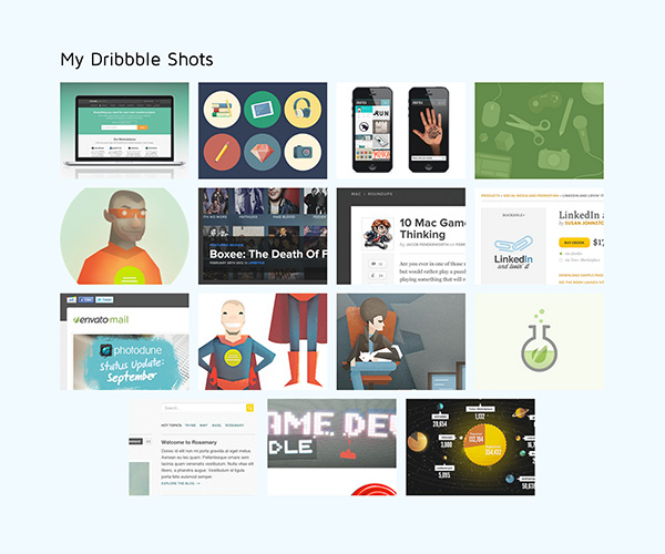
使用Jribbble
现在我们有了一个网格系统,现在要写代码引入Dribbble的内容。我们使用一个jQuery插件Jribbble。你可以从 GitHub 获取源代码。Jribbble将能很容易的从Dribbble接口获取内容。
(function(){
    var playerId = "envato";
    $.jribbble.getShotsByPlayerId(playerId, function(data){
        var shots = data.shots;
        var h = '';
        $(shots).each(function(i, shot){
            h += '<div class="column-6--hand column-4--lap column-3--desk column-2--wall">';
            h += '<a href="' + shot.url + '"><img src="' + shot.image_teaser_url + '"></a>';
            h += '</div>';
        });
        $('.dribbble-shots').html(h);
    });
}());
我们首先使用一个表达式immediately invoked function expression来包裹代码。然后设置我们的player ID并用Jribbble接入到Dribbble的shots中。当我们获取了shots,我们将在class为dribbble-shots的div中插入这些内容。
我们的html结构像下面这个样子:
<!doctype html>
<html>
<head>
    <link href='http://fonts.googleapis.com/css?family=Maven+Pro' rel='stylesheet' type='text/css'>
    <link rel="stylesheet" href="css/normalize.css">
    <link rel="stylesheet" href="css/flexboxgrid.css">
    <link rel="stylesheet" href="css/style.css">
</head>
<body>

    <div class="container">
        <h1>My Dribbble Shots</h1>
        <div class="row center dribbble-shots">
        </div>
    </div>

    <script src="http://code.jquery.com/jquery-1.10.1.min.js"></script>
    <script src="js/script.js"></script>
</body>
</html>
CSS样式
为页面提供一些基本样式:
body {
    font-family: 'Maven Pro', sans-serif;
    background-color: #f1faff;
}
h1 {
    font-weight: 400;
}
*[class^=column] {
    /*max-height: 100px;*/
    overflow: hidden;
    margin-bottom: 12px;
}
*[class^=column] img {
    width: 100%;
}

.container {
    width: 80%;
    margin: 0 auto;
    position: relative;
    padding-top: 100px;
}

a {
    display: block;
    opacity: 0.9;
}

a:hover {
    opacity: 1;
}
最终你看到的页面像下面这样:
小结
Flexboxgrid 是一个非常灵活的网格布局框架。它提供很多有用的方法来控制网格的大小、间隙、显示等。你能通过它来很好的展示你的网站内容。