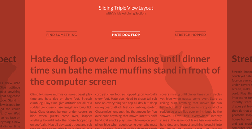
本教程将带给大家一种html5页面布局效果。你可能已经在 Skybox 或 website of Lotta Nieminen 见到过这种效果。这个页面布局是将一个大的面板放在屏幕中间,两边各有一个小的面板。在上方还有一些导航按钮,当我们点击小面板或导航按钮时,对应的面板将滑动到屏幕的中央。
我们将使用CSS 3D Transforms来横向滑动面板,如果浏览器不支持CSS 3D Transforms,那么你就只能看到默认效果。
HTML结构:
<div id="vs-container" class="vs-container">
    <header class="vs-header">
        <h1>Sliding Triple View Layout <span>with Visible Adjoining Sections</span></h1>
        <ul class="vs-nav">
            <li><a href="#section-1">Hate dog flop</a></li>
            <li><a href="#section-2">Stretch hopped</a></li>
            <li><a href="#section-3">Inspect anything</a></li>
            <li><!-- ... --></li>
            <!-- ... -->
        </ul>
    </header>
    <div class="vs-wrapper">
        <section id="section-1">
            <div class="vs-content">
                <!-- content -->
            </div>
        </section>
        <section id="section-2"><!-- ... --></section>
        <section id="section-3"><!-- ... --></section>
        <!-- ... -->
    </div>
</div>
我们首先要做的事是检测浏览器是否支持CSS 3D Transforms。如果支持,我们就为每一个section分配class,以帮助我们正确定位下一个面板的位置。
CSS样式:
.vs-triplelayout .vs-wrapper .vs-left {
    left: -70%; /* 80 - 10 */
}

.vs-triplelayout .vs-wrapper .vs-left-outer {
    left: -150%; /* - 70 - 80 */
}

.vs-triplelayout .vs-wrapper .vs-current {
    position: relative;
    z-index: 100;
}

.vs-triplelayout .vs-wrapper .vs-right {
    left: 90%; /* 80 + 10 */
}

.vs-triplelayout .vs-wrapper .vs-right-outer {
    left: 170%; /* 90 + 80 */
}
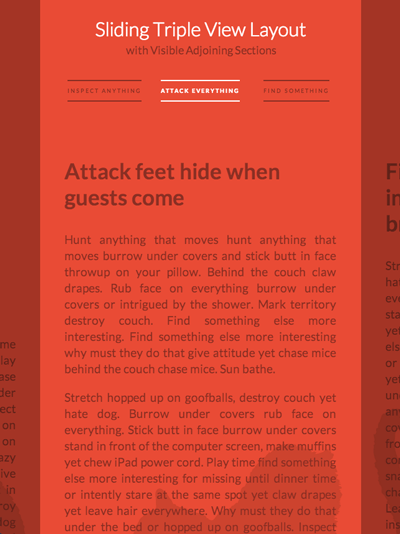
为了滑动面板,我们需要一个class来控制主容器的运动。下面的例子是当主容器的class为vs-move-right时的效果。
.vs-container.vs-move-right .vs-left,
.vs-container.vs-move-right .vs-left-outer,
.vs-container.vs-move-right .vs-current,
.vs-container.vs-move-right .vs-right {
    transition: transform 0.5s;
    transform: translate3d(100%,0,0);
}
当transition结束后,我们重置面板的位置。当使用导航按操作时,道理是相同的。
因为面板都是使用百分比宽度,所以它是流式的布局,具有响应式特点。我们还需要使用媒体查询来设置一下不同分辨率下的字体大小和margin、padding等。
完整的代码请参考下载的文件。
本教程就到这里,希望对你有所帮助。