在这个教程里我们将向大家展示如何使用css transforms来创建一个漂亮的圆形菜单。我们将一步步的带你创建样式表,然后解释一些使用到的数学计算公式和简单逻辑,以便使你有一个很清晰的思路。
正如上面所说的,我们将使用到一些基本的数学计算公式和css transforms来创建样式。但是你不用担心,这些公式都非常简单,我将一步步的给大家解释。
HTML结构:
我们要创建的是一个菜单,让我们先从正常的菜单结构开始。我们需要一个包含无序列表的div,一个触发打开关闭动作的按钮。在第一种效果中,当菜单打开时我们还需要一个遮罩层来遮住页面。
这个例子中的图标我们将使用Font Awesome。
数学计算公式:
最好的理解这些公式的方式是使用画图的方式来。所以下面会用图解的方式来解释每一步的css样式是如何来的。
先来看看每个扇形的角度是多少,下面是一张示意图:
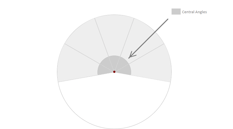
所以扇形的分布如上图所示,我们的demo中有6个li,那么每个li的角度为:
180deg / 6 = 30deg
如果你想做一个完整的圆形,那么角度值为:
360deg / 6 = 60deg
以此类推,你可以计算出你想要的扇形角度。我们将在css中使用这些角度。
要创建一个刚好等于我们所需要的角度的扇形,可以使用skew()来将它们倾斜。倾斜的值为:
90deg – x deg
这里的x为我们需要的角度。
这时候,列表中的所有li都将因倾斜而产生扭曲,因此我们需要所有的a元素设置为不倾斜,
CSS
我们将使用Modernizr来检测页面是否支持CSS transforms,并且当检测到不支持CSS transforms的浏览器时给出一个简单的回调函数。
现在开始写菜单样式。菜单应该是固定在页面底部的,在页面初始化时是最小化的,当点击了按钮后才开始放大并展开。
.csstransforms .cn-wrapper {
  font-size:1em;
  width: 26em;
  height: 26em;
  overflow: hidden;
  position: fixed;
  z-index: 10;
  bottom: -13em;
  left: 50%;
  border-radius: 50%;
  margin-left: -13em;
  transform: scale(0.1);
  transition: all .3s ease;
}
/* class applied to the container via JavaScript that will scale the navigation up */
.csstransforms .opened-nav {
  border-radius: 50%;
  transform: scale(1);
}
给菜单触发按钮添加一些样式
.cn-button {
  border:none;
  background:none;
  color: white;
  text-align: Center;
  font-size: 1.5em;
  padding-bottom: 1em;
  height: 3.5em;
  width: 3.5em;
  background-color: #111;
  position: fixed;
  left: 50%;
  margin-left: -1.75em;
  bottom: -1.75em;
  border-radius: 50%;
  cursor: pointer;
  z-index: 11
}
.cn-button:hover,
.cn-button:active,
.cn-button:focus{
  background-color: #222;
}
当菜单打开时,会有一个遮罩遮罩页面。
.cn-overlay{
  width:100%
  height:100%;
  background-color: rgba(0,0,0,0.6);
  position:fixed;
  top:0;
  left:0;
  bottom:0;
  right:0;
  opacity:0;
  transition: all .3s ease;
  z-index:2;
  pointer-events:none;
}

/* Class added to the overlay via JavaScript to show it when navigation is open */
.cn-overlay.on-overlay{
  pointer-events:auto;
  opacity:1;
}
现在按照先前的数学公式给菜单项和a元素添加样式。
.csstransforms .cn-wrapper li {
  position: absolute;
  font-size: 1.5em;
  width: 10em;
  height: 10em;
  transform-origin: 100% 100%;
  overflow: hidden;
  left: 50%;
  top: 50%;
  margin-top: -1.3em;
  margin-left: -10em;
  transition: border .3s ease;
}

.csstransforms .cn-wrapper li a {
  display: block;
  font-size: 1.18em;
  height: 14.5em;
  width: 14.5em;
  position: absolute;
  position: fixed; /* fix the "displacement" bug in webkit browsers when using tab key */
  bottom: -7.25em;
  right: -7.25em;
  border-radius: 50%;
  text-decoration: none;
  color: #fff;
  padding-top: 1.8em;
  text-align: center;
  transform: skew(-50deg) rotate(-70deg) scale(1);
  transition: opacity 0.3s, color 0.3s;
}

.csstransforms .cn-wrapper li a span {
  font-size: 1.1em;
  opacity: 0.7;
}
/* for a central angle x, the list items must be skewed by 90-x degrees
in our case x=40deg so skew angle is 50deg
items should be rotated by x, minus (sum of angles - 180)2s (for this demo) */

.csstransforms .cn-wrapper li:first-child {
  transform: rotate(-10deg) skew(50deg);
}

.csstransforms .cn-wrapper li:nth-child(2) {
  transform: rotate(30deg) skew(50deg);
}

.csstransforms .cn-wrapper li:nth-child(3) {
  transform: rotate(70deg) skew(50deg)
}

.csstransforms .cn-wrapper li:nth-child(4) {
  transform: rotate(110deg) skew(50deg);
}

.csstransforms .cn-wrapper li:nth-child(5) {
  transform: rotate(150deg) skew(50deg);
}

.csstransforms .cn-wrapper li:nth-child(odd) a {
  background-color: #a11313;
  background-color: hsla(0, 88%, 63%, 1);
}

.csstransforms .cn-wrapper li:nth-child(even) a {
  background-color: #a61414;
  background-color: hsla(0, 88%, 65%, 1);
}

/* active style */
.csstransforms .cn-wrapper li.active a {
  background-color: #b31515;
  background-color: hsla(0, 88%, 70%, 1);
}

/* hover style */
.csstransforms .cn-wrapper li:not(.active) a:hover,
.csstransforms .cn-wrapper li:not(.active) a:active,
.csstransforms .cn-wrapper li:not(.active) a:focus {
  background-color: #b31515;
  background-color: hsla(0, 88%, 70%, 1);
}
当浏览器不支持CSS transforms时,我们给出一个简单的回调。
.no-csstransforms .cn-wrapper{
  font-size:1em;
  height:5em;
  width:25.15em;
  bottom:0;
  margin-left: -12.5em;
  overflow: hidden;
  position: fixed;
  z-index: 10;
  left:50%;
  border:1px solid #ddd;
}

.no-csstransforms .cn-button{
  display:none;
}

.no-csstransforms .cn-wrapper li{
  position:static;
  float:left;
  font-size:1em;
  height:5em;
  width:5em;
  background-color: #eee;
  text-align:center;
  line-height:5em;
}

.no-csstransforms .cn-wrapper li a{
  display:block;
  width:100%;
  height:100%;
  text-decoration:none;
  color:inherit;
  font-size:1.3em;
  border-right: 1px solid #ddd;
}

.no-csstransforms .cn-wrapper li a:last-child{
  border:none;
}

.no-csstransforms .cn-wrapper li a:hover,
.no-csstransforms .cn-wrapper li a:active,
.no-csstransforms .cn-wrapper li a:focus{
  background-color: white;
}

.no-csstransforms .cn-wrapper li.active a {
  background-color: #6F325C;
  color: #fff;
}
我们希望菜单是响应式的,以适应所有的屏幕。
@media screen and (max-width:480px){
  .csstransforms .cn-wrapper{
    font-size:.68em;
  }
  .cn-button{
    font-size:1em;
  }
  .csstransforms .cn-wrapper li {
    font-size:1.52em;
  }
}

@media screen and (max-width:320px){
  .no-csstransforms .cn-wrapper{
    width:15.15px;
    margin-left: -7.5em;
  }
  .no-csstransforms .cn-wrapper li{
    height:3em;
    width:3em;
  }
}
JAVASCRIPT
在这个demo中我们不想使用任何的javascript框架。我们用Classie.js来添加和删除class,如果浏览器不支持addEventListener和removeEventListener,可以使用EventListener polyfill来解决。
我们将给按钮添加点击事件,点击按钮将使菜单打开或关闭。
当菜单打开时,点击菜单外的任何地方,菜单也将关闭。
(function(){

  var button = document.getElementById('cn-button'),
    wrapper = document.getElementById('cn-wrapper'),
    overlay = document.getElementById('cn-overlay');

  //open and close menu when the button is clicked
  var open = false;
  button.addEventListener('click', handler, false);
  button.addEventListener('focus', handler, false);
  wrapper.addEventListener('click', cnhandle, false);

  function cnhandle(e){
    e.stopPropagation();
  }

  function handler(e){
    if (!e) var e = window.event;
    e.stopPropagation();//so that it doesn't trigger click event on document

      if(!open){
        openNav();
      }
    else{
        closeNav();
      }
  }
  function openNav(){
    open = true;
      button.innerHTML = "-";
      classie.add(overlay, 'on-overlay');
      classie.add(wrapper, 'opened-nav');
  }
  function closeNav(){
    open = false;
    button.innerHTML = "+";
    classie.remove(overlay, 'on-overlay');
    classie.remove(wrapper, 'opened-nav');
  }
  document.addEventListener('click', closeNav);

})();
到这里,本教程就结束了,希望它对你有所帮助。