
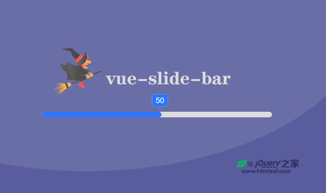

vue-slide-bar是一个简单的Vue滑块组件,可以用于选择范围,可以添加标签和自定义样式,支持预定义的最小和最大值。
vue-slide-bar的特点包括:
- 简单易用,可以用于选择范围。
- 可以添加标签和自定义样式。
- 支持预定义的最小和最大值。
- 支持动态加载。
使用方法
安装
如果您想使用vue-slide-bar滑块插件,首先您需要安装它,命令如下:
npm install vue-slide-bar --save
// or
yarn add vue-slide-bar
使用
全局使用
// main.js
import Vue from 'vue'
import VueSlideBar from 'vue-slide-bar'

Vue.component('VueSlideBar', VueSlideBar)
局部引用
// xxx.vue
import VueSlideBar from 'vue-slide-bar'

export default {
  components: {
    VueSlideBar
  }
}
示例代码:
<template>
  <VueSlideBar v-model="value"/>
</template>

export default {
  data () {
    return {
      value: 50
    }
  }
}


// With Label

<template>
  <div>
    <VueSlideBar
      v-model="slider.value"
      :data="slider.data"
      :range="slider.range"
      :labelStyles="{ color: '#4a4a4a', backgroundColor: '#4a4a4a' }"
      :processStyle="{ backgroundColor: '#d8d8d8' }"
      @callbackRange="callbackRange">
      <template slot="tooltip" slot-scope="tooltip">
        <img src="static/images/rectangle-slider.svg">
      </template>
    </VueSlideBar>
    <h2>Value: {{slider.value}}</h2>
    <h2>Label: {{rangeValue.label}}</h2>
  </div>
</template>

import VueSlideBar from 'vue-slide-bar'

export default {
  data () {
    return {
      rangeValue: {},
      slider: {
        value: 45,
        data: [
          15,
          30,
          45,
          60,
          75,
          90,
          120
        ],
        range: [
          {
            label: '15 mins'
          },
          {
            label: '30 mins',
            isHide: true
          },
          {
            label: '45 mins'
          },
          {
            label: '1 hr',
            isHide: true
          },
          {
            label: '1 hr 15 mins'
          },
          {
            label: '1 hr 30 mins',
            isHide: true
          },
          {
            label: '2 hrs'
          }
        ]
      }
    }
  },
  methods: {
    callbackRange (val) {
      this.rangeValue = val
    }
  },
  components: {
    VueSlideBar
  }
}


// Custom Style & Min-Max
<template>
  <div>
    <VueSlideBar
      v-model="value2"
      :min="1"
      :max="10"
      :processStyle="slider.processStyle"
      :lineHeight="slider.lineHeight"
      :tooltipStyles="{ backgroundColor: 'red', borderColor: 'red' }">
    </VueSlideBar>
    <h2>Value: {{value2}}</h2>
  </div>
</template>

import VueSlideBar from 'vue-slide-bar'

export default {
  data () {
    return {
      value2: 8,
      slider: {
        lineHeight: 10,
        processStyle: {
          backgroundColor: 'red'
        }
      }
    }
  },
  components: {
    VueSlideBar
  }
}


// Loading

<template>
  <div>
    <VueSlideBar
      v-model="loading"
      :showTooltip="false"
      :lineHeight="20"
      :isDisabled="true"/>
    <br>
    <button type="button" name="button" @click="startLoad()">
      Click to start load
    </button>
    <h2>Loading: {{loading}}%</h2>
  </div>
</template>

import VueSlideBar from 'vue-slide-bar'

export default {
  data () {
    return {
      loader: null,
      loading: 0
    }
  },
  methods: {
    startLoad () {
      this.loader = setInterval(() => {
        this.loading++
        if (this.loading === 100) {
          console.log('clear', this.loading)
          clearInterval(this.loader)
        }
      }, 100)
    }
  }
  components: {
    VueSlideBar
  }
}
配置参数
vue-slide-bar滑块插件的可用配置参数如下:
- v-model:初始值(v-model),默认为0。
- min:最小值,默认为0。
- max:最大值:默认为100。
- process-style:进度条的样式,默认为null。
- tooltip-styles:Tooltip的样式,默认为null。
- tooltip-styles:Tooltip的样式,默认为null。
- label-style:label标签的样式,默认为null。
- data:自定义数据。一个数组。
- is-disabled:是否禁用滑块,默认为false。
- draggable:是否可以拖动滑块,默认值为true。
- show-tooltip:是否显示tooltip,默认值为true。
- icon-width:图标宽度,默认值为20px。
- line-height:行高,默认值为5。
- speed:transision过渡时间时间,默认为0.5。
- paddingless:是否删除填充和最小高度,默认值为false。
事件
vue-slide-bar滑块插件的可用事件如下:
- input:滑块的值更改时触发。
- callbackRange:滑块的范围值更改时触发。
- dragStart:在滑块开始拖动时触发。
- dragEnd:在滑块停止拖动时触发。
插槽
tooltip:自定义工具提示(tooltip)插槽。


