
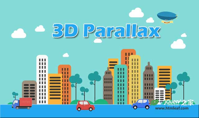

这是一款简单但效果非常酷的jQuery和CSS3背景图片3D视觉差特效。该背景图片3D视觉差特效使用jQuery、 CSS3 transform 和translate3d来在鼠标移动时,以不同的速度移动一组带背景图片的DIV层,形成视觉差效果。
使用方法
HTML结构
这个背景图片3D视觉差特效的HTML结构使用一个<div>来包裹一组用于制作视觉差效果的子<div>元素。每一个子<div>中使用data-offset来指定该层移动的速度。
<div class="scene">
  <div data-offset="90" class="clouds parallax"></div>
  <div data-offset="30" class="trees parallax"></div>
  <div data-offset="20" class="grass parallax"></div>
  <div data-offset="50" class="buildings parallax"></div>
  <div class="ground"></div>
</div>
CSS样式
视觉差效果中的CSS样式你可以自定义,下面是插件中使用的一些样式。
.scene {
  position: absolute;
  bottom: 0;
  left: 0;
  overflow: hidden;
  right: 0;
  border-bottom: 100px solid #342a2a;
  height: 800px;
}

.scene > div {
  position: absolute;
  bottom: 0;
}

.ground {
  width: 100%;
  height: 30px;
  background: #1d1818;
  z-index: 999;
}

.scene > div.clouds {
  width: 895px;
  left: 50%;
  margin-left: -447px;
  height: 255px;
  bottom: 250px;
  background: url(img/WYfbo0O.png) no-repeat center;
}

.scene div.trees {
  width: 908px;
  height: 174px;
  background: url(img/4JOfJhg.png) no-repeat center;
  z-index: 100;
  left: 50%;
  bottom: 20px;
  margin-left: -454px;
}

.scene div.grass {
  width: 964px;
  height: 37px;
  z-index: 200;
  left: 50%;
  bottom: 20px;
  margin-left: -482px;
  background: url(img/h0aXbZr.png) no-repeat center;
}

.buildings {
  width: 763px;
  height: 303px;
  left: 50%;
  margin-left: -400px;
  background: url(img/5LmAigM.png) no-repeat center;
}
JAVASCRIPT
首先引入jQuery文件。
<script src="js/jquery-1.11.1.min.js"></script>
然后使用下面的代码来制作背景图片3D视觉差效果:
$(window).on('mousemove', function(e) {
  var w = $(window).width();
  var h = $(window).height();
  var offsetX = 0.5 - e.pageX / w;
  var offsetY = 0.5 - e.pageY / h;

  $(".parallax").each(function(i, el) {
    var offset = parseInt($(el).data('offset'));
    var translate = "translate3d(" + Math.round(offsetX * offset) + "px," + Math.round(offsetY * offset) + "px, 0px)";

    $(el).css({
    '-webkit-transform': translate,
    'transform': translate,
    'moz-transform': translate
    });
  });
});


