

这是一款时下最为流行的 jQuery 和 CSS3 扁平风格滑动面板插件。
HTML结构
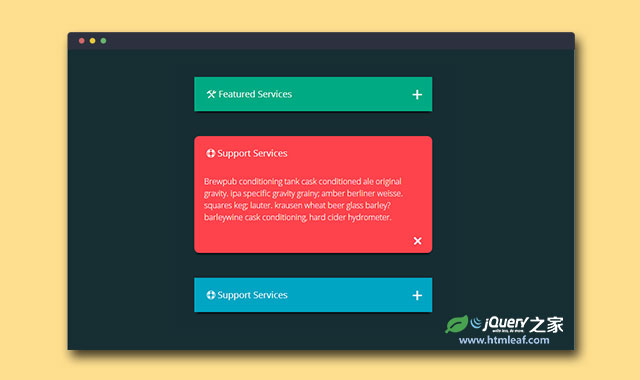
该滑动面板使用无序列表制作,HTML结构非常简单。每个列表项中使用一个div .info-box-green作为整个滑动面板的wrapper。里面的h4标签是面板的标题,div.info-content是面板的内容。最后空的<span>是面板右边显示的"+"号。
<ul class="wrapper">
  <li>
    <div class="info-box-green">
      <h4 class="entypo-tools"> Featured Services </h4>

      <div class="info-content">
        <div class="text">
          <p>...</p>
        </div>
        <span class="entypo-plus" id="expand-green"></span>
      </div>
    </div>
  </li>

  ...

</ul>
CSS样式
该滑动面板使用CSS3来制作扁平化风格的样式。在面板打开时,面板右边的“+”号还有一个旋转动画,由CSS3 transform完成的。
.info-box-green, .info-box-red, .info-box-sky {
  margin: 50px auto;
  padding: 0;
  width: 480px;
  -webkit-box-shadow: 0 8px 6px -6px black;
     -moz-box-shadow: 0 8px 6px -6px black;
          box-shadow: 0 8px 6px -6px black;
}

.info-box-red h4 {
  -webkit-border-radius: 10px;
  border-radius: 10px;
  margin-bottom: -10px;
}

.info-box-red > .info-content > .text {
 -webkit-border-radius: 0 0 10px 10px;
  border-radius: 0 0 10px 10px;
}

.info-box-green h4, .info-box-green > .info-content > .text {
 background-color: #00AB83;
}

.info-box-red h4, .info-box-red > .info-content > .text {
  background-color: #FF434C;
}

.info-box-sky h4, .info-box-sky > .info-content > .text {
  background-color: #00A5C3;
}

.info-box-green h4, .info-box-red h4, .info-box-sky h4 {
  padding: 25px;
  font-size: 1.125em;
  font-weight: 400;
  color: #FFF;
}

.info-box-green > .info-content > .text, .info-box-red > .info-content > .text, .info-box-sky > .info-content > .text {
  padding: 0px;
  font-size: 1em;
  line-height: 1.5em;
  height: 0;
  color: #FFF;
  overflow: hidden;
  -webkit-transition:  height 200ms ease;
     -moz-transition:  height 200ms ease;
       -o-transition:  height 200ms ease;
          transition:  height 200ms ease;
}

.info-box-green > .info-content > .text > p, .info-box-red > .info-content > .text > p, .info-box-sky > .info-content > .text > p {
  padding: 20px 20px 60px;
}

.info-box-sky > .info-content > .text {
  background-color: #FFF;
  color: #444;
  border-radius: 0;
}

.info-box-green > .info-content > .text.open-green, .info-box-red > .info-content > .text.open-red, .info-box-sky > .info-content > .text.open-sky {
  display: block;
  height: auto;
}

.info-box-green > .info-content > span.close-green, .info-box-red > .info-content > span.close-red, .info-box-sky > .info-content > span.close-sky {
  -webkit-transform:rotate(135deg);
     -moz-transform:rotate(135deg);
       -o-transform:rotate(135deg);
      -ms-transform:rotate(135deg);
}

.info-box-green span, .info-box-red span, .info-box-sky span {
  display: inline-block;
  float: right;
  position: relative;
  bottom: 60px;
  right: 10px;
  margin: 0;
  padding: 10px;
  color: #FFF;
  font-size: 2em;
  cursor: pointer;
  /*  Rotate '+' to 'X' */
  -webkit-transition: all 600ms ease-in-out;
     -moz-transition: all 600ms ease-in-out;
       -o-transition: all 600ms ease-in-out;
      -ms-transition: all 600ms ease-in-out;
          transition: all 600ms ease-in-out;
}

.info-box-sky > .info-content > span.close-sky {
  color: #444;
}

.info-box-red span {
  position: relative;
  bottom: 50px;
  right: 10px;
}
JAVASCRIPT
该滑动面板插件使用 jQuery 来切换样式完成面板的展开和收缩。
<script>
  $('#expand-green').on('click', function () {
      $(this).toggleClass('close-green');
      $('.text').toggleClass('open-green').end();
  });
  $('#expand-red').on('click', function () {
      $(this).toggleClass('close-red');
      $('.text').toggleClass('open-red');
  });
  $('#expand-sky').on('click', function () {
      $(this).toggleClass('close-sky');
      $('.text').toggleClass('open-sky');
  });
</script>


