
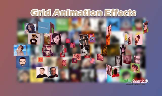

这是一组效果非常炫酷的jQuery 3D网格照片墙动画特效。这组3D网格照片墙共4种不同的效果,它们都是使用jQuery .delay(),jQuery easing插件和CSS3动画过渡来在网格中制作缩略图的动画特效。
该3D网格照片墙动画特效依赖于jQuery easing插件,在点击“animate”按钮之后,缩略图会随机消失,并带有波动效果。然后会以3D旋转的方式快速恢复到原来的位置上,效果非常炫酷。
使用方法
HTML结构
该3D网格照片墙动画特效的HTML结果非常简单:使用一个<div>作为网格容器,和一个按钮来触发动画效果。
<div class="grid"></div>
<span class="animate">Animate</span>
CSS样式
在网格容器上设置了固定的宽度和高度,为了制作3D效果,还设置了perspective: 500px;。每一张图片也设置了固定的宽度和高度,并且均为左浮动。
* {margin: 0; padding: 0;}
body {text-align: center; /*overflow: hidden;*/}

.grid {
  width: 600px; height: 300px; margin: 100px auto 50px auto;
  perspective: 500px; /*For 3d*/
}
.grid img {width: 60px; height: 60px; display: block; float: left;}

.animate {
  font: 12px Montserrat; text-transform: uppercase;
  background: rgb(0, 100, 0); color: white;
  padding: 10px 20px; border-radius: 5px;
  cursor: pointer;
}
.animate:hover {background: rgb(0, 75, 0);}
JavaScript
网格中的图片是在js代码中动态添加的。.animate按钮上添加了click事件监听,在按钮被点击的时候,网格中的每一张图片都使用jQuery.delay()函数来设置一个随机的延迟值,并使用animate()动画来使图片的透明度降低为0。接着在所有图片都消失之后,promise()方法返回一个Promise对象,用来观察当某种类型的所有行动绑定到集合,排队与否还是已经完成。最后在done()方法中执行缩略图的3D旋转动画,类似龙卷风的效果。
var images = "", count = 50;
for(var i = 1; i <= count; i++)
  images += '<img class="grid-image" src="img/'+i+'.jpg" />';

//图片添加到网格中
$(".grid").append(images);

var d = 0; //延迟
var ry, tz, s; //转换参数

//animation time
$(".animate").on("click", function(){
  //fading out the thumbnails with style
  $("img.grid-image").each(function(){
    d = Math.random()*1000; //1ms to 1000ms delay
    $(this).delay(d).animate({opacity: 0}, {
      step: function(n){
        s = 1-n; //scale - will animate from 0 to 1
        $(this).css("transform", "scale("+s+")");
      },
      duration: 1000,
    })
  }).promise().done(function(){
    //after *promising* and *doing* the fadeout animation we will bring the images back
    storm();
  })
})
//bringing back the images with style
function storm()
{
  $("img.grid-image").each(function(){
    d = Math.random()*1000;
    $(this).delay(d).animate({opacity: 1}, {
      step: function(n){
        //rotating the images on the Y axis from 360deg to 0deg
        ry = (1-n)*360;
        //translating the images from 1000px to 0px
        tz = (1-n)*1000;
        //applying the transformation
        $(this).css("transform", "rotateY("+ry+"deg) translateZ("+tz+"px)");
      },
      duration: 3000,
      easing: 'easeOutQuint',
    })
  })
}


