

formvalidation是一款功能非常强大的基于Bootstrap的jQuery表单验证插件。该jQuery表单验证插件内置了16种表单验证器,你也可以通过Bootstrap Validator's APIs写自己的表单验证器。该表单验证插件的可用验证器有:
- between:检测输入的值是否在两个指定的值之间。
- callback:通过回调函数返回验证信息。
- creditCard:验证信用卡格式。
- different:如果输入值和给定的值不同返回
true。 - digits:如果输入的值只包含数字返回
true。 - emailAddress:验证电子邮件格式是否有效。
- greaterThan:如果输入的值大于或等于指定的值返回
true。 - hexColor:验证一个hex格式的颜色值是否有效。
- identical:验证输入的值是否和指定字段的值相同。
- lessThan:如果输入的值小于或等于指定的值返回
true。 - notEmpty:检测字段是否为空。
- regexp:检测输入值是否和指定的javascript正则表达式匹配。
- remote:通过AJAX请求来执行远程代码。
- stringLength:验证字符串的长度。
- uri:验证URL地址是否有效。
- usZipCode:验证美国的邮政编码格式。
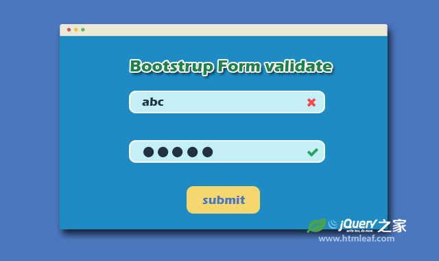
这个jQuery表单验证插件还可以和Foundation、Pure、Semantic UI和UIKit一起配合使用。产科下面的效果图。
formvalidation和Bootstrap一起使用:

formvalidation和Foundation一起使用:
formvalidation和Pure一起使用:
formvalidation和UI Kit一起使用:
formvalidation和Semantic UI一起使用:
使用方法
使用这个表单验证插件首先要引入必要的js和css文件。jQuery要求1.9.1+以上的版本。
<script src="jquery/1.10.2/jquery.min.js"></script>
<link rel="stylesheet" href="http://netdna.bootstrapcdn.com/bootstrap/3.0.2/css/bootstrap.min.css">
<script src="http://netdna.bootstrapcdn.com/bootstrap/3.0.2/js/bootstrap.min.js"></script>
<script type="text/javascript" src="../dist/js/bootstrapValidator.js"></script>
<link rel="stylesheet" href="../dist/css/bootstrapValidator.css"/>
HTML结构
该表单验证插件的最基本例子的HTML结果如下:
<form id="defaultForm" method="post" class="form-horizontal">
  <div class="form-group">
    <label class="col-lg-3 control-label">Username</label>
    <div class="col-lg-5">
      <input type="text" class="form-control" name="username" />
    </div>
  </div>
  <div class="form-group">
    <label class="col-lg-3 control-label">Email address</label>
    <div class="col-lg-5">
      <input type="text" class="form-control" name="email" />
    </div>
  </div>
  <div class="form-group">
    <label class="col-lg-3 control-label">Password</label>
    <div class="col-lg-5">
      <input type="password" class="form-control" name="password" />
    </div>
  </div>
  <div class="form-group">
    <label class="col-lg-3 control-label">Retype password</label>
    <div class="col-lg-5">
      <input type="password" class="form-control" name="confirmPassword" />
    </div>
  </div>
  <div class="form-group">
    <label class="col-lg-3 control-label" id="captchaOperation"></label>
    <div class="col-lg-2">
      <input type="text" class="form-control" name="captcha" />
    </div>
  </div>
  <div class="form-group">
    <div class="col-lg-9 col-lg-offset-3">
      <button type="submit" class="btn btn-primary">Sign up</button>
    </div>
  </div>
</form>
JAVASCRIPT
在页面加载完毕之后,通过下面的方法来初始化该表单验证插件:
<script type="text/javascript">
  $(document).ready(function() {
  // Generate a simple captcha
  function randomNumber(min, max) {
  return Math.floor(Math.random() * (max - min + 1) + min);
  };
  $('#captchaOperation').html([randomNumber(1, 100), '+', randomNumber(1, 200), '='].join(' '));

  $('#defaultForm').bootstrapValidator({
    message: 'This value is not valid',
      fields: {
      username: {
      message: 'The username is not valid',
      validators: {
      notEmpty: {
      message: 'The username is required and can\'t be empty'
      },
      stringLength: {
      min: 6,
      max: 30,
      message: 'The username must be more than 6 and less than 30 characters long'
      },
      regexp: {
        regexp: /^[a-zA-Z0-9_\.]+$/,
        message: 'The username can only consist of alphabetical, number, dot and underscore'
        },
        different: {
        field: 'password',
        message: 'The username and password can\'t be the same as each other'
        }
      }
    },
    email: {
      validators: {
        notEmpty: {
          message: 'The email address is required and can\'t be empty'
        },
        emailAddress: {
          message: 'The input is not a valid email address'
        }
      }
    },
    password: {
    validators: {
      notEmpty: {
          message: 'The password is required and can\'t be empty'
        },
        identical: {
          field: 'confirmPassword',
          message: 'The password and its confirm are not the same'
        },
        different: {
          field: 'username',
          message: 'The password can\'t be the same as username'
        }
      }
    },
    confirmPassword: {
      validators: {
        notEmpty: {
        message: 'The confirm password is required and can\'t be empty'
        },
        identical: {
        field: 'password',
        message: 'The password and its confirm are not the same'
        },
        different: {
        field: 'username',
        message: 'The password can\'t be the same as username'
        }
      }
    },
    captcha: {
      validators: {
        callback: {
          message: 'Wrong answer',
          callback: function(value, validator) {
          var items = $('#captchaOperation').html().split(' '), sum = parseInt(items[0]) + parseInt(items[2]);
          return value == sum;
          }
        }
      }
    }
  }
  });
});
</script>
配置参数
该表单验证插件的默认参数配置如下:
// The first invalid field will be focused automatically
autoFocus: true,

// Support declarative usage (setting options via HTML 5 attributes)
// Setting to false can improve the performance
declarative: true,

// The form CSS class
elementClass: 'fv-form',

// Use custom event name to avoid window.onerror being invoked by jQuery
// See #630
events: {
  // Support backward
  formInit: 'init.form.fv',
  formError: 'err.form.fv',
  formSuccess: 'success.form.fv',
  fieldAdded: 'added.field.fv',
  fieldRemoved: 'removed.field.fv',
  fieldInit: 'init.field.fv',
  fieldError: 'err.field.fv',
  fieldSuccess: 'success.field.fv',
  fieldStatus: 'status.field.fv',
  localeChanged: 'changed.locale.fv',
  validatorError: 'err.validator.fv',
  validatorSuccess: 'success.validator.fv'
},

// Indicate fields which won't be validated
// By default, the plugin will not validate the following kind of fields:
// - disabled
// - hidden
// - invisible
//
// The setting consists of jQuery filters. Accept 3 formats:
// - A string. Use a comma to separate filter
// - An array. Each element is a filter
// - An array. Each element can be a callback function
//    function($field, validator) {
//  $field is jQuery object representing the field element
//  validator is the BootstrapValidator instance
//  return true or false;
//    }
//
// The 3 following settings are equivalent:
//
// 1) ':disabled, :hidden, :not(:visible)'
// 2) [':disabled', ':hidden', ':not(:visible)']
// 3) [':disabled', ':hidden', function($field) {
//return !$field.is(':visible');
//  }]
excluded: [':disabled', ':hidden', ':not(:visible)'],

// Map the field name with validator rules
fields: null,

// Live validating option
// Can be one of 3 values:
// - enabled: The plugin validates fields as soon as they are changed
// - disabled: Disable the live validating. The error messages are only shown after the form is submitted
// - submitted: The live validating is enabled after the form is submitted
live: 'enabled',

// Locale in the format of languagecode_COUNTRYCODE
locale: 'en_US',

// Default invalid message
message: 'This value is not valid',

// The field will not be live validated if its length is less than this number of characters
threshold: null,

// Whether to be verbose when validating a field or not.
// Possible values:
// - true:  when a field has multiple validators, all of them will be checked, and respectively - if errors occur in
//  multiple validators, all of them will be displayed to the user
// - false: when a field has multiple validators, validation for this field will be terminated upon the first encountered error.
//  Thus, only the very first error message related to this field will be displayed to the user
verbose: true,

// ~~~~~~~~~~~~~~~~~~~~~~~~~~~~~~~~~~~~~~~~~~~~~~~~~~~~~~~~~
// These options mostly are overridden by specific framework
// ~~~~~~~~~~~~~~~~~~~~~~~~~~~~~~~~~~~~~~~~~~~~~~~~~~~~~~~~~

button: {
  // The submit buttons selector
  // These buttons will be disabled to prevent the valid form from multiple submissions
  selector: '[type="submit"]',

  // The disabled class
  disabled: ''
},

control: {
  // The CSS class for valid control
  valid: '',

  // The CSS class for invalid control
  invalid: ''
},

err: {
  // The CSS class of each message element
  clazz: '',

  // The error messages container. It can be:
  // - 'tooltip' if you want to use Bootstrap tooltip to show error messages
  // - 'popover' if you want to use Bootstrap popover to show error messages
  // - a CSS selector indicating the container
  // In the first two cases, since the tooltip/popover should be small enough, the plugin only shows only one error message
  // You also can define the message container for particular field
  container: null,

  // Used to determine where the messages are placed
  parent: null
},

// Shows ok/error/loading icons based on the field validity.
icon: {
  valid: null,
  invalid: null,
  validating: null,
  feedback: ''
},

row: {
  // The CSS selector for indicating the element consists of the field
  // You should adjust this option if your form group consists of many fields which not all of them need to be validated
  selector: null,
  valid: '',
  invalid: '',
  feedback: ''
}
更多信息请参考formvalidation表单验证插件官方网站:http://formvalidation.io/


