
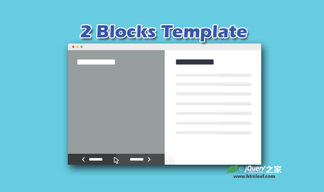

这是一款非常有创意和实用的HTML5全屏两列布局网页模板。在大屏幕设备中,该模板以两列布局的方式出现,用户可以通过点击导航按钮来切换页面,新的内容会覆盖旧的内容。在小屏幕设备上,会以画廊的显示显示所有的项目,点击相应的项目会全屏滑出相应的内容面板。
制作方法
HTML结构
该两列布局网页模板的HTML结构分为两个主要的部分:第一个是所有项目的图片-.cd-images-list,它们都被设置为背景图片。第二个是项目的描述部分。这两个部分分别被包裹在不同的<div>中。另外还使用ul.block-navigation来制作整个项目的导航按钮。
<div class="cd-image-block">
  <ul class="cd-images-list">
    <li class="is-selected">
      <a href="#0">
        <h2>2 Blocks Template</h2>
      </a>
    </li>

    <li>
      <a href="#0">
        <h2>Project Two</h2>
      </a>
    </li>

    <!-- other list items here -->
  </ul>
</div> <!-- .cd-image-block -->

<div class="cd-content-block">
  <ul>
    <li class="is-selected">
      <div>
        <h2>Lorem ipsum dolor sit amet, consectetur adipisicing elit. Facere, illo!</h2>

        <!-- additional content here -->
      </div>
    </li>

    <li>
      <div>
        <h2>Lorem ipsum dolor sit amet, consectetur.</h2>

        <!-- additional content here -->
      </div>
    </li>

    <!-- other list items here -->
  </ul>

  <button class="cd-close">Close</button>
</div> <!-- .cd-content-block -->

<ul class="block-navigation">
  <li><button class="cd-prev inactive">← Prev</button></li>
  <li><button class="cd-next">Next →</button></li>
</ul> <!-- .block-navigation -->
CSS样式
在移动手机等小屏幕设备中,.cd-content-block 元素(它包含项目的描述信息)使用固定定位,并且开始时被移动到屏幕之外,因此只有项目的图片列表可以被看见。当用户点击或触摸了某个项目图片,.cd-content-block元素被移动回屏幕中(使用.is-visible class),这时对应的项目描述信息会被添加.is-selected class。没有被添加这个class的项目的opacity和visibility属性会分布设置为0和hidden。
.cd-content-block {
  /* move the block outside the viewport (to the right) - mobile only */
  position: fixed;
  z-index: 1;
  top: 0;
  left: 0;
  transform: translateX(100%);
  transition: transform 0.3s;
}
.cd-content-block.is-visible {
  transform: translateX(0);
}
.cd-content-block > ul > li {
  position: absolute;
  height: 100%;
  overflow-y: scroll;
  opacity: 0;
  visibility: hidden;
}
.cd-content-block > ul > li.is-selected {
  /* this is the selected content */
  position: relative;
  opacity: 1;
  visibility: visible;
}
在大屏幕的设备中(视口大于768像素),.cd-image-block(项目图片)和.cd-content-block(项目描述)分别设置为50%宽度,和100%高度,以及一个overflow: hidden属性。这样可以使不在这个区域中的子元素隐藏起来。
默认情况下,.cd-image-block > ul > li和.cd-content-block > ul > li元素都被移动到右侧屏幕之外(使用translateX(100%))。因为它们的父元素设置了overflow: hidden,所以它们是不可见的。
当某个项目被选择的时候,相应的项目图片和项目说明被添加.is-selected class,移动回屏幕中,这时它们变为可见状态。
@media only screen and (min-width: 768px) {
  .cd-image-block,
  .cd-content-block {
    /* slider style - desktop version only */
    width: 50%;
    float: left;
    height: 100vh;
    overflow: hidden;
  }
  .cd-image-block > ul,
  .cd-content-block > ul {
    position: relative;
    height: 100%;
  }
  .cd-image-block > ul > li,
  .cd-content-block > ul > li {
    position: absolute;
    top: 0;
    left: 0;
    height: 100%;
    width: 100%;
    /* by default, the items are moved to the right - relative to their parent elements */
    transform: translateX(100%);
    transition: transform 0.5s;
  }
  .cd-image-block > ul > li.is-selected,
  .cd-content-block > ul > li.is-selected {
    /* this is the visible item */
    position: absolute;
    transform: translateX(0);
  }
  .cd-image-block > ul > li.move-left,
  .cd-content-block > ul > li.move-left {
    /* this is the item hidden on the left */
    transform: translateX(-100%);
  }
}
JAVASCRIPT
该两列布局模板使用jQuery来实现项目的导航功能。并在移动手机版本中监听.cd-images-list > li > a元素的点击事件来打开相应的项目面板。
updateBlock()函数用于更新可见的项目,它在大屏幕和小屏幕中都起作用。
function updateBlock(n, device) { //n is the index of the selected project
  var imageItem = imagesList.eq(n), //imageList contains the .cd-images-list > li elements
    contentItem = contentList.eq(n); //contentList contains the .cd-content-block > ul > li elements

  //this function assigns the is-selected class to the 2 selected list items, removing it from their siblings
  classUpdate($([imageItem, contentItem]));

  if( device == 'mobile') {
    //on mobile version
    contentItem.scrollTop(0);
    //add a cover layer to the images
    $('.cd-image-block').addClass('content-block-is-visible');
    //move the slide-in panel back into the viewport
    contentWrapper.addClass('is-visible');
  } else {
    //hide scrolling bar while changing project content
    contentList.addClass('overflow-hidden');
    contentItem.one('webkitTransitionEnd otransitionend oTransitionEnd msTransitionEnd transitionend', function(){
      //wait for the end of the animation
      contentItem.siblings().scrollTop(0);
      contentList.removeClass('overflow-hidden');
    });
  }

  //this function updates the visibility of the .block-navigation buttons according to visible project
  updateBlockNavigation(n);
}


