
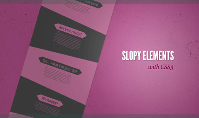

这是一款实用的、效果炫酷的html5和css3制作不规则的网页背景分割线网页模板。
EXAMPLE 1
下面来看一下第一个demo的制作流程。
html结构:实用一个section来包裹所有的内容,其中放置一个class为se-slope的div,div中放置的是文章article。
<section class="se-container">
    <div class="se-slope">
        <article class="se-content">
            <h3>Some headline</h3>
            <p>Some text</p>
        </article>
    </div>
    <div class="se-slope">
        <!-- ... -->
    </div>
    <!-- ... -->
</section>
CSS
背景的颜色和偶数se-slope单元的背景色一致。
body{
    background: #e90089;
}
包裹容器设置为overflow:hidden,因为当我们旋转某些元素的时候,它们可能会发生溢出。:
.se-container{
    display: block;
    width: 100%;
    overflow: hidden;
    padding-top: 150px;
}
所有的div都将被旋转:单数的div将填充黑色和旋转5度,偶数的div将填充紫色并旋转-5度。在旋转时我们需要调整单数div的位置,这里是在顶部添加了一个margin。
.se-slope{
    margin: 0 -50px;
    transform-origin: left center;
}
.se-slope:nth-child(odd){
    background: #000;
    transform: rotate(5deg);
    margin-top: -200px;
    box-shadow: 0px -1px 3px rgba(0,0,0,0.4);
}
.se-slope:nth-child(even){
    background: #e90089;
    transform: rotate(-5deg);
    box-shadow: 0px 2px 3px rgba(0,0,0,0.4) inset;
}
文章居中显示:
.se-content{
    margin: 0 auto;
}
给标题添加一些好看的样式。这里使用了 :before和 :after伪元素来在标题的两端添加三角形效果。
这时候该隐藏radio按钮:
.se-content h3{
    font-size: 60px;
    position: relative;
    display: inline-block;
    padding: 10px 30px 8px 30px;
    height: 80px;
    line-height: 80px;
    margin-bottom: 20px;
    font-family: 'Bitter', 'Trebuchet MS', Arial;
    text-shadow: 1px 1px 1px rgba(0,0,0,0.9);
}
.se-slope:nth-child(odd) .se-content h3{
    background: #e90089;
    color: #000;
}
.se-slope:nth-child(even) .se-content h3{
    background: #000;
    color: #e90089;
}
.se-content h3:before{
    content: '';
    width: 0;
    height: 0;
    border-top: 38px solid transparent;
    border-bottom: 60px solid transparent;
    border-right: 60px solid black;
    position: absolute;
    left: -59px;
    top: 0px;
}
.se-content h3:after{
    content: '';
    width: 0;
    height: 0;
    border-top: 38px solid transparent;
    border-bottom: 60px solid transparent;
    border-left: 60px solid black;
    position: absolute;
    right: -59px;
    top: 0px;
}
调整一些单数单元的元素的颜色:
.se-content p{
    width: 75%;
    max-width: 500px;
    margin: 0 auto;
    font-style: italic;
    font-size: 18px;
    line-height: 24px;
    padding-top: 10px;
}
使用:first-letter选择器将第一个字母美化一下:
.se-content p:first-letter{
    font-size: 40px;
    font-family: 'Adobe Garamond Pro', Georgia, serif;
}
最后将文章部分旋转回0度,并调整padding使它更好看些:
.se-slope:nth-child(odd) .se-content{
    transform: rotate(-5deg);
    color: #e90089;
    padding: 130px 100px 250px 100px;
}
.se-slope:nth-child(even) .se-content{
    transform: rotate(5deg);
    color: #000;
    padding: 150px 100px 250px 100px;
}
第二个Demo的css代码请参考下载文件。下面是它的效果截图:


