
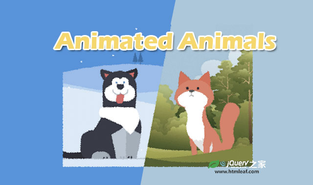

这是一款基于SVG过滤器和CSS3制作的可爱小动物动画特效。该特效中使用HTML标签和SVG结合制作动物的外形,并通过CSS3 animation动画来制作动物的各种动画特效。
使用方法
HTML结构
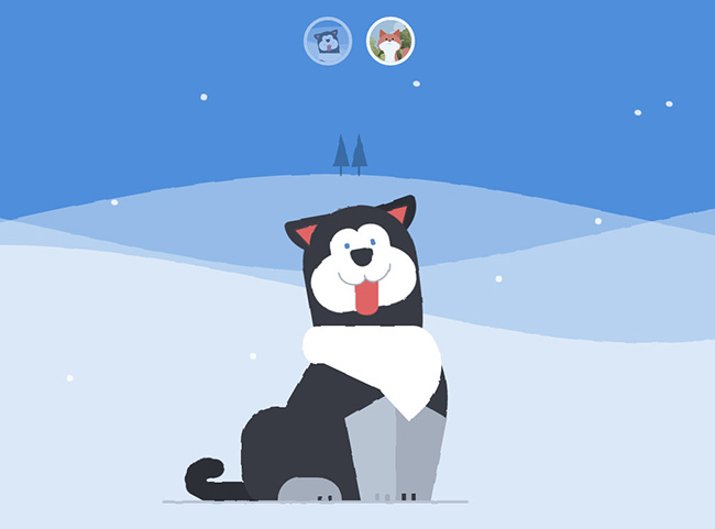
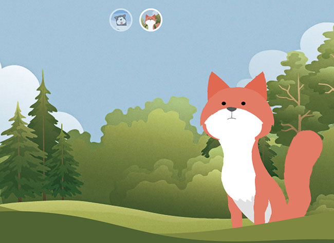
该特效在创建动物时使用了不同的技术,在创建哈士奇时使用的是CSS border-radius属性,而在创建狐狸时使用的是内联的SVG背景图像。
2个例子都使用嵌套的div作为动物的身体,合理的组合这些元素有利于制作动物运动时各个部分的动画效果。
<!-- Markup for the fox head -->
<div class="fox-head">
  <div class="fox-face">
    <div class="fox-ears">
      <div class="fox-ear"></div>
      <div class="fox-ear"></div>
    </div>
    <div class="fox-skull"></div>
    <div class="fox-front"></div>
    <div class="fox-eyes"></div>
    <div class="fox-nose"></div>
  </div>
</div>

<!-- Markup for the husky head -->
<div class="husky-head">
  <div class="husky-ear"></div>
  <div class="husky-ear"></div>
  <div class="husky-face">
    <div class="husky-eye"></div>
    <div class="husky-eye"></div>
    <div class="husky-nose"></div>
    <div class="husky-mouth">
      <div class="husky-lips"></div>
      <div class="husky-tongue"></div>
    </div>
  </div>
</div>
哈士奇的身体多数以圆形和椭圆形为主,所以需要使用大量的border-radius属性来制作。例如它的后腿的CSS代码为:
.husky-hind-leg {
  // ...
  border-top-left-radius: 35% 100%;
  border-top-right-radius: 40% 100%;
}
另外一些部分不能单独使用border-radius属性来制作,必须和transform相结合,例如哈士奇的前腿。
.husky-front-legs > .husky-leg:before {
  transform: skewY(-30deg) skewX(10deg);
  transform-origin: top right;
}
对于狐狸身体部分的创建,作者使用Adobe Illustrator来创建图形,然后将各个部分保存为SVG图形。最后使用Sass-SVG将其转换为CSS样式:
.fox-nose:before {
  @include svg((viewBox: (0 0 168 168))) {
    // the nose
    @include svg('path', (
      fill: $color-nose,
      d: 'M83.7,86.7c3.3,0,11.6-3.9,11.6-7.1c0-3.2-9.4-3.2-11.6-3.2c-2.2,0-11.6,0-11.6,3.2   C72.1,82.8,80.4,86.7,83.7,86.7z'
    ));

    // the line connecting the nose to the mouth
    @include svg('path', (
      stroke: $color-nose,
      fill: none,
      d: 'M83.7,102.3V86.7'
    ));

    // the mouth
    @include svg('path', (
      stroke: $color-nose,
      fill: none,
      d: 'M94.5,104.9c0,0-5.2-2.7-10.8-2.7c-5.6,0-10.8,2.7-10.8,2.7'
    ));
  }
}
上面的代码会生成一个被编码后的内联的背景图像。
.fox-nose:before {
  background-image: url("data:image/svg+xml;charset=utf8,%3Csvg...");
}
哈士奇:
狐狸:
关于该动物动画特效的详细教程请参考:Animated Animals in CSS and SVG


