
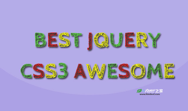

这是一款纯CSS3炫酷彩色粉笔字特效。该特效利用CSS3和谷歌字体,来制作效果非常炫酷的粉笔字,并带有一些动画效果。
使用方法
在HTML文件中引入谷歌字体。
<link href="css/bootstrap.css" rel="stylesheet">
<link href="https://fonts.googleapis.com/css?family=Cabin+Sketch:700&display=swap" rel="stylesheet">
HTML结构
<div class="container">
    <div class="row">
        <div class="col-md-12">
            <div class="text-effect">
                <span>B</span><span>e</span><span>s</span><span>t</span>
                <span>J</span><span>Q</span><span>u</span><span>e</span><span>r</span><span>y</span>
            </div>
        </div>
    </div>
</div>
CSS样式
.text-effect{
    color: #ffff00;
    font-family: 'Cabin Sketch', cursive;
    font-size: 100px;
    text-align: center;
    text-transform: uppercase;
    margin: 0 auto;
    position: relative;
}
.text-effect span{
    display: inline-block;
    animation: animate 0.5s linear infinite both;
}
.text-effect span:nth-child(1),
.text-effect span:nth-child(4),
.text-effect span:nth-child(7),
.text-effect span:nth-child(10){
   color: #4cd137;
}
.text-effect span:nth-child(2),
.text-effect span:nth-child(5),
.text-effect span:nth-child(8){
   color: #ff0000;
}
@keyframes animate{
    0%, 50%, 100%{ transform: rotate(0deg) scale(1); }
    25%{ transform: rotate(4deg) scale(0.98); }
    75%{ transform: rotate(-4deg) scale(1.02); }
}
@media only screen and (max-width: 990px){
    .text-effect{ font-size: 100px; }
}
@media only screen and (max-width: 767px){
    .text-effect{ font-size: 80px; }
}
@media only screen and (max-width: 479px){
    .text-effect{ font-size: 60px; }
}
@media only screen and (max-width: 359px){
    .text-effect{ font-size: 45px; }
}


