

这是一款基于bootstrap的进度条美化特效。该进度条在原生bootstrap进度条的基础上,使用少量的CSS3代码来进行美化,生成更加好看的进度条效果。
使用方法
在页面中引入bootstrap样式文件。
<link href="path/to/bootstrap/3.3.7/css/bootstrap.min.css" rel="stylesheet">
HTML结构
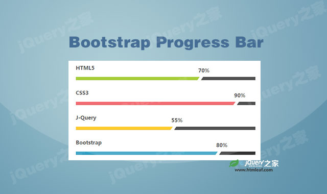
bootstrap进度条的基本HTML结构如下:
<div class="container">
    <div class="row">
        <div class="col-md-offset-3 col-md-6">
            <h3 class="progress-title">HTML5</h3>
            <div class="progress">
                <div class="progress-bar" style="width:70%; background:#97c513;">
                    <div class="progress-value">70%</div>
                </div>
            </div>

            <h3 class="progress-title">CSS3</h3>
            <div class="progress">
                <div class="progress-bar" style="width:90%; background:#f2545b;">
                    <div class="progress-value">90%</div>
                </div>
            </div>

            <h3 class="progress-title">J-Query</h3>
            <div class="progress">
                <div class="progress-bar" style="width:55%; background:#ffc304;">
                    <div class="progress-value">55%</div>
                </div>
            </div>

            <h3 class="progress-title">Bootstrap</h3>
            <div class="progress">
                <div class="progress-bar" style="width:80%; background:#2e9dc2;">
                    <div class="progress-value">80%</div>
                </div>
            </div>
        </div>
    </div>
</div>
CSS样式
使用下面的CSS代码来对进度条进行美化:
.progress-title{
    font-size: 16px;
    font-weight: 700;
    color: #333;
    margin: 0 0 20px;
}
.progress{
    height: 10px;
    background: #333;
    border-radius: 0;
    box-shadow: none;
    margin-bottom: 30px;
    overflow: visible;
}
.progress .progress-bar{
    position: relative;
    -webkit-animation: animate-positive 2s;
    animation: animate-positive 2s;
}
.progress .progress-bar:after{
    content: "";
    display: inline-block;
    width: 9px;
    background: #fff;
    position: absolute;
    top: -10px;
    bottom: -10px;
    right: -1px;
    z-index: 1;
    transform: rotate(35deg);
}
.progress .progress-value{
    display: block;
    font-size: 16px;
    font-weight: 600;
    color: #333;
    position: absolute;
    top: -30px;
    right: -25px;
}
@-webkit-keyframes animate-positive{
    0%{ width: 0; }
}
@keyframes animate-positive {
    0%{ width: 0; }
}


