
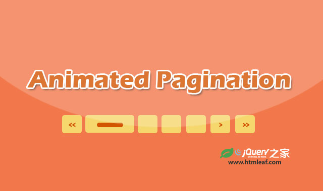

这是一款效果非常酷的纯CSS3带过渡动画特效的分页条ui设计效果。该分页条的首页、尾页、上一页和下一页按钮在鼠标滑过时,会带有非常好看的平滑拉伸动画效果。并且整个分页条带有很漂亮的阴影效果。
使用方法
HTML结构
该分页条的HTML结构如下:使用<section>元素来包裹一组无序列表。
<section class="archive-pages">
  <ul>
    <li class="first"><a href="#" title="first page">first page</a></li>
    <li class="previous"><a href="#" title="previous page">previous page</a></li>
    <li class="selected">1</li>
    <li><a href="#" title="Pagina 2">2</a></li>
    <li><a href="#" title="Pagina 3">3</a></li>
    <li><a href="#" title="Pagina 4">4</a></li>
    <li><a href="#" title="Pagina 5">5</a></li>
    <li class="next"><a href="#" title="next page">next page</a></li>
    <li class="last"><a href="#" title="last page">last page</a></li>
  </ul>
</section>
CSS样式
在CSS样式中,首先为分页按钮和当前激活的按钮设置基本样式。
.archive-pages li a:hover{
  color:#000;
}
.archive-pages li.selected{
  color:white;
}
.archive-pages a,
.archive-pages a:visited{
  color:#555;
}
.archive-pages li.selected{
  color:white;
  padding:5px;
  width:18px;
  line-height:20px;
  background: rgb(53,121,214);
  background: -moz-radial-gradient(center, ellipse cover,  rgba(53,121,214,1) 0%, rgba(53,121,214,1) 91%, rgba(27,85,157,1) 100%);
  background: -webkit-gradient(radial, center center, 0px, center center, 100%, color-stop(0%,rgba(53,121,214,1)), color-stop(91%,rgba(53,121,214,1)), color-stop(100%,rgba(27,85,157,1)));
  background: -webkit-radial-gradient(center, ellipse cover,  rgba(53,121,214,1) 0%,rgba(53,121,214,1) 91%,rgba(27,85,157,1) 100%);
  background: -o-radial-gradient(center, ellipse cover,  rgba(53,121,214,1) 0%,rgba(53,121,214,1) 91%,rgba(27,85,157,1) 100%);
  background: -ms-radial-gradient(center, ellipse cover,  rgba(53,121,214,1) 0%,rgba(53,121,214,1) 91%,rgba(27,85,157,1) 100%);
  background: radial-gradient(ellipse at center,  rgba(53,121,214,1) 0%,rgba(53,121,214,1) 91%,rgba(27,85,157,1) 100%);
  filter: progid:DXImageTransform.Microsoft.gradient( startColorstr='#3579d6', endColorstr='#1b559d',GradientType=1 );
}
.archive-pages ul{
  float:left;
  margin:0px;
  padding:10px;
  list-style:none;
}
.archive-pages li{
  border:1px solid silver;
  float:left;
  font-weight:700;
  margin:0 2px;
  text-align:center;
  border-radius: 3px;
  -moz-border-radius: 3px;
  -webkit-border-radius: 3px;
  background: -moz-linear-gradient(top,  rgba(255,255,255,0) 0%, rgba(214,214,214,1) 100%);
  background: -webkit-gradient(linear, left top, left bottom, color-stop(0%,rgba(255,255,255,0)), color-stop(100%,rgba(214,214,214,1)));
  background: -webkit-linear-gradient(top,  rgba(255,255,255,0) 0%,rgba(214,214,214,1) 100%);
  background: -o-linear-gradient(top,  rgba(255,255,255,0) 0%,rgba(214,214,214,1) 100%);
  background: -ms-linear-gradient(top,  rgba(255,255,255,0) 0%,rgba(214,214,214,1) 100%);
  background: linear-gradient(to bottom,  rgba(255,255,255,0) 0%,rgba(214,214,214,1) 100%);
  filter: progid:DXImageTransform.Microsoft.gradient( startColorstr='#00ffffff', endColorstr='#d6d6d6',GradientType=0 );
}
然后分别设置分页按钮鼠标滑过时的样式。
.archive-pages li.selected:hover{
  cursor:default;
  background: rgb(53,121,214);
  background: -moz-radial-gradient(center, ellipse cover,  rgba(53,121,214,1) 0%, rgba(53,121,214,1) 91%, rgba(27,85,157,1) 100%);
  background: -webkit-gradient(radial, center center, 0px, center center, 100%, color-stop(0%,rgba(53,121,214,1)), color-stop(91%,rgba(53,121,214,1)), color-stop(100%,rgba(27,85,157,1)));
  background: -webkit-radial-gradient(center, ellipse cover,  rgba(53,121,214,1) 0%,rgba(53,121,214,1) 91%,rgba(27,85,157,1) 100%);
  background: -o-radial-gradient(center, ellipse cover,  rgba(53,121,214,1) 0%,rgba(53,121,214,1) 91%,rgba(27,85,157,1) 100%);
  background: -ms-radial-gradient(center, ellipse cover,  rgba(53,121,214,1) 0%,rgba(53,121,214,1) 91%,rgba(27,85,157,1) 100%);
  background: radial-gradient(ellipse at center,  rgba(53,121,214,1) 0%,rgba(53,121,214,1) 91%,rgba(27,85,157,1) 100%);
  filter: progid:DXImageTransform.Microsoft.gradient( startColorstr='#3579d6', endColorstr='#1b559d',GradientType=1 );
}
.archive-pages li:hover{
  background: -moz-linear-gradient(top,  rgba(255,255,255,0) 0%, rgba(196,196,196,1) 100%);
  background: -webkit-gradient(linear, left top, left bottom, color-stop(0%,rgba(255,255,255,0)), color-stop(100%,rgba(196,196,196,1)));
  background: -webkit-linear-gradient(top,  rgba(255,255,255,0) 0%,rgba(196,196,196,1) 100%);
  background: -o-linear-gradient(top,  rgba(255,255,255,0) 0%,rgba(196,196,196,1) 100%);
  background: -ms-linear-gradient(top,  rgba(255,255,255,0) 0%,rgba(196,196,196,1) 100%);
  background: linear-gradient(to bottom,  rgba(255,255,255,0) 0%,rgba(196,196,196,1) 100%);
  filter: progid:DXImageTransform.Microsoft.gradient( startColorstr='#00ffffff', endColorstr='#c4c4c4',GradientType=0 );
}
首页、尾页、上一页和下一页按钮上为width,text-indent,letter-spacing这3个属性设置动画过渡效果。并且在鼠标滑过这写按钮时,相应的修改这些属性的值。
.archive-pages .first a,
.archive-pages .previous a,
.archive-pages .next a,
.archive-pages .last a{
  overflow:hidden;
  white-space:nowrap;
  -webkit-transition-duration: 300ms;
  -webkit-transition-property: width,text-indent,letter-spacing;
  -webkit-transition-timing-function: ease;
  -moz-transition-duration: 300ms;
  -moz-transition-property: width,text-indent,letter-spacing;
  -moz-transition-timing-function: ease;
  -o-transition-duration: 300ms;
  -o-transition-property: width,text-indent,letter-spacing;
  -o-transition-timing-function: ease;
  transition-duration: 300ms;
  transition-property: width,text-indent,letter-spacing;
  transition-timing-function: ease;
}
.archive-pages .first a:hover,
.archive-pages .previous a:hover,
.archive-pages .next a:hover,
.archive-pages .last a:hover{
  width: 100px;
  text-indent:0;
  letter-spacing:0px;
}
.archive-pages .first a{
  text-indent:+6px;
  letter-spacing:10px;
}
.archive-pages .previous a{
  text-indent:+7px;
  letter-spacing:10px;
}
.archive-pages .next a{
  text-indent:-159px;
  letter-spacing:10px;
}
.archive-pages .last a{
    text-indent:-154px;
  letter-spacing:10px;
}
完整的分页样式代码可以参看下载文件的style.css文件。


