

这是一组效果非常炫酷的网页介绍标题文字动画特效。这组文字动画效果共有8种效果,分别为弹性效果,文字剪裁效果,文字遮罩效果,视觉差效果,反转效果,文字缩放效果和全屏视频背景效果。
使用方法
HTML结构
所有文字动画效果的HTML结构都非常简单:使用一个section.cd-intro作为容器,里面的div.cd-intro-content是用于制作标题文字动画效果的内容。
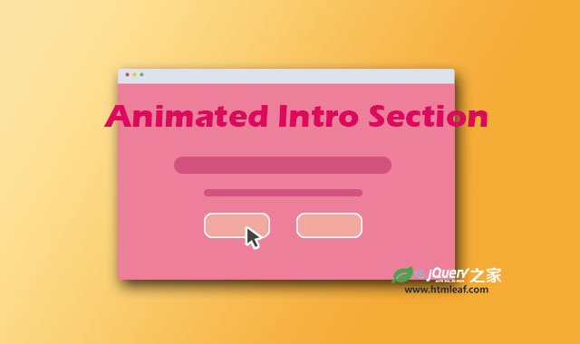
在第一种bouncy效果中,使用<h1>元素作为页面标题,<p>元素是一些标语,div.action-wrapper是一些按钮元素。
<section class="cd-intro">
  <div class="cd-intro-content bouncy">
    <h1>Animated Intro Section</h1>
    <p>A collection of text effects for the intro section of your website</p>
    <div class="action-wrapper">
      <a href="#0" class="cd-btn main-action">Get started</a>
      <a href="#0" class="cd-btn">Learn More</a>
    </div>
  </div>
</section>
添加到.cd-into-content中的.bouncy class用于触发文字动画效果。
CSS样式
默认情况下,标题文本的内容是隐藏的,它通过设置opacity属性为0实现,然后会使用CSS3 Animation来使其产生动画效果。
对于bouncy效果,这里为<h1>,<p>和.cd-btn创建了3个不同的animations动画。
.cd-intro-content h1,
.cd-intro-content p,
.cd-intro-content .cd-btn {
  opacity: 0;
  animation-delay: 0.3s;
  animation-fill-mode: forwards;
}

.bouncy.cd-intro-content h1 {
  animation-name: cd-bounce-right;
}

.bouncy.cd-intro-content p {
  animation-name: cd-bounce-left;
}

.bouncy.cd-intro-content h1,
.bouncy.cd-intro-content p {
  animation-duration: 0.6s;
}

.bouncy.cd-intro-content .cd-btn {
  animation-name: cd-bounce-rotate;
  animation-duration: 0.5s;
}

.bouncy.cd-intro-content .cd-btn.main-action {
  animation-delay: 0.4s;
}

@keyframes cd-bounce-right {
  0% {
    opacity: .2;
    transform: translateX(-200px);
  }
  60% {
    opacity: .7;
    transform: translateX(15px);
  }
  100% {
    opacity: 1;
    transform: translateX(0);
  }
}

@keyframes cd-bounce-left {
  0% {
    opacity: .2;
    transform: translateX(200px);
  }
  60% {
    opacity: .7;
    transform: translateX(-15px);
  }
  100% {
    opacity: 1;
    transform: translateX(0);
  }
}

@keyframes cd-bounce-rotate {
  0% {
    opacity: .2;
    transform: perspective(800px) rotateX(-80deg);
  }
  20% {
    opacity: 1;
  }
  60% {
    transform: perspective(800px) rotateX(20deg);
  }
  100% {
    opacity: 1;
    transform: perspective(800px) rotateX(0);
  }
}
对于视频背景效果,在HTML标签中有一个div.cd-bg-video-wrapper元素,它用于包裹背景视频(视频是通过Javascript 动态加载的)。
另外,在<h1>元素中还插入了两个SVG元素:.svg-mask和.svg-mask-mobile。这两个svg用于创建标题透明效果(第一个是在大屏幕上使用,第二个是在小屏幕中使用的)。
.cd-bg-video-wrapper {
  /* background cover video */
  position: absolute;
  z-index: 1;
  top: 0;
  left: 0;
  width: 100%;
  height: 100%;
  overflow: hidden;
  background: url(../assets/bg-img.jpg) no-repeat center center;
  background-size: cover;
}
.cd-bg-video-wrapper video {
  /* you won't see this element in the html, but it will be injected using js */
  display: block;
  position: absolute;
  left: 50%;
  top: 50%;
  bottom: auto;
  right: auto;
  transform: translateX(-50%) translateY(-50%);
  min-height: 100%;
  min-width: 100%;
  max-width: none;
  height: auto;
  width: auto;
}

.video.cd-intro-content svg {
  position: absolute;
  z-index: 2;
  /* center the svg inside its parent */
  left: 50%;
  top: 50%;
  bottom: auto;
  right: auto;
  transform: translateX(-50%) translateY(-50%);
  opacity: 0.8;
}
.video.cd-intro-content svg.svg-mask {
  /* this is the svg mask used on desktop version */
  display: none;
}
@media only screen and (min-width: 768px) {
  .video.cd-intro-content svg.svg-mask-mobile {
    display: none;
  }
  .video.cd-intro-content svg.svg-mask {
    display: block;
  }
}
JavaScript
这个网页介绍标题文字动画特效是完全使用CSS来制作的。
jQuery代码仅仅是为了加载最后一种效果中的视频文件,它仅会在屏幕宽度大于768像素的时候加载全屏的背景视频。它通过在div.cd-bg-video-wrapper元素上的data-video来查找视频文件。


