
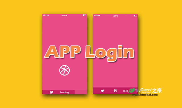

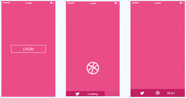
这是一款使用纯CSS3制作的效果非常有创意的手机APP登录界面动画特效。该特效在用户点击登录按钮之后,按钮变形为一个小球图标,并且小球会上下弹跳,之后小球会落入界面底部成为一个图标按钮。
使用方法
HTML结构
该手机APP登录特效的HTML结构使用嵌套<div>的HTML结构。为制作点击事件,采用<checkbox>和<label>的组合,使用checkbox-hack来制作点击事件。
<div class="demo">
  <input type="checkbox" id="cb" class="demo__checkbox" />
  <label class="demo__login-label" for="cb"></label>
  <div class="demo__somewhat"></div>
  <p class="demo__time">5:12PM</p>
  <div class="demo__battery"></div>
  <div class="demo__login">Login</div>
  <div class="demo__ball-cont">
    <i class="fa fa-dribbble demo__ball"></i>
  </div>
  <div class="demo__footer">
    <a href="https://www.htmleaf.com/" target="_blank" class="demo__twitter">
      <i class="fa fa-twitter"></i>
    </a>
    <label for="cb" class="demo__reset-label">reset</label>
  </div>
</div>
CSS样式
在登录按钮被点击之后,使用checkbox-hack来将按钮变形为圆心,并最终使它的透明度降低为0,变为不可见。
.demo__login {
  position: absolute;
  width: 20rem;
  height: 4.4rem;
  left: 50%;
  top: 50%;
  -webkit-transform: translate(-50%, -50%);
      -ms-transform: translate(-50%, -50%);
          transform: translate(-50%, -50%);
  text-align: center;
  line-height: 4rem;
  text-transform: uppercase;
  color: #fff;
  font-size: 2.5rem;
  border: 0.2rem solid #fff;
  will-change: width, height, border-radius, opacity;
}
.demo__checkbox:checked ~ .demo__login {
  -webkit-transition: font-size 0.2s, width 0.5s, height 0.5s, border-radius 0.3s, opacity 0s 0.7s, border-width 0.3s;
          transition: font-size 0.2s, width 0.5s, height 0.5s, border-radius 0.3s, opacity 0s 0.7s, border-width 0.3s;
  font-size: 0;
  width: 8.6rem;
  height: 8.6rem;
  border-radius: 50%;
  opacity: 0;
  border-width: 0.7rem;
}
之后小球图标的包裹容器透明度设置为1,并开始执行ballContAnim()动画。实际的小球也开始执行ballAnim()动画。
.demo__ball-cont {
  z-index: -1;
  position: absolute;
  left: 50%;
  top: 50%;
  margin-left: -4.3rem;
  margin-top: -5rem;
  width: 8.6rem;
  height: 10rem;
  font-size: 10rem;
  line-height: 1;
  color: #fff;
  -webkit-transform-origin: 50% 300%;
      -ms-transform-origin: 50% 300%;
          transform-origin: 50% 300%;
  opacity: 0;
  will-change: opacity, transform;
}
.demo__checkbox:checked ~ .demo__ball-cont {
  z-index: 2;
  opacity: 1;
  -webkit-transition: opacity 0.2s 0.5s;
          transition: opacity 0.2s 0.5s;
  -webkit-animation: ballContAnim 2.2s 0.7s cubic-bezier(0.83, 0.28, 0.35, 1.02) forwards;
          animation: ballContAnim 2.2s 0.7s cubic-bezier(0.83, 0.28, 0.35, 1.02) forwards;
}
.demo__checkbox:checked ~ .demo__ball-cont .demo__ball {
  -webkit-animation: ballAnim 2.2s 0.7s cubic-bezier(0.83, 0.28, 0.35, 1.02) forwards;
          animation: ballAnim 2.2s 0.7s cubic-bezier(0.83, 0.28, 0.35, 1.02) forwards;
}


