

这是一款很酷的带定时消失功能的css3消息提示框插件。
HTML
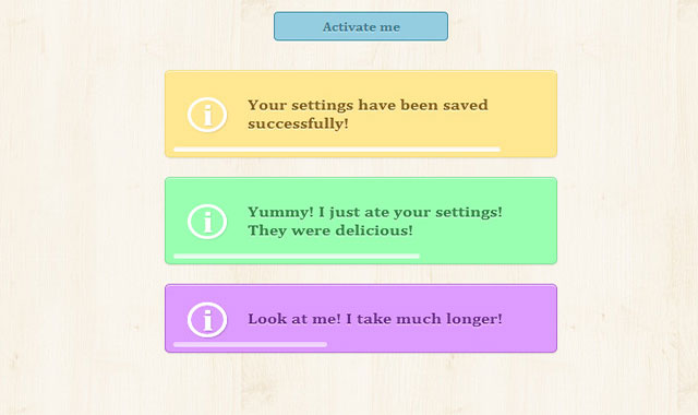
html结构非常简单:用一个wrapper div作为包裹容器,里面放一个用于显示信息的p标签和一个用来做进度条的div。
<div class="tn-box tn-box-color-1">
    <p>Your settings have been saved successfully!</p>
    <div class="tn-progress"></div>
</div>
为了给包裹div设置不同的颜色,给它设置两个class:tn-box和tn-box-color-1。
CSS
.tn-box {
    width: 360px;
    position: relative;
    margin: 0 auto 20px auto;
    padding: 25px 15px;
    text-align: left;
    border-radius: 5px;
    box-shadow:
        0 1px 1px rgba(0,0,0,0.1),
        inset 0 1px 0 rgba(255,255,255,0.6);
    opacity: 0;
    cursor: default;
    display: none;
}

.tn-box-color-1{
    background: #ffe691;
    border: 1px solid #f6db7b;
}
设置包裹div的初始dispaly:none,并给设置它的透明度为0。
进度条的样式如下:
.tn-progress {
    width: 0;
    height: 4px;
    background: rgba(255,255,255,0.3);
    position: absolute;
    bottom: 5px;
    left: 2%;
    border-radius: 3px;
    box-shadow:
        inset 0 1px 1px rgba(0,0,0,0.05),
        0 -1px 0 rgba(255,255,255,0.6);
}
动画开始前,进度条的宽度为0。
在demo中,使用一个checkbox来作为按钮触发消息提示框动画。
input.fire-check:checked ~ section .tn-box {
    display: block;
    animation: fadeOut 5s linear forwards;
}
input.fire-check:checked ~ section .tn-box .tn-progress {
    animation: runProgress 4s linear forwards 0.5s;
}
因为按钮的动作发生在消息提示框之前,所以可以使用一般通用选择器来完成按钮操作。
如果你想使用javascript来完成按钮动作,你可以像下面这样写样式:
.tn-box.tn-box-active {
    display: block;
    animation: fadeOut 5s linear forwards;
}
.tn-box.tn-box-active .tn-progress {
    animation: runProgress 4s linear forwards 0.5s;
}
tn-box-active是在按钮按下时被加到tn-box div中的class。
下面是消息框淡入淡出动画效果:
@keyframes fadeOut {
    0%  { opacity: 0; }
    10% { opacity: 1; }
    90% { opacity: 1; transform: translateY(0px);}
    99% { opacity: 0; transform: translateY(-30px);}
    100% { opacity: 0; }
}
下面是进度条的动画效果:
@keyframes runProgress {
    0%  { width: 0%; background: rgba(255,255,255,0.3); }
    100% { width: 96%; background: rgba(255,255,255,1); }
}
我们使它运动到进度条宽度的96%,颜色上使用RGBA。


